Doc:2.6/Manual/Interface/Buttons and Controls
Buttons and Controls
Buttons and other controls can be found in almost every Window of the Blender interface. The different types of controls are described below.
Operation Buttons
These are buttons that perform an operation when clicked with LMB  . They can be identified by their gray color in the default Blender scheme.
Pressing CtrlC over these buttons copies their python command into the clipboard which can be used in the python console or in the text editor when writing scripts.
Toggle Buttons

Toggle buttons consist of tick boxes. Clicking this type of button will toggle a state but will not perform any operation. In some cases the button is attached to a number button to control the influence of the property.
Radio Buttons
Radio buttons are used to choose from a small selection of "mutually exclusive" options.
Number Buttons

Number buttons can be identified by their labels, which in most cases contains the name and a colon followed by a number. Number buttons are handled in several ways:
- To change the value in steps, click LMB
 on the small triangles on the sides of the button.
 - To change the value in a wider range, hold down LMB and drag the mouse to the left or right. If you hold Ctrl after holding down LMB , the value is changed in discrete steps; if you hold ⇧ Shift instead, you'll have finer control over the values.
- ↵ Enter or LMB lets you enter the value by hand.
When entering values by hand, pressing ↖ Home or ⇥ End will move the cursor to the beginning or the end of the range. Pressing Esc will cancel editing. You can copy the value of a button by hovering over it and pressing CtrlC. Similarly you can paste a copied value with CtrlV.
Expressions
You can also enter expressions such as 3*2 instead of 6. or 5/10+3. Even constants like pi (3.142) or functions like sqrt(2) (square root of 2) may be used.
These expressions are evaluated by python; for all available math expressions see: math module reference
Units
As well as expressions, you can mix units with numbers; for this to work, units need to be set in the scene settings (Metric or Imperial).
Examples of valid units include:
- 1cm
- 1m 3mm
- 1m, 3mm
- 2ft
- 3ft/0.5km
- 2.2mm + 5' / 3" - 2yards
Note that the commas are optional. Also notice how you can mix between metric and imperial even though the display can only show one at a time.
Menu Buttons

Use the Menu buttons to work with items on dynamically created lists. Menu buttons are principally used to link DataBlocks to each other. DataBlocks are items like Meshes, Objects, Materials, Textures, and so on. Linking a Material to an Object will assign that material to the selected Objects.

- The first button (with an icon of the DataBlock type) opens a menu that lets you select the DataBlock to link by clicking LMB on the requested item. This list has a search box at the bottom.
- The second button displays the name of the linked DataBlock and lets you edit it after clicking LMB .
- The "+" button duplicates the current DataBlock and applies it.
- The "X" button clears the link.
Sometimes there is a list of applied DataBlocks (such as a list of materials used on the object). See DataBlock link buttons above.
- To select a datablock, click LMB on it.
- To add a new section (e.g. material, or particle system), click LMB on the "+" button to the right of the list.
- To remove a section, click LMB on the "-" to the right of the list.
Another type of a Menu button block will show a static list with a range of options. For example, the Add Modifier button will produce a menu with all of the available modifiers.

Unlinked objects
Unlinked data is not lost until you quit Blender. This is a powerful Undo feature. If you delete an object the material assigned to it becomes unlinked, but is still there! You just have to re-link it to another object or supply it with a "Fake User" (i.e. by clicking that option in the corresponding DataBlock in the datablock-view of the Outliner). |
Color Selector Controls
- In Blender, you can choose from 4 types of color pickers; the options are
- Circle (Default), Square (HS + V) , Square (SV + H) and Square (HV + S)
For more information about how to select the type of color picker, please go to the System preferences page.
- All of the Color picker types have the common RGB, HSV and Hex options to show values.
- Optionally, depending on the operation, another slider for Alpha control is added at the bottom of the color picker.
- Blender uses Floating point values to express colors for RGB and HSV values.
- The Hex values are expressed in the same way HTML colors are expressed.
- Note that Blender corrects Gamma by default; for more information about how to disable Gamma correction in Blender, please go to the Color Management and Exposure page.
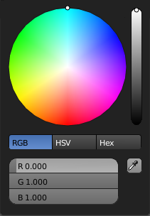 Fig. 2 - Color Picker - Circle
|
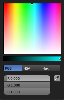 Fig. 3 - Color Picker Square (HS + V)
|
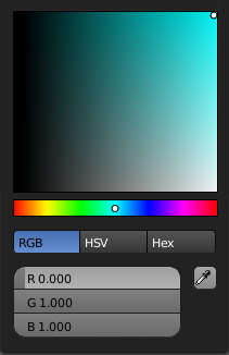 Fig. 4 - Color Picker Square (SV + H)
|
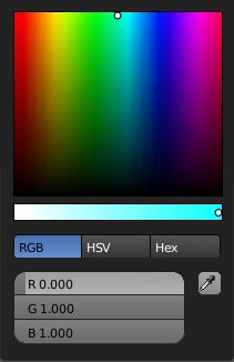 Fig. 5 - Color Picker Square (HV + S)
|
- Use Mouse wheel to change overall brightness.
- Color sliders don't have a default value; the last value before any changes is used instead.
Eye Dropper
The eye dropper allows you to sample a color from anywhere in the Blender window. The Eye Dropper can be accessed from any color picker or by pressing E with the mouse hovering over the color property.
LMB and dragging the eyedropper will mix the colors you drag over which can help when sampling noisy imagery. Spacebar resets and starts mixing the colors again.
Cascade Buttons
Occasionally, some buttons actually reveal additional buttons. For example, the Ramps panel has a Cascade button called Ramp that reveals additional buttons dealing with colorbanding. See Colorband before and Colorband after.


|