「利用者:Sculptorjim/Nodes/Common Controls」の版間の差分
(Created page with "{{Page/Header||}} {{review|}} = Node Controls = This page explains the widgets to control a node. thumb|right|300px|Nodes main controls ...") |
細 (1版 をインポートしました) |
(相違点なし)
| |
2018年6月29日 (金) 06:06時点における最新版
Page status (reviewing guidelines)
Page reviewed and in good shape |
目次
Node Controls
This page explains the widgets to control a node.
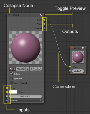
- Titlebar
- This contains the node's name, along with several different collapse buttons.
- Input sockets
- The left side of a node has input sockets:
- blue sockets accept vectors.
- yellow sockets accept colors.
- gray sockets accept single values (like alpha).
- Output sockets
- The right side of a node has output sockets:
- blue sockets produce vectors.
- yellow sockets produce colors.
- gray sockets produce single values (like alpha).
- Image preview
- Inside the node there's an area to show the image preview being output by the node or the curves that control the node behavior (for example in a RGB node).
- Buttons and menus
- Below the image preview there are buttons and menus to control the node behavior.
- Threads
- A curved line shows a connection from an output socket to an input socket. The socket types must match.
Connections associated with the active node are highlighted for better visibility.
Collapsing toggles
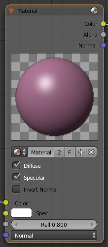
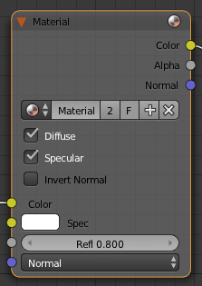
At the top of a node there are up to 4 visual controls for the node (Top of a Node). Clicking these controls influences how much information the node shows.
- Preview image toggle
- The sphere button on the far right of the titlebar hides/unhides the preview image.
Sizing the node
Fine Sizing of an individual node can also be accomplished somewhat by clicking LMB ![]() and dragging on the left or right edge of the node.
and dragging on the left or right edge of the node.
Sockets
Each Node in your node window will have "sockets" (often also referred to as "connectors") which are small colored circles to which input data and output data can be linked (Node Sockets).
The sockets on the left side of a node describe inputs, while the sockets on the right side are outputs.
For your convenience, nodes are color-coded according to the type of information they expect to send or receive. There are three colors:
 Gray sockets
- Indicates values (numeric) information. It can either be a single numerical value or a so-called "value map." (You can think of a value map as a grayscale-map where the different amount of bright/dark reflects the value for each point.) If a single value is used as an input for a "value map" socket, all points of the map are set to this same value.
- Common use: Alpha maps and value options for a node.
Between nodes, yellow must be linked to yellow, gray to gray, blue to blue, unless you use a converter, which we'll cover later on.
Next to the color in the node you will see the name of that socket. Though not always the case, you can think of the name of the socket as what the information is intended to be. But this is not necessarily what it has to be. For example, I can add a link from a gray socket titled Alpha to the material node's gray Reflection socket and still get a result, the key thing being that it's a "gray to gray" connection.
There are exceptions where you can mix yellow (i.e. a color image) and gray (e.g. grayscale) without converters. Blender normally places a converter if needed, so feel free to experiment with them. You can use the "Viewer" output nodes, as explained in the later sections, to see if/how it works.
Curves
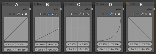
Some nodes have a curve area that translates an input value to an output value. You can modify this curve shape by clicking on a control point and moving it, or adding a control point. Some examples are shown below:
Every curve starts out as a straight line with a slope of 1. The curve starts out with two tiny black control points at each end of the line. Clicking LMB ![]() on a control point selects it and it turns white.
on a control point selects it and it turns white.
Changing the curve affects how the output is generated. The input, X, usually proceeds linearly (at regular intervals) across the bottom axis. Go up until you hit the curve, and then over to the right to determine the Y output for that corresponding X. So, for the second example, as X goes from 0 to 1.0 across the bottom, Y varies from 0.0 to 0.5. In the third, as X goes from 0.0 to 1.0 across the bottom, Y stays constant at 0.5. So, in the picture above, these curves have the following effect on time: A don't affect, B slow down, C stop, D accelerate, and E reverse time.
The "Curves" widget is a built-in feature in Blender's UI, and can be used anywhere, provided the curve data itself is being delivered to this widget. Currently it is used in the Node Editor and in the UV Window.
This widget will map an input value horizontally and return the new value as indicated by the height of the curve.
Note: The fact that one of the points on the curve is "white" in each of these screenshots is not significant; it just means that it happened to be the point most-recently selected by your author when preparing this tutorial. What matters here is the shape of the curve, not the position (nor the color) of the control points that were used to define it.
RGB Curves
Multiple curves can be edited in a single widget. The typical use, RGB curves, has "Combined" result or "Color" ("C") as the first curve, and provides curves for the individual R, G, and B components. All four curves are active together; the "C" curve gets evaluated first.
Selecting curve points
- LMB
 always selects 1 point and deselects the rest.
 - Hold ⇧ Shift while clicking to extend the selection or select fewer points.
Editing curves
- LMB
 click&drag on a point will move points.
 - A LMB
 click on a curve will add a new point.
 - Dragging a point exactly on top of another will merge them.
- Holding ⇧ Shift while dragging snaps to grid units.
- CtrlLMB
 adds a point.
 - Use the X icon to remove selected points.
Editing the view
The default view is locked to a 0.0-1.0 area. If clipping is set, which is the default, you cannot zoom out or drag the view. Disable clipping with the icon resembling a #.
Special tools
The wrench icon gives a menu with choices to reset a view, to define interpolation of points, or to reset the curve.


