「利用者:Ack-err/GSoC 2013/Toolbar Designs」の版間の差分
(→Toolbar Designs) |
細 (1版 をインポートしました) |
(相違点なし)
| |
2018年6月29日 (金) 05:57時点における最新版
目次
Toolbar Designs 1 - 19/07/2013
This page shows several mockups of redesigned toolbars. Below each mockup is a list of key characteristics.
Mockup 1 - Edit Mode
- No wide buttons, all buttons are organised in two columns.
- No text headers for groups of buttons, could possibly be changed for a group icon in front of the group.
- Shortcuts are shown on the buttons as to provide a cheat sheet.
- All buttons that lead to submenus are shown as normal buttons, but with three full stops to indicate a menu will open.
- Only one panel can be open at a time (e.g. opening Mesh Options will close Mesh Tools) as in an accordion style.
- Small dots in front of a button's name indicate that the corresponding command has default parameters that can be set. A grey dot turns to orange if the default parameters have indeed been changed.
- Scrolling in the toolbar will scroll through the panels.
- Repeat Last and History… have been moved to the History panel.
- The History panel shows two columns, labels left, widgets right.
- The divider between the Tool Shelf and the History panel is more clearly shown through a darker divider.
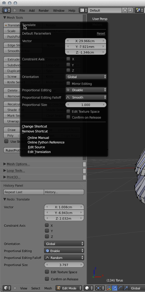
Mockup 2 - Edit Mode
- Right clicking a button will show a popup menu which allows for the default parameters to be changed.
- A reset button allows for the default parameters to be reset to the absolute defaults.
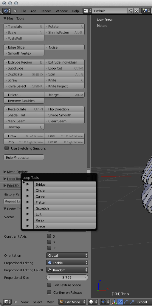
Mockup 3 - Edit Mode
- Left clicking the title of a closed panel will open the buttons from that panel in a popup menu.
- Clickability is communicated by underlining the title and appending three full stops.
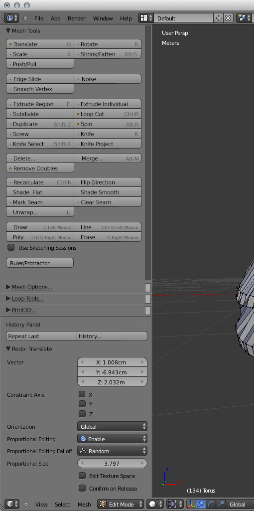
Mockup 4 - Edit Mode
- Commands for which the default parameters have been changed should have a small but clear indicator.
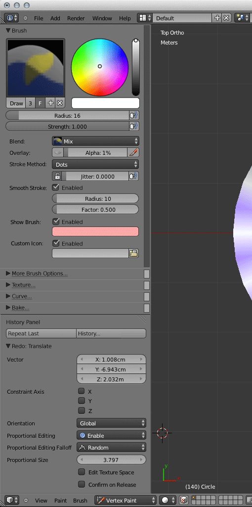
Mockup 5 - Vertex Paint Mode
- Similar to the Edit Mode toolbar, the Vertex Paint Mode toolbar becomes wider and makes better use of horizontal space.
- The brush and the colour widgets sit next to each other at the top of the brush panel.
- Other properties of the brush are shown in two columns, labels on the left, widgets on the right.
- Brush options that do not fit go in the More Brush Options panel.
- The options in the current Appearance and Stroke panels are moved to the new Brush panel.
- No default parameters can be set (like in the Edit Mode mockup) because the whole panel is already a list of parameters.
Mockup 6 - Vertex Paint Mode
- Similar to the Edit Mode toolbar, only one panel can be open at a time.
- Clicking a panel's title will open that panel in a popup.


