「Dev:Ref/Proposals/UI/mode sensitive N-Panel」の版間の差分
(→problems with properties editor if you strip the item listing panels) |
細 (1版 をインポートしました) |
(相違点なし)
| |
2018年6月29日 (金) 06:07時点における最新版
目次
problems
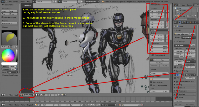
1. The current N-panel is showing irrelevant information to the editing mode that you are in (for most cases) ~
The N-panel editor in the 3d viewport always shows the same information/properties in all modes. As a result you get a lot of irrelevant stuff to scroll through in most editing modes. The user wouldnt need to alter the rotation or the translation of a mesh while working in texture paint mode for example. They wouldnt need to access the "Motion tracking" panel in most modes.
2. Screen Space ~
Blender's UI is currently not using it's screen estate very well. The interface is wasting space to display a lot of irrelevant information when the user is texture painting for example. The properties editor is rarely accessed to set a custom brush or do some other small thing. And since it requires effort to hide completely, it just sort of stays there most of the time.
The N-panel on the other hand is easy to toggle on and off. This is distracting to old users, steals valuable canvas screen estate (artists)
3. The interface makes you work ~
The user also has to manually navigate to the required tab in the properties editor and know where to find the feature that would aid their task.
4. The properties editor is not available in most of the other layout presets~
There are a few items in the Properties editor which the user has to access in other editor windows, such as the image editor for example. But the properties editor is not available in the uv unwrapping layout preset or the image editor. It takes a lot of horizontal space as it is wide.
It is not available in the texture editor window. The N-panel however is available everywhere!
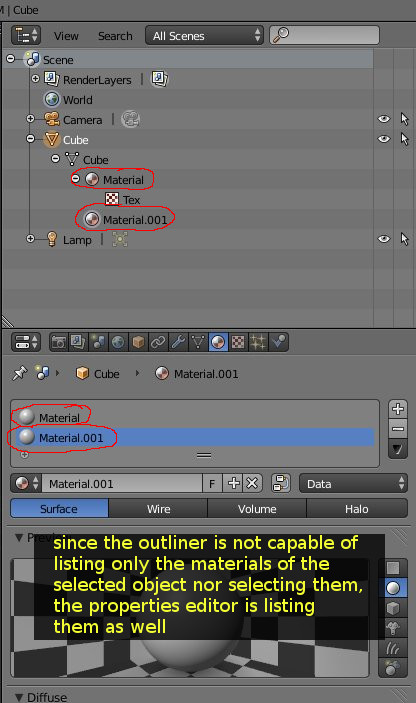
5. The current outliner is not very useful for anything but listing items. As a result, the properties editor has been hijacking that function from the outliner. This could be solved by empowering the Outliner to be Object oriented!
6.You have this problem of the properties editor becoming a part outliner as well- listing both the items that contain properties and their properties as well. This adds to a lot of scrolling in the properties editor and inefficient use of screen estate.
In this proposal I am going to refer to anything that contains a number of properties as an "ITEM". So in above screenshot the cube object contains two material items. They contain properties. One of the material items is a parent to a texture item. The texture item contains properties.
solution
To solve a lot of this cluttered interface issue and also speed up workflow by reducing the need to deal with switching tabs in the properties editor and looking for stuff, Blender's N-panel can adopt some of the T-toolbar behavior.
It is already planned to get the tabs.
My suggestion is:
1. Make the N-panel sensitive to the editing mode that you are in- so it displays information/properties that are relevant to what you are doing. Just like the toolbar.
2. Since the N-panel already shows object properties (such as object coordinates in object mode), I don't see why we can't also move/duplicate some of the items in the properties editor to the N-panel. Everything in the properties Editor that is relevant to what the object mode needs needs to go to the N-panel's object mode.
We only need a few of the items that are found in some of the properties editor tabs.
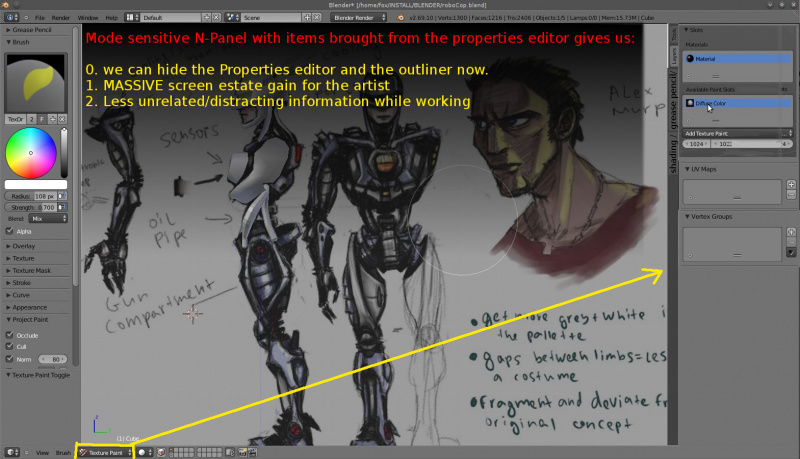
if we move/duplicate some of the properties panels to the N-panel, we will allow the users to entirely hide the big fat Properties editor and outliner while they are not needed.
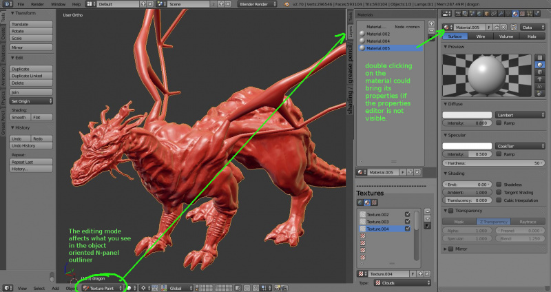
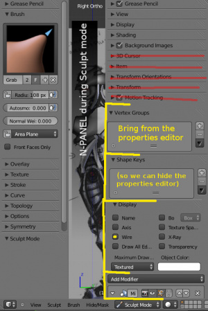
Here is a mockup to illustrate the idea for an N-panel during sculpting mode
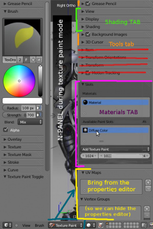
And another one to illustrate the idea for an N-panel during texturing mode
Some example items that are in the Properties editor, would be useful in the N-panel:
The n-panel in...could show...
- object mode: modifier stack,
- texture painting: Materials and textures lists (to switch between and edit textures),Textures>brush type(to set new brush textures), Vertex groups (for masking), UV maps,
- Edit mode: modifier stack, UV maps,
- sculpt mode: modifier stack, Shape keys, vertex groups, Textures>brush type (to set new brush textures),
- vertex paint: todo
- Weight paint: todo
- armature>edit mode: todo
- armature>pose mode: todo
-The N-panel is not present only inside the 3d viewport. It is also available in the Image editor and other blender editors. So this design logic can be beneficial to all of blender's layouts.
- Important note to this part of the proposal
The properties editor has two types of data:
1.Data of the currently selected object (material, textures, vertex groups, etc etc)
2.Global Data of the current scene ( rendering settings, rendering and baking buttons, etc)
I made the proposal focus on accessing the first type of data in the N-panel as these editing modes are object oriented, not scene-oriented.
So if an item in the property editor is scene related and does not aid an editing task in the 3d viewport - that item does not belong in the N panel. Things like the rendering settings for example.
Also it is important to distinguish between list type panels and properties. The N-panel should not try to take entire property editor tabs (like for example the entire materials tab with all the material properties, the entire textures tab with all of a textures properties) . It should aid the active editing mode in a minimalist way that doesnt go too advanced. So the properties editor stays the editor to edit properties. The N-panel becomes the editor that guesses what type of new data block you need to create/assign to the active object- so things like uv maps, vertex groups, list of textures or materials are a perfect match.
Empower the outliner, move it to a better location
First of all move the outliner to the N-panel - as one of the tabs there Doing so has a number of advantages over how it is today! As you can see so far my proposal is to turn one of the n-panel's tabs into a sort of an object/mode oriented outliner to reclaim the listing function from the properties editor! One that lists "Items" inside the selected object - items that contain Properties.
You can also keep it's scene oriented mode and improve it. Make the scene oriented mode available in the same N-panel tab while you are in object mode and make it better at categorizing objects within the scene.
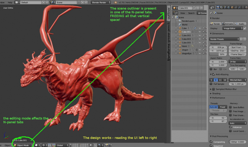
Doing so will:
1. Give more vertical space to the properties editor
2. Reduce clutter in the properties editor
3. Give a lot of vertical space to the outliner (as tall as the n-panel!) and make it very easy to toggle on and off!
4. Make the outliner much more useful.
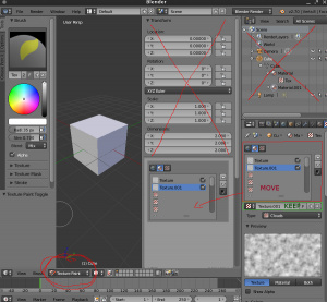
problems with properties editor if you strip the item listing panels
You can argue that if you take out all the Item lists in the properties editor, the user might get confused because when the N-panel is not visible. This design flaw can be sorted by:
Moving only the listing panel parts of the UI to the N-panel, but keeping the drop down lists that show the property that contains the currently displayed properties inside the Properties editor
here is how this could look like:
- How do you select an active Object's datablock entry to edit (materials, textures,etc) while the outliner is not visible?
A)Perhaps by using the legacy drop down list to get to them? But getting to them through that list currently also means changing them to any one of all the existing ones.
B)Perhaps by clicking on the hierarchy line to bring down a menu of the active object's existing datablock entries). So clicking on the Materials entry (in example bellow), brings down a list of all of the Object's materials.
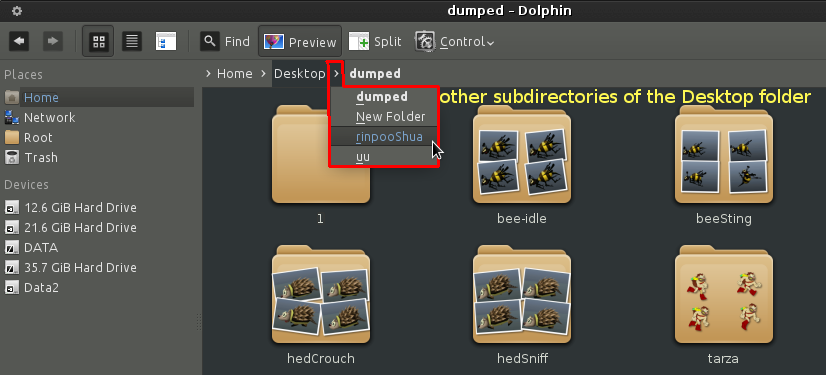
This is similar to how navigation bars work in some file managers on linux. Clicking an arrow between two directory buttons allows you to select any of their respected other sub-directories.
example of dolphin file manager using this feature
Conclusion
As you can see from this mockup, with a bit of improvement on the N-panel, Blender can look much cleaner!
-It can be much more intelligent in guessing what you need depending on what you are doing and show only relevant information.
-The user gains a lot more screen estate for the working area. More vertical space for the outliner, more vertical space for the properties editor.
- The overall interface design is more predictable and it fits with some of the already established design concepts.
And this is of course optional. The mockup does not disrupt the Properties editor design. It simply improves the N-panel's design for better full 3d viewport screen workflow - making it easier to access precisely the object data you need and when you need it!
Proposal by Blurymind/ Todor Imreorov
