「Dev:Ref/Proposals/UI/Screen Layout Selection」の版間の差分
(→Current issues) |
細 (1版 をインポートしました) |
(相違点なし)
| |
2018年6月29日 (金) 06:06時点における最新版
Proposal
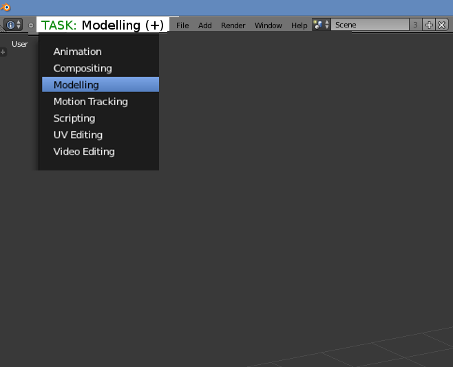
Renaming the ”Screen layout” feature to “Task” and make it much more prominent in the interface.
Current issues
- Displaying an icon with four cubes and the text saying “Default” makes it impossible to understand what it does at a glance for a new user.
- Users are constantly rebuilding the interface while working instead of using pre-made layouts.
- Not clearly focusing on one specific task decreases the quality of the workflow.
Mockup
- Instead of using an icon, it should state “task”.
- The word “task” should be highlighted, clearly showing that this is the current focus.
- Tasks should be considered the “highest level” of the software since it is a custom combination of smaller parts of Blender, and therefor take the largest space in the UI.
- When pressing the plus to add a new task, it should be named “Custom” by default and not “CurrentTask.001” to show that this is a new, free task that could be anything.
Improvements this will bring
Exploring Blender
It will be easier for beginners to find the different parts and functions of Blender and see what it can do if they realize that they can quickly switch between different tasks via a dropdown.
Saving custom layouts for experienced users
A beginner does not need to worry about creating custom UI layouts since all common beginner tasks already has a layout created. Having a beginner realize that these are already created for him lets him focus on the task instead of the UI. Later, whenever the user feel like it wants to go beyond and learn more, the “Add Custom Task” allows users to start experimenting and combine their own ways of working (with a tooltip explaining how windows can be added, changed and resized in any way you want).
Focus on the work
Having it read, for example, “Task: Modelling” in the corner it will improve people’s workflows by indirectly forcing them to focus on one task at a time, spend less time doing a little bit of everything and spend less time constantly rebuilding the UI.
