「利用者・トーク:JayDez」の版間の差分
細 (1版 をインポートしました) |
|
(相違点なし)
| |
2018年6月29日 (金) 04:44時点における最新版
Toggling Tool Shelf On/Off Mockup
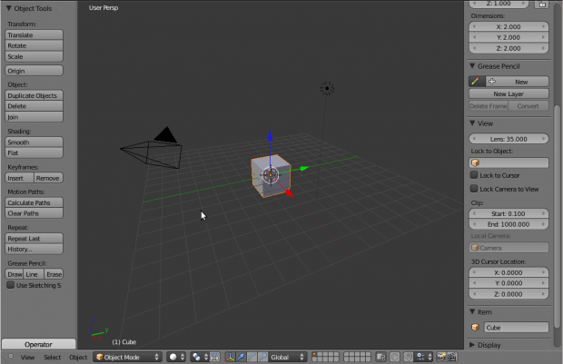
Instead of using the little plus icons (which are located in weird places), I would propose the use of tabs to show which Tool shelves are visible and which are not. This is especially useful in the case of closing only one part of the Tool Shelf (right now you can only close the Operator part), where you cannot simply toggle the Tool Shelf on and off, you MUST use the little plus icons.
Mock-ups
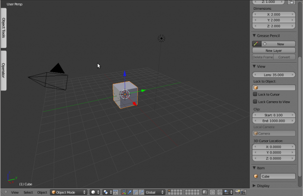
Here is a mock-up of a tab for the operator part of the Tool Shelf, when it is closed.
This mock-up shows both the upper and lower halves of the Tool Shelf closed (as is the case if you close the operator section and then close the Tool Shelf). If the operator section had not been closed before-hand, then there might only be one tab labeled Tool Shelf.
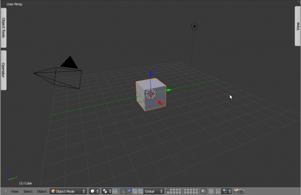
This shows the situation where every panel is closed. Idealy the tabs would be aligned on either side of the 3d view for better aesthetics.
Upsides
This allows the user to know which tab opens which panel, without having to click at various plus icons to find out. The way I have ordered the tabs also puts them in more intuitive places than where the plus icons are being placed currently.
Downsides
The biggest flaw with this style at the moment is the requirement for vertical text, however this could be alleviated if the tabs were stacked downwards or upwards from the top or the bottom. The reason I chose the approach I did was so that it would use up the least screen space.
Other
Another useful functionality to implement, would be to allow the upper part of the Tool Shelf to be closed as well as the operator part. Right now, dragging the operator side of the Tool Shelf all the way to the top, only results in the operator section being closed, instead of the other section. When using python scripts, it is nice to be able to use as much of the Tool Shelf as possible for the operator, in which case closing the upper half of the Tool Shelf would be nice. Then a tab could appear at the top (might like the one at the bottom, except flipped), from which you could reopen the top section of the Tool Shelf.
The other idea I had regarding the actual look (colour), was to make the tabs the same colour as the enum menus.


