「Dev:Ref/Requests/User Interface/General2.6」の版間の差分
(→Behaviour of Import) |
(相違点なし)
|
2015年6月2日 (火) 23:50時点における版
目次
- 1 UI Features
- 1.1 Bigger controls for Color Ramp
- 1.2 Better workflow with transform tool orientation
- 1.3 Arrange Logic Bricks like Nodes
- 1.4 Modifier appearing like Nodes
- 1.5 Reset Layout to Startup File
- 1.6 3 digit hex input for color picker
- 1.7 Count Info for Selected Objects/Local View Mode
- 1.8 Addon Counter
- 1.9 Change viewport to web browser
- 1.10 Add key at frame
- 1.11 Feedback when canceling
- 1.12 Universal header positioning option
- 1.13 Add a key to toggle Opposite View
- 1.14 Spacebar Search Menu
- 1.15 Color Management / ICC
- 1.16 Image Viewer / Overhighlighted
- 1.17 UV/Image Editor
- 1.18 Name Picker / Dropper
- 1.19 Move Grease pencil settings
- 1.20 Pixel Unit
- 1.21 new tool: Plane fill
- 1.22 New Join function
- 1.23 New Tool: Sever / lasso sever
- 1.24 Blender should demonstrate its tools/options
- 1.25 Upgrade screw!
- 1.26 Macros
- 1.27 Shaping the Torus
- 1.28 Snap levels
- 1.29 intuitive camera rotate
- 2 User Preference Features
- 3 Outliner Features
UI Features
Bigger controls for Color Ramp
The arrow controls for the colors in the Color Ramp are way too small, it's a sniper job to deal with them, they need to be bigger.
Papalagi 13:10, 30 July 2014 (CEST)
Better workflow with transform tool orientation
Hi, it would be nice to have this script http://blenderartists.org/forum/showthread.php?326991-Transform-Orientations-typical-interaction-use-case-%28workflow-UI%29&p=2579989&viewfull=1#post2579989 functionality in blender master build.
Arrange Logic Bricks like Nodes
The Logic Bricks layout quickly becomes cluttered and unreadable, it would be great to have a "Node style" positioning capability
Papalagi 09:27, 26 September 2014 (CEST)
Modifier appearing like Nodes
This one is for consistency: Modifier work like Nodes with just one input and one output, why not putting them in the Node Editor?
Papalagi 09:27, 26 September 2014 (CEST)
Reset Layout to Startup File
When collaborating with others I often get into strange layout situations when opening their file (altered default view, changed "Occlude Background Geometry", pivot point, etc.), and the changes I've made to the layout in my startup file aren't there.
It'd be great to have a menu option that would load my configuration from the startup file. It would clear up the workflow considerably.
GreenJello 22:40, 1 October 2013 (CEST)
3 digit hex input for color picker
Currently, the hex input for the color picker only accepts six hex digits. I'm used to using, for example, da0 instead of ddaa00, but Blender doesn't support this.
(Edit: this was added with patch #35359)
Forest-ka 21:08, 12 May 2013 (CEST)
Count Info for Selected Objects/Local View Mode
a.) Counting numbers for vertices/polys/edges/etc. by selecting objects/groups/etc.; b.) When in Local View mode (e.g. when pressing "/"), the Info bar only shows objects displayed in local view. c.) or adding them both? :P
You know, for single object, that would be easy by entering Edit Mode, then sellect all. But this wouldn't be quite easy for counting elements among multiple objects at the same time. A current compromised way is that you have to put them all into a blank scene, then hide the other scene. So, we really expect and respect such feature coming out.
--Leon Cheung 08:10, 2 May 2013 (CEST)
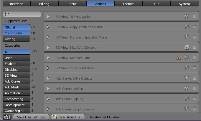
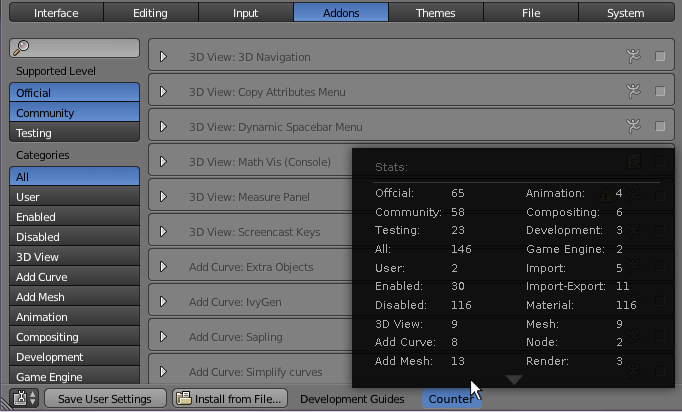
Addon Counter
This would be quite useful to quickly know the count details for each addon category. Here I would propose two solutions for reference:
Solution 1:
Solution 2:
--Leon Cheung 08:01, 16 February 2013 (CET)
Change viewport to web browser
Create option/ability to designate/select a viewport window from the Icon Slider button in the Header to display a web browser within Blender.
I find myself flipping between Blender and a web browser for referencing so often during development that I'd prefer to goto quad view and have one of the windows be a portal to the web so I can reference it while working in Blender. Softimage|XSI had/may still have this feature. Besides, it would be kinda nice to watch the latest Daily Show/Colbert Report while blending.
--User:Delysid25 05 Dec 2012
Add key at frame
CM = Contextmenu
CM, below "Add keyframe".
Add keyframe at Frame opens a Input box where you can type in numbers.
Working Example: Color Change from Green to Red to Yellow, setup in seconds, without the Timeline, without any Window Change, just in the Color selector.
Material-> Difuse Color -> Green -> CM:Add key at (FRAME 10) -> Difuse Color -> Red -> CM:Add Key at (FRAME 15) -> Difuse Color -> Yellow -> CM:Add key at (FRAME 20)
I Hope my thought is clear and not confusing.
[tichy]
Feedback when canceling
Make the cancel button look greyed out, and not react to clicks when an process is canceled (eg. Fluid sim bake or render). This lets the user know that the cancel command has been acknowledged and prevents them from generating more click events. It should be the first thing done when canceling, so the user gets instant feedback.
Universal header positioning option
It would be nice having an option in the Blender User Preferences to control the position of menu bars (headers) in all windows and panels—either top or bottom. Would this be possible?
--User:Andreu 22 May 2012
- I second this request for a number of reasons. Firstly, most users are accustomed to having the headers (thus the name!) at the top of windows, second, some systems have docks (such as OSX and the Cairo dock in Linux) that inconveniently come in the way when the mouse pointer approaches the bottom of the screen. There does not seem to be a way to do this in Python, as "bpy.ops.screen.header_flip()" only internally works out where the header is at the moment. This is "hidden" in the C code, and not available from Python. Klutz 02:26, 1 November 2012 (CET)
Add a key to toggle Opposite View
It will be good to have a Key to toggle the opposite view of a 3D Window / Quad View in Quad-View Mode. So, if you press that key while in Top View, it will switch to Bottom View and viceversa, same for Left<->Right and Front<->Back. Using that key you doesn't need to remember the exact key for the opposite view, I think it's faster and simpler for working in Quad View modes.
Maybe will be nice to also make Ctrl-Alt-Q to cycle between Top/Front/Right Quad View to Bottom/Back/Left Quad View to normal single window 3D view.
--User:nahuel 13 May 2012
Spacebar Search Menu
1st item should be selected by default
Having the 1st item selected by default, the user could press the return key immediately after typing the desired "command" in order to execute the topmost result. This would save a keystroke or mouse click every time the spacebar search menu is used.
Fuzzy matching
- https://en.wikipedia.org/wiki/Approximate_string_matching
- http://seatgeek.com/blog/dev/fuzzywuzzy-fuzzy-string-matching-in-python
Remember user habits
- Keep a record of each command frequency of use and use it to sort the results.
- Remember which command the user selected for each particular search string, and present the command in 1st place next time user types the same string. Basically be aware of which string the user is typing for reaching each command and sort accordingly.
--User:aristidesfl 8 May 2012
Color Management / ICC
Blender work today without color management in linear or sRGB color space. The Problem is, that monitors do not display sRGB colors perfect (really!). Today, you must save renderings and load in graphics-software, to see corrected colors. To solve this, blender should be able to use a monitor profile (ICC-file) for display in image viewer only. Saved images should not be changed by profile.
By the way: the checkbox "Color Management" is wrong named and should be renamed to "sRGB Color Space"
I the future, it would be nice to have more color spaces (Linear, sRGB, AdobeRGB ...) - replace checkbox with a combobox for this.
http://en.wikipedia.org/wiki/Color_management
http://en.wikipedia.org/wiki/LittleCMS
Image Viewer / Overhighlighted
We need a checkbox in image viewer, to display overhighlighted colors (>1.0). Some options needed:
- Display if all channels are over 1.0
- Display if one or more channels are over 1.0
UV/Image Editor
Functionality: View->View All ... Home, should zoom to fit to panel, instead of set zoom to one of the presets that shows the whole image (like 1:2 or 1:1). Optionally, there could be another button to fit image to panel. --Josiah 04:48, 18 December 2011 (CET)
Name Picker / Dropper
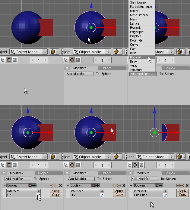
I agree with TedSchundler's old request above. To expand on it a bit, this sounds like a heavily used feature from a game level editor I've messed with in the past. It worked by allowing name data to be copied from an object in the 3D/camera view just by clicking on it with a dropper tool, similar to how many color pickers work in most image editors. This picker tool was usable for all name input fields.
This was a great time saver as it's not unusual to forget assigned names (especially in complex scenes) and the picker allowed an objects name info to be quickly copied over without having to change the selection.
On the right is a quick animated example I put together for one instance of how this tool could be used with Blender's modifier panel. The picker wouldn't have to be limited to the 3D View though, I think it would be beneficial to have it able to pull name data from objects in the Outliner and possibly other Window Types as well. --Brandished 07:31, 21 July 2009 (UTC)
IDEA: instead of adding a Modifier: A Shortcut or a single Boolean Button!
Example: CTRL+B -> Than pick what you want to pick.
They call me Tichy, dont know why. I call me Tichy too, still dont know why.
Another Idea: How about instead of a picker, just allow objects to be dragged from the outliner or the viewport into the input fields.
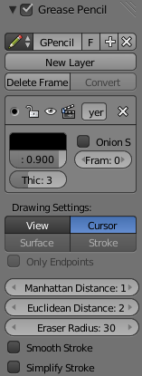
Move Grease pencil settings
It seems to me that the settings for grease pencil located in User Preferences > Editing might be more accessible if they are moved to the Properties region with the rest of the grease pencil settings:
Pixel Unit
As we have Blender/Metric/Imperial units systems, we could have a render size pixel relative unit system. The goal is to have a precise placement of elements inside a pre-defined space (render size). I think it would have to be relative to a defined orthographic view (let's say top ortho view), X and Y would be the render size and Z depth. Some sort of rectangle would define the view limit (light inside/dark outside as camera view) and Z can easily continue this rectangle in depth (maybe not so easily for viewport out of top view). Center could be defined as any corner or center of render size.
The real interesting thing is to be able to place any element (object/vertex/edge/face/selection) where the rendered pixel should be.
--User:Bithur 19 January 2014
new tool: Plane fill
Kinda like fill on a 2d paint program, except the ink is a face, it seeks to escape towards a certain point to the other side from between the two edges you have specified. It's intended to be a fast alternative to the CPU intensive Boolean modifier.
  Code ideas (hidden, you dont want to read it!):
  1. At least two edges are required to set the plane of fill, they must have a common plane (or within limits. And islands in the fill as well, otherwise the program will put some uneditable faces in!), a path must exist on the plane between the two edges, the normals of the faces beside the edges determine the normal of the new faces (and must face from each other on the path that exists between the edges). An alternative to beginning with edges is to create a face to be stretched (or to work from it's edges) or work using an existing face (without at least one attached face on its sides) in the desired plane.
  2. When the polygon it is working on meets itself it begins a new polygon at the edge that it couldnt contact with the previous polygon. If the function collides with an edge with an incorrect normal, the edge is highlighted and an error given.
  3. An additional problem that can occur is that it can come across two edges can intersect and of course you must work within the boundaries. A vertex must be placed and the two meshes that have the intersection must have new edges added towards the other verticies within view of the new vert and faces of the same direction added between, can optionally limit the new face edges to those within certain angles from perpendicular of the new vert (preferably so perpendicular is selected only - should the function be already performed on the opposite side - this is why you assume the old pattern of faces on the side does not matter). The faces are created should the user want to remove the external part/subtractor (the subtractor if not already assimilated, the user would only need to delete one edge or portion of a ring that is protruding out).
  4. If it contacts a face? It could calculate from the coordinates of the faces, which will run through the plane and then determine if they are within the specific area, and add two verts and one edge (dividing the face) per interception. Although this was dreamed up without the need to intercept a perpendicular face. Such code should aready exist somewhere.
  5. During the operation it will overwrite all teh faces in the same plane (and within reach) as the new face. for two reasons, if the user was just updating the face for changes in its shape and if the user has inverted the normals of a piece used to punch a hole (the normal inverted face against the function's plane can be removed).
  I hope these steps cover everything :)
  6. Because of the relativly few faces created, it is easy reapply the instruction and redo should the surface change (if the new object subdivides a face it will be removed, but the obect encompasses a face not it will not). (and not take 2.25 minutes as boolean did for me).
  7.Restrictions: Please note that i have never observed a ring polygon (or the like) in blender and therefore it may not exist. I have never observed a polygon having an edge against another one of its edges (but can have a single polygon between these edges
- One alternative to the existing boolean modifier is the BoolTool plugin (is 3D as well).
New Join function
I would have loved to add these as bugs to the original join function, however the devs act as though the only bug is between the keyboard and the chair. Perhaps the Join function as-is is how they intended it to be. So.... I propose a new join function with the "functions" in points 2 and 3 removed. (number 1 is merely to provide user a tip)
  1. If i have modifiers applied - of course a non-noob would expect it to break something if you have different modifiers for the parts (the joined part can only have the same modifiers) but it can still mess it up even if it is the same modifier with same settings. Having said that, it is a matter of pressing "apply" to the modifiers before the join. So i reccommend that happen automatically, save the user some clicking and confusion!  Example of using only one modifier with the same settings: Rotate a cube 45* around Z axis. move away from origin, apply a mirror with X+Y selected to produce four cubes, then duplicate and then change z angle to 0* and duplicate this one again twice more (if you want) and set z of these to ± 22.5 you now should have a ring 16 of diagonal cubes. Click join and the individual settings get changed and cubes appear to get removed - maybe you lose only two, but you can lose like six - I havnt determined what choses this, maybe it is the angles chosen, i started with 45,90,112.5 and i think 67.5.).
  2. Newbies are just told to make the program to recalculate the normals - but still something got changed as a result of a join. Choose duplicate, choose mirror, choose join. *or* choose duplicate, choose scale (scale to a opposite polarity scale), choose join. After Join, the normals invert on the pieces depending on which had the priority in the selection and if the others in selection have an even or odd count of negative scale figures (differing from the object with the priority). Make sure "backface culling" is checked to see this one. The problem will not occur if the second part gets mirrored twice (in two axis) or if one is mirrored and the other is scaled negative.
  3. Join on objects with links can cause a duplication elsewhere of objects not in selection. I am told it could be related to parts getting the same name beside the white triangle icon, this was caused by the "make links" command (sometimes they may or may not move to the same location after the make links command gets executed). An attempt of making the names different by rename causes the names of the others to change, no apparent fix other than re-duplicating+moving and sizing the parts without using links because i cannot remove the link with selected the parts, Neither can Join remove the link -- and when i finally did find the "unlink" menu item to click (in outliner, i expected to see it in the Make links submenu) i get "not implimented"  - ARRRHHH!!!
New Tool: Sever / lasso sever
Sever or lasso slicer (to work with wireframe on or off), creates faces and verticies on either side of the cross section(s) of the slice(s) and also selects the severed part. The selected severed part can be moved away, put into another layer or be seperated to be another object. Note that if lasso is used the lasso can intersect itself. Suggested with 3d printing in mind so i can slice and discriminately set (and click "apply") modifiers (i want to use solidify only upon certain parts, but not on parts where solidify will misbehave. The parts where solidify will misbehave i just want to keep solid), then join once more, then print. or allows more flexible use of the scale preperation method if you desire to do it that way.
Blender should demonstrate its tools/options
I suggest this is largely because there are sooo many tools in blender and this is suggested with noobs in mind, but it can also spark ideas.... As i go over the menus with my mouse, i would like my selection to underogo a demonstation of the function i have just hovered over/past. Admittidly, each of the functions might have to have demo settings which might be a little different from the defaults and perhaps you can make certain settings of the function change by themselves (causing a lively animated effect) to get the user's attention to demonstrate/introduce what the function does. The reason why i call it a noob function is that a noob does not know what the commands do (the capacity of the program), neither do they know their names. This will speed up the work of the noob. The demo for some functions might include adding an additional view, eg if in edit mode, a quarter of the screen shows what it does in object mode, etc. (NO GUESSING!!! No undoing!!!)
  eg if i hovered over inset (faces submenu), the faces i have selected whould demo what inset actually does. if i had no faces selected then i would get a polite message (in the tooltip?) that i need faces selected to see this, or alternately a new cube can pop up showing what the tool does to the cube face (which is required for high CPU inteseive commands like boolean which took 2mins in my model).
  eg if i were hovering over a setting to choose a colour (eg in user preferences), it would  (gradually) change colours: eg, move the dot in the colour circle as a ball bounces inside the colour circle or randomly move the R, G and B settings using the code used for the other control demos) and the corresponding setting would change on the screen so the user knows exactly what this setting applies that he is about to set
  In animation mode the demo might be difficult, requiring multiple views of each potential setting, perhaps it can skew/divide the one view, who knows - too hard basket?
Upgrade screw!
The screw modifier appears to be able to be modified for copying an object around a pivot point (same face faces the pivot). Can call it screw/multiply-around after completion. Mirror and array will now not be the only options for cloning.
- update: I have found two plugins, "circle array" and "follow path array" which are modifiers.
Macros
MS.Office style macros. A function to automatically write scripts and also introduces users to writing scripts. Speeds up work dramatically.
Shaping the Torus
When adding a torus, we should (to use the same terminology as with the sphere,) be able to specify segments and rings. This way i can create a torus with a flat top, bottom, inside and outside.
Above seven items (starting with plane fill) by --Charlieb 08:29, 12 August 2014 (UTC)
Snap levels
Snap seems to be able to detect if the conditions are met, but if it gets met more times it does not attempt to snap again. Occurs if the object to snap to is already submerged/submerging in another object, and i want to snap to another.
intuitive camera rotate
The program has a number of ways to set the orientation of the camera in the sidebar (euler, quaternion), however this omits the intuitive method of using the same standard for manipulating objects in the 3d view (i can still use the 3d manipulator and it behaves well, however i do note that all the figures in the transform bar change when i modify the X or Y rotation axis, with objects this does not happen). It would be good to also add zoom and roll text boxes. In addition, how about after i press Keypad0 to see the camera's view, i can use the normal 3d view commands to move it around (pan, rotate, roll and zoom) and press 0 again to escape. currently, these actions cause escaping.
- found plugin "look at it", seems to be an improvment on the existing method anyway.
Above two items (starting with snap levels) by --Charlieb 23:50, 12 August 2014 (UTC) Added plugin references to whole list Charlieb 06:42, 13 August 2014 (UTC)
User Preference Features
Edit Mode Wireframe toggle for Subsurfaces in 3D viewport
Ability to hide wireframe and vertices in the 3D viewport when working in Edit Mode on Subsurfaced meshes, when modeling the wire get in the way and don't allow the exact perception of the mesh shape.
At the moment the only (unconfortable) workaround is adding a realtime rendered 3D view.
Papalagi 23:08, 30 July 2014 (CEST)
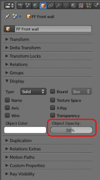
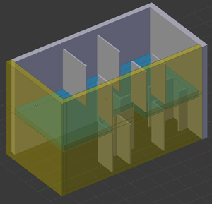
Object colour and transparency in 3D viewport
Ability to change the selected object's colour and opacity from the 'Object properties' display panel using the existing 'Object Color' control and additional 'Object Opacity' control.
This should be done without the need to create a material
--Mattb5906 03:00, 2 January 2012 (CET)
Different groups of objects have different colours
For example, my group of lambs should have yellow colour, while my group of mesh should have different colour. Currently in Blender all groups have same colour.
Save different user settings
User settings for 3D modelling are different from user settings for animation. I would like to have a feature that let me 'name' my settings before I Ctrl-U it, then I can choose what settings I want to use from Blender splash screen when Blender starts.
Change keys of axis locks
It would be nice to be able to change the key to lock the transforms axes... This would be useful for alternate keyboard layouts where the x, y and z keys are very far from each other (or from the left hand side of the keyboard) for example, a colemak user wants to rotate in Y axis, the R key in colemak is mapped to S so there is no issue, but when going to press Y, in colemak Y is mapped to O, so it is needed to move the hand through all the keyboard and press O, so you have to try to guess where is the O, and you may or may not succeed.., if you don't, you have to ctrl+z and try again... or you have to stop looking at the screen to look at the keyboard, loosing focus. Edit: This feature already exists, just it is a little hidden. Credits to hjaarnio for helping me find it. In Input Preferences, in the group 'transform modal map' at the bottom, you can add bindings for 'orientation Y axis' and 'orientation Y plane', the suggested bugfix now is to add them to the default key configuration map, so they can be easier to find in the future.
Outliner Features
Duplicated names of different objects in Outliner
For example, I want to name one of my lamp 'Face' to remember that it's near the face. But there's already a name 'Face' belonging to mesh 'Face'. Currently that mesh will be automatically named 'Face.001'. I hope I can use the same name for different types of objects, such as lamps and mesh.
Improve Outliner selection and with respect to display of multi-selected objects
The Outliner does not indicate by highlight/tint or any other indication that multiple objects are indeed selected. It only shows the last (active) object in a highlighted text. Improve intuitive workflow with the Outliner by displaying all selected objects names in medium highlight with reserve to the last selected active object being the brightest.
Furthermore, selection of objects within the Outliner would improve by traditional file section methodology: LMB-click on one object in the list selects (which Blender does), Shift-LMB-clicking on an object further down/up on the list selects all objects in between and including the first and last clicked object (Blender only adds second selected object to the first); Ctrl-LMB clicking on individual objects toggles selection in the queue (Shift-LMB clicking in Blender does this); Ctrl+Shift-LMB clicking adds all objects in between last previously selected and newly last selected object to the existing selection queue; etc.
Box selection of objects within the Outliner should physically toggle select all objects within the grab instead of further requiring to RMB-click on any of the selected objects in the Outliner and selecting the word "select" from the context pop-up window in order to actually select objects in the scene.
--User:Delysid25 28 Dec 2012
Tooltips are Wonderful, but Get in the Way
When selecting items in a menu, for instance, Tooltips hide the very items you are trying to select. Is there a way to suppress their being shown by, say, holding down a key. This would make menu selection more pleasant. --nspies 15 Feb 2013 -- this UI Proposal provides the functionality but the opposite way - press Alt to see tooltips. --sambler I'd suggest to put the tooltips in the place where the blender version is, well out of the way of people who dont read tooltips (and where it does not obstruct other items in the menu). Here it would only interfere with people who wanted to read the figures while blender is in a hang state after the user clicked on a tool. Charlieb 10:41, 12 August 2014 (UTC)
