「Dev:Ref/Proposals/UI/Tabbing Editor Side Panels for Better Organization」の版間の差分
(→Current Problem) |
細 (1版 をインポートしました) |
(相違点なし)
| |
2018年6月29日 (金) 06:05時点における最新版
Current Problem
The current T and N panels are overcrowded, making it difficult to find the options needed, also there is not room to add needed features like layer management, and an asset browser.
Loading and creating images and video clips in the current header pullup menu system is not very user friendly, due to very small thumbnails; this could be improved by an "in editor browser".
Solution
adding tabs to the side panel smakes switching modes quick and natural, solves organization problems, as well as making a viable space for new features and addons.
Addons could add their own tabs in either panel.
The system also makes room for other solutions like mode dependent tool shelves and asset management;
watch Video for full presentation:(9:30)
https://vimeo.com/79910953
The tabs on the Toolbar switch modes\display addons, and access the browser tab.
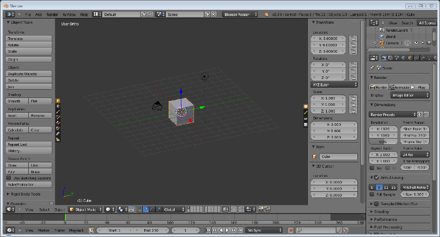
The tabs on the Properties panel display categories of poperties, reference tools, display options, layer management, and additional tools.
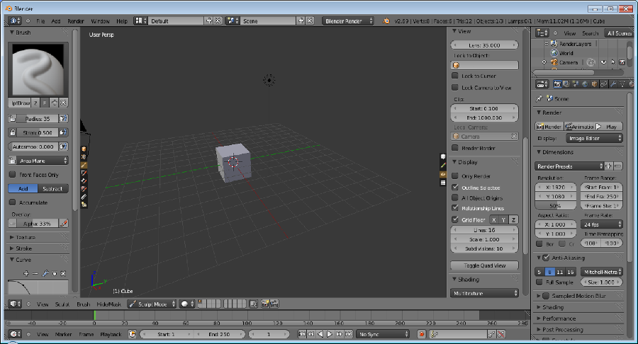
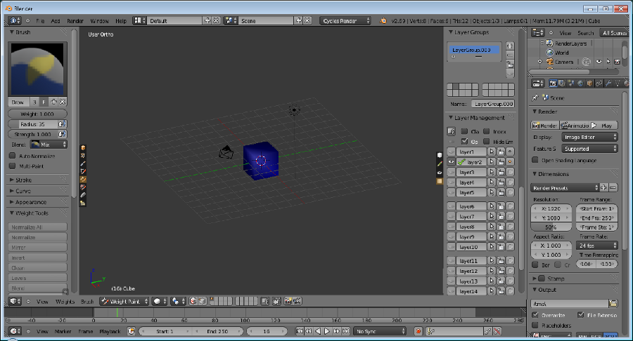
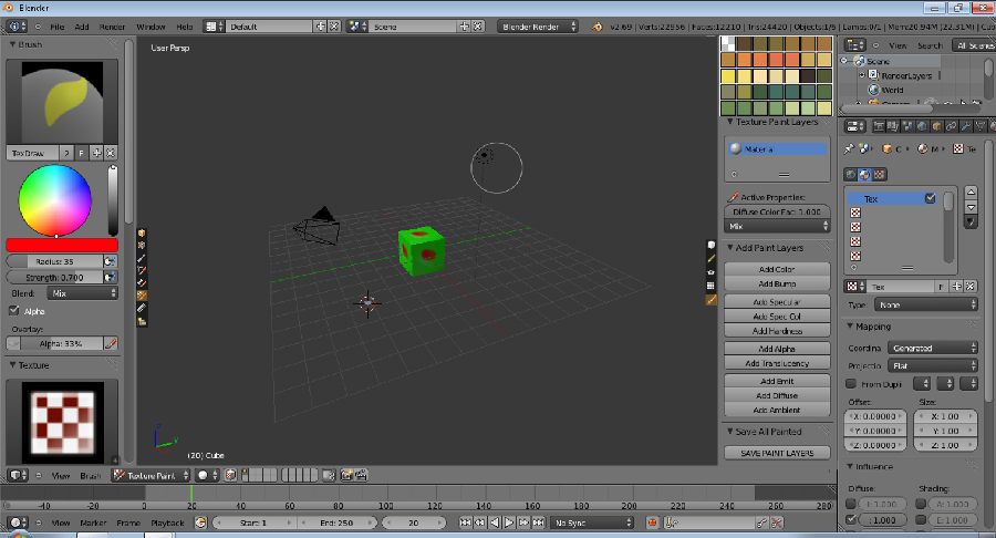
mode dependent shelves could be activated in the N panel; such as more paint tools when in paint mode.
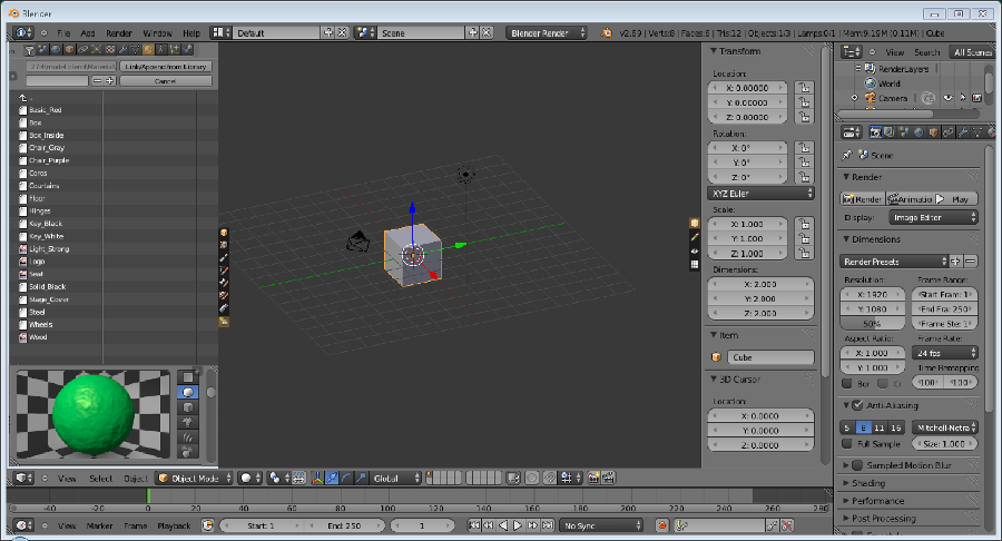
The browser tab would load a .blend file , and allow you to browse it with an outliner, or filter it using the filter bar, this makes appending any type of asset very quick and smooth.
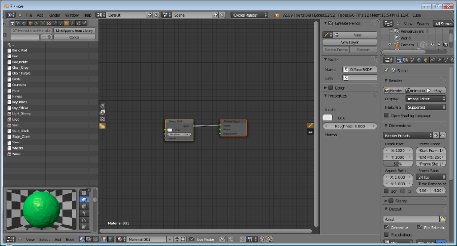
The proposed browser would be very handy in the node editor for assigning image textures, and importing node groups.
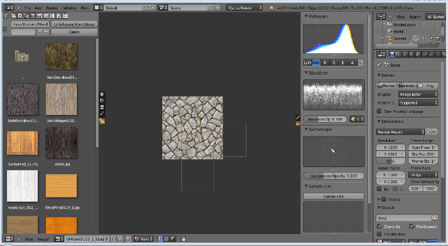
this browser in active mode(not shown) would display the images in the active project and allow you to create new images, in browse mode, it would allow you to browse your hard disk. this is great improvement over the menu popup system currently implemented.
The image properties in the UV editor could be moved to the right side panel for greater consistency, and better use of space.

bahlerb3(at)live.com