「Dev:Ref/Proposals/UI/Toolbar」の版間の差分
(→Tools as Popup) |
細 (1版 をインポートしました) |
(相違点なし)
| |
2018年6月29日 (金) 06:06時点における最新版
目次
Toolbar
by William Reynish
Outline
This goal of this document is to identify issues and solutions related to the toolbar in Blender
Current Issues
- Toolbar is only accessible in the 3D View
- The list of tools is missing many fundamental tools (e.g. Bevel)
- It is being abused by Add-Ons and panels such as 'Rigid Body Tools'
- It takes up a lot of screen space (which will only get worse if added to other editors)
Toolbar Placement
Here you can see multiple variations on toolbar placement in the UI:
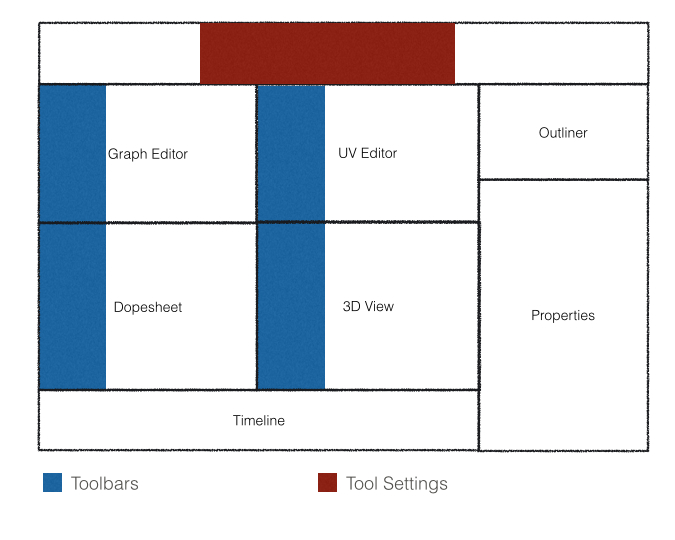
Toolbars in every editor
Add toolbars to all editors
Advantages:
- Makes tools available to all editors
Disadvantages:
- Takes up an enormous amount of space, leaving a smaller area left for user content
- Adds lots of visual clutter to each editor
- There's no good way to shove this into many 2D Editors (e.g. Graph Editor)
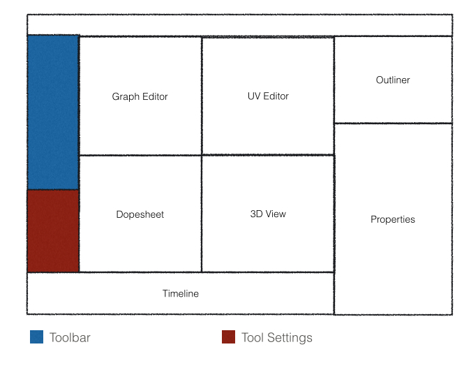
One Toolbar to Rule Them All
Advantages:
- Makes tools available to all editors
- Takes up less space
- Less clutter on the screen
Disadvantages:
- Isn't compatible with the multi-editor design of Blender
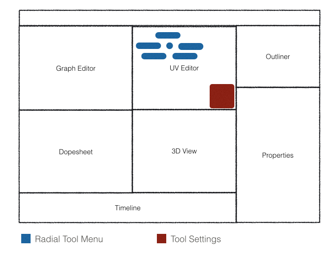
Tools as Popup
Press Space to get a radial menu with context-sensitive tools
Advantages:
- Takes up no screen space when not in use
- Works with all editors
- Can be more context sensitive
- Is compatible with Blender's multi-editor paradigm
Disadvantages:
- Isn't quite as discoverable
- Needs some nesting to get a large list of tools
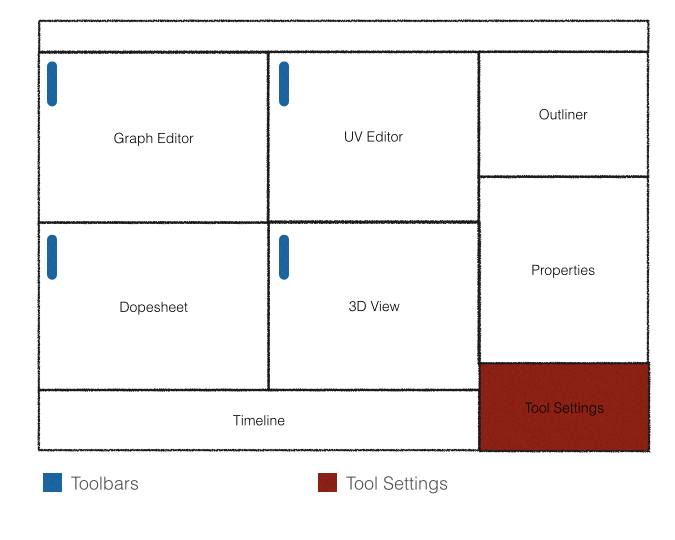
Mini 'favourites' icon list
A small list of common tools displayed in a compact manner for each editor
Advantages:
- Takes up little screen space
- No confusing deep hierarchies
- Could be user-customized
Disadvantages:
- Doesn't have space for that many tools
Evaluation
...


