「利用者:Julianeisel/ui-widgets」の版間の差分
(→Interface Widgets) |
細 (1版 をインポートしました) |
(相違点なし)
| |
2018年6月29日 (金) 06:14時点における最新版
目次
Interface Widgets
| Not used yet | |
| Most of the stuff described here is not valid yet. It's the result of some experimenting which is on hold now. |
Overview
Blender's interface widget code is kept quite separated from the other UI code. Main reason for this is to make later refactors or rewrites easier.
Also, in future it might be interesting to see if we can modularize the code even more so that they can be made a standalone library which can be reused in other applications (e.g. Blenderplayer, Cycles standalone).
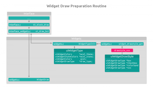
Communication with the other UI code happens via the widget API in interface_widgets.c
Draw-styles:
An important part in the widget code architecture is the support for draw-styles. The idea behind draw-styles is to provide an option for the user to tweak the visual widget style for his personal preference (more info here). For each draw-style, the widget drawing can be completely different. To support this properly, each draw-style has its own file (drawstyle_xxx.c) in which the drawing for each widget is defined.
Widget API
Widget API functions for external access
WidgetTypeInit
Description:
Initializes uiWidgetType based on the widget type.
Parameters:
| Parameter | Description |
|---|---|
| const uiWidgetTypeEnum type | Widget type to initialize |
Returns:
The initialized uiWidgetType.
WidgetDraw
Description:
Handles and triggers widget main draw routine.
- passing NULL for but disables calling custom draw callback and text callback,
- passing NULL for fstyle or str disables calling text callback
Parameters:
| Parameter | Description |
|---|---|
| uiWidgetType *wt | uiWidgetType initialized by WidgetTypeInit |
| uiBut *but | uiBut version of this widget (yep, this is bad, we should get rid of it) |
| rcti *rect | Rectangle to use for drawing |
| int state | Flags for the current state of the widget |
| int roundboxalign | Flags to set which corners will become rounded (e.g. UI_CNR_TOP_LEFT, UI_CNR_BOTTOM_RIGHT, UI_CNR_NONE, UI_CNR_ALL) |
| const int iconid | Index of the icon to draw |
| const char *str | String to use for text drawing |
| const bool use_text_blend | Enables transparency for text drawing |
Files
| File | Description |
|---|---|
| interface/interface_widgets.c | Place for transition between uiBut and uiWidget |
| interface/widgets/widgets.c | Widget API and internal functions |
| interface/widgets/widgets.h | Widget API and internal functions |
| interface/widgets/widgets_draw/drawstyle_xxx.c | Widget drawing functions for the given draw-style (XXX link to draw-style docs) |
| interface/widgets/widgets_draw/widgets_draw.c | Shared low-level widget drawing functions |
| interface/widgets/widgets_draw/widgets_draw_text.c | Shared low-level widget text drawing functions |
| interface/widgets/widgets_draw/widgets_draw_intern.h | Internal header for shared low-level widget drawing functions |
Widget types
Note: The below described drawing characteristics refer to the "Classic" draw-style. Since drawing can be completely different between draw-styles, there might be deviations.
| Type | Description | Image |
|---|---|---|
| UI_WTYPE_BOX | Container widget for combining other widgets to create a visual grouping | |
| UI_WTYPE_CHECKBOX | Widget for boolean options drawn with a checkbox and text | ファイル:Checkbox.png |
| UI_WTYPE_COLORBAND | Widget for creating custom color blends | |
| UI_WTYPE_EXEC | Button for executing operators | |
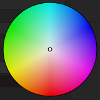
| UI_WTYPE_HSV_CIRCLE | Round color picker widget | 
|
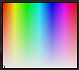
| UI_WTYPE_HSV_CUBE | Rectangular color picker widget | 
|
| UI_WTYPE_HSV_VERT | Vertical color picker widget | |
| UI_WTYPE_ICON | Similar to label widget, but drawn embossed if it's animated, driven, etc. | |
| UI_WTYPE_LABEL | Widget for displaying text and/or icon without handling | |
| UI_WTYPE_LINK | A bezier link line | 
|
| UI_WTYPE_LISTITEM | Item in an uiList | |
| UI_WTYPE_LISTSCROLL | Scrollbar widget for uiLists | |
| UI_WTYPE_MENU_BACK | Floating region background (menus, popups) | |
| UI_WTYPE_MENU_ICON_RADIO | Menu button with preview image/icon, drawing similar to radio buttons | |
| UI_WTYPE_MENU_ITEM | Item in an open menu | |
| UI_WTYPE_MENU_ITEM_PREVIEW | Item in an open menu with preview image/icon | |
| UI_WTYPE_MENU_ITEM_RADIAL | Pie menu item button | |
| UI_WTYPE_MENU_LABEL | Text item in an open menu without handling | |
| UI_WTYPE_MENU_NODE_LINK | Menu button with slightly different drawing to indicate that it's linked to a node | |
| UI_WTYPE_MENU_RADIO | Menu button, drawing similar to radio widgets | |
| UI_WTYPE_NAME | Widget for text editing | |
| UI_WTYPE_NUMBER | A button for displaying and tweaking numeric data | |
| UI_WTYPE_PROGRESSBAR | Widget for visualizing progress during rendering or baking | |
| UI_WTYPE_PULLDOWN | Button for opening pulldown menus | |
| UI_WTYPE_RADIO | A button that can be grouped with other radio buttons, activating one deactivates the others in the group (except if shift is held) | |
| UI_WTYPE_REGULAR | Fallback widget drawing, for testing, shouldn't be used apart from that | |
| UI_WTYPE_SCROLL_BACK | Outer scrollbar part | |
| UI_WTYPE_SCROLL_INNER | Draggable inner scrollbar part | |
| UI_WTYPE_SEPARATOR | Horizontal separator line in menus | |
| UI_WTYPE_SLIDER | Horizontal widget for dragging factor values | |
| UI_WTYPE_SWATCH | Color choose widget | |
| UI_WTYPE_TOOLTIP | Widget for tooltip background | |
| UI_WTYPE_UNITVEC | Widget for manipulating 3 dimensional vectors | |
| UI_WTYPE_TOGGLE | Widget similar to radio button, but using different drawing |
