「Dev:Ref/Outdated/Proposals/UI/Info Architecture/Design/Dependencies」の版間の差分
< Dev:Ref | Outdated | Proposals/UI | Info Architecture | Design
細 (moved Dev:Ref/Proposals/UI/Info Architecture/Design/Dependencies to Dev:Ref/Outdated/Proposals/UI/Info Architecture/Design/Dependencies) |
細 (1版 をインポートしました) |
(相違点なし)
| |
2018年6月29日 (金) 02:45時点における最新版
Dependency
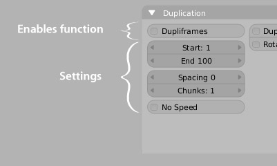
- To keep a clear, consistent and predictable operation, when the visibility/accessibility/use of UI controls depends on the state of other UI controls, the dependency should flow from top to bottom within a panel, and left to right within the buttons window in general (top to bottom for vertical panels). Controls that are dependent on each other should be kept as close together as possible, so it's obvious what dependent controls have changed.

For example, databrowse menus that change that data that those controls operate on, should be positioned to the top and left of their dependent controls. So in the Editing buttons, the databrowse menu should appear in the top left corner (as it currently is). An example of what ot to do is in the 2.34 Scene/Render buttons layout, where the Unified Renderer button (in the bottom right corner) causes the Gamma and Post-Process buttons to appear in a completely different location in the far-left panel.

-- JasonSaunders - 13 Dec 2004