「利用者:Lamoot」の版間の差分
細 (Robot: Changing template: K) |
細 (1版 をインポートしました) |
(相違点なし)
| |
2018年6月29日 (金) 03:36時点における最新版
Here I'll post various minor suggestions how to improve Blender's interface, especially point out some inconsistencies within it + a feature proposal or two.
目次
Normal Map Baking
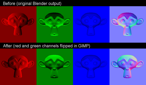
Blender's normal map baking tool is a welcome addition to a game artist's tool-set, however it lacks certain functionality that would make it more versatile and fit better in a production pipeline. The problem is, there is no direct control over how the red, green and blue channel represent the baked normals. In addition, the normal map baker's default output is different from other applications, such as xNormal and Maya. Both of these are widely used in the games industry and are already production proven (meaning the way they bake their normal maps is more commonly used and can be regarded as a standard). See this next example for a better idea of the problem I'm talking about:
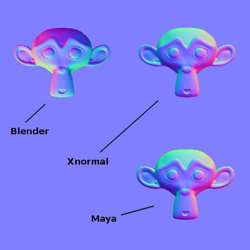
This issue isn't as critical, as the channels can be flipped in any more capable 2d application (GIMP, Phostoshop etc.). This extra step does, however, interfere with productivity, since an external application has to be used for something that could be easily done in Blender. In addition, users unaware of this issue could be confused why their normal maps don't work properly in other 3d engines.
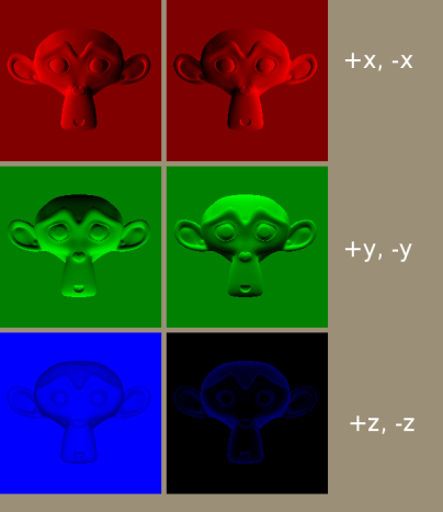
The way to fix this, is to give the user control over how the channels are baked. In xNormal you get to choose +x or -x, +y or -y, +z or -z, for the red, green and blue channel, respectively.
This would make the normal map baker more robust, as the output could be adapted, with minimal effort, to how the target engine works. Even if the target engine would use some less common way how the three channels represent the normals, Blender could fit in without problems.
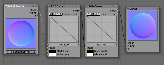
Temporary Workaround (thanks to PapaSmurf)
For those who want to flip their normal map channels in Blender, they can do so with this node setup. It's not ideal, but it works without the help of external applications.
When in one of the file browser windows, pressing P will get you to the parent folder. However, in the append window, when browsing in the .blend file itself, pressing P, will get you outside the .blend file. Such behavior is in contrast with P functioning as a command to take you only one level up and is an inconsistency in Blender's behavior.
I'm not sure exactly how the sub-sections (scene, texture, object etc.) of a .blend file are classified, but in the append window, these feel and behave as folders. This is why I believe they would be better being treated as folders, rather than some special sub-sections with their own special behavior.
Selecting files to append
There seem to be three ways to select and append something into your file, once you are in the append window.
- 1.) LMB
 clicking on the data-block and its name will appear in the name bracket, then click on the "load library" button and the data block will be appended.
 - 2.) MMB
 clicking on a data-block, for the fastest way and minimal input from the user to append a single data-block
 - 3.) RMB
 clicking on one or multiple data-blocks to highlight (select) them and click on the "load library" to append them. In the name bracket, there might be some other data-block name that we selected with the 1st method earlier, but it won't be loaded if other files are highlighted in the data-block list below. The problem is that the user is receiving two pieces of information and only one of them is correct.
Hopefully you can see the 1.) and 3.) methods overlap quite some of their functionality and could be merged for more consistency and elegance.
First we should pick either the LMB ![]() or RMB
or RMB ![]() as the selecting button. Picking one would exclude the other from having any effect in the frame of this particular situation. Then this mouse button would be used for selecting and highlighting the data-blocks. By holding ⇧ Shift and clicking, multiple data-blocks could be selected. In the name bracket, Blender would display the name of the last selection.
as the selecting button. Picking one would exclude the other from having any effect in the frame of this particular situation. Then this mouse button would be used for selecting and highlighting the data-blocks. By holding ⇧ Shift and clicking, multiple data-blocks could be selected. In the name bracket, Blender would display the name of the last selection.
This would leave us with a more robust selecting method for one or multiple data-blocks and a second method optimized for speed for quickly appending single data-blocks.
Modifier list getting crowded - WIP
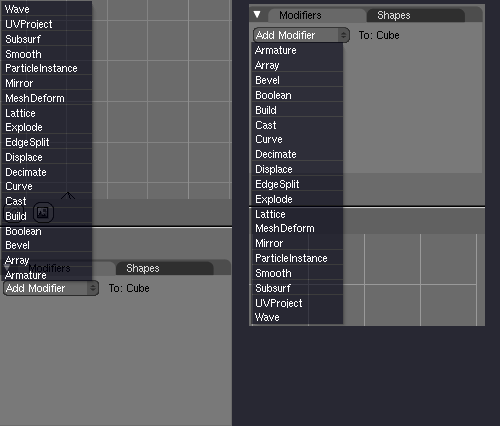
The modifier list is ever-expanding, with each new Blender release adding more new modifiers. The problem is the whole list is getting a bit crowded with its current 19 modifiers and this presents a problem with finding and selecting a desired modifier from the list. The situation can be expected to get more problematic with future Blender releases bringing even more modifiers (not that more modifiers are a bad thing per se :) ). At least 3 new modifiers can be expected to be added in the next official release (multires, shrinkwrap, simple deform).
Currently, the modifiers are ordered alphabeticly, which works to a certain extent, but there is already a problem even with this approach. The alphabetical order depends in which direction the list opens to. This gives the user 2 versions of the list, while there is no real reason why the alphabetical order should be flipped just like that. This only causes confusion and harder navigating when the alphabetical order is inverted.
Proposals from Polycount
- "Have the countdown to a tooltip to appear on hover be persistent when you move to another button, not have it start from 0 (see what I mean by cryptic? I mean that when you get a tooltip on something, moving to the button besides it makes the tooltip dissapear untill you've hovered over it for long enough again, rather than just showing the new tooltip immediately)"
- "-menu-entries load in the reverse order when they're accessed from the top than from the bottom. (this is just a niggle. I was considering starting a thread on blenderartists.org, 'perspective from a non-blender 3d artist' or something)"
- tweak mode moved from preferences to mesh tools, a key to toggle it? (T is still free in mesh edit mode in 2.49). Or hold a modifier key + LMB/RMB to enable tweak mode only while the modifier key is active (held, pressed).
- sticky keys: holding a key vs. pressing a keys.
