Dev:Ref/Proposals/UI/Tools Workflow
目次
Tools Workflow
by William Reynish
Outline
One of the main Ui hurdles in Blender revolves around the tools system. This goal of this document is to identify the problems and present a unified solution.
Current Issues
- Modal toolbar items (Such as Grab, Rotate, Scale) immediately execute from the current cursor position, rendering them almost useless when accessed from the toolbar or menu
- Operator 'redo'-panel (Tool Settings) is for tools in all areas of Blender, but is only accessible in the 3D View, and only inside the toolbar (invisible when toolbar is closed)
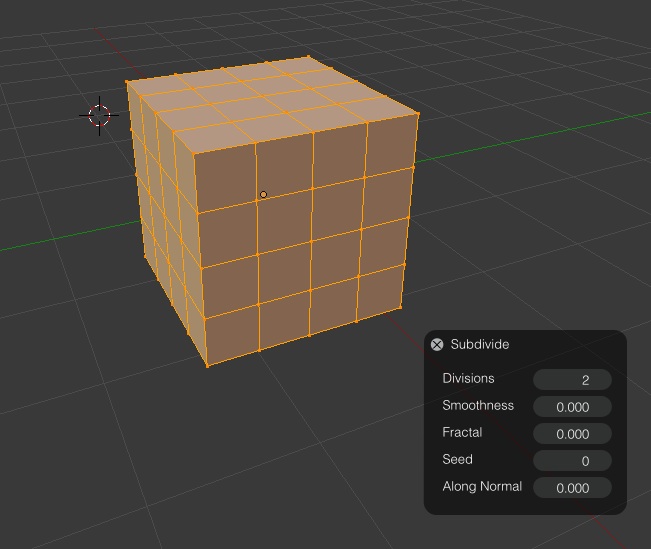
- Some tools are non-modal (Subdivide, Spin, Poke), yet others are modal (Transform, Knife Cut, Loop Cut etc)
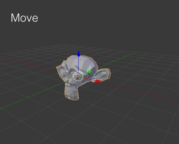
- 3D manipulators are disconnected from their tools. The manipulators for Translate, Rotate, Scale are not associated with the Grab, Rotate and Scale tools, and there are only manipulators available for these three tools.
- Toolbar is only available in the 3D View, although there are many tools in other areas of Blender.
Accessing Modal Tools from Toolbar
Why Hotkeys Are Not Enough
Blender was created with a hotkey-driven tool-system in mind. That was fine when it was an internal tool, and when there were only very few tools available, but today Blender has a huge list of tools. There aren't enough keys on the keyboard to fit all the tools into it in a convenient way, and it presents a huge burden on the user to remember hundreds of keystrokes. This is why we have the toolbar.
The Problem With Modal Operators in the Toolbar
When the toolbar was added, many of these hotkey-oriented tools were put into the toolbar, so that you could easily find them and use them. The problem is that as you enable a modal tool such as Extrude, it will extrude it from the current cursor position, which then happens to be over the toolbar. As the toolbar is located to the left of the screen, it becomes almost impossible to perform certain extrusions, because the cursor will simply stop at the left edge of the screen. The same issue is true for all the modal operators such as Grab, Rotate, Scale, Edge Slide etc.
Conflict
This presents a conflict. The two paradigms don't fit. If modal tools are enabled immediately from the cursor position relative to the selected item, they don't work with the concept of having a toolbar somewhere on the screen. So, what can we do?
Possible Solutions
- Don't have any modal operators in the toolbar (No Grab, Rotate, Scale, Extrude, Edge Slide, Shrink/Fatten etc)
- This is a poor solution as many of these tools are essential to using Blender, and not having them in the toolbar makes the toolbar somewhat useless
- Reset the cursor position when enabling a tool
- Poor solution, because the user will be confused as the cursor moves around without his/her consent. It is considered bad practice for apps for set cursor positions, and it's inherently incompatible with Wacom tablets, where cursor placement is absolute
- Modal tools should not react immediately to cursor movement, but rather wait until the user clicks and drags inside the 3D View.
- Adds an extra click for modal tools, but that could only be when enabled from the toolbar or a menu.
Proposed Solution
Here's an overview of the proposed solution:
1: User clicks tool
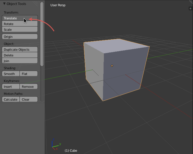 http://wiki.blender.org/uploads/2/2b/Tool_workflow_1.jpg
2: Manipulators appear. User drags these manipulators, or numerically enters values
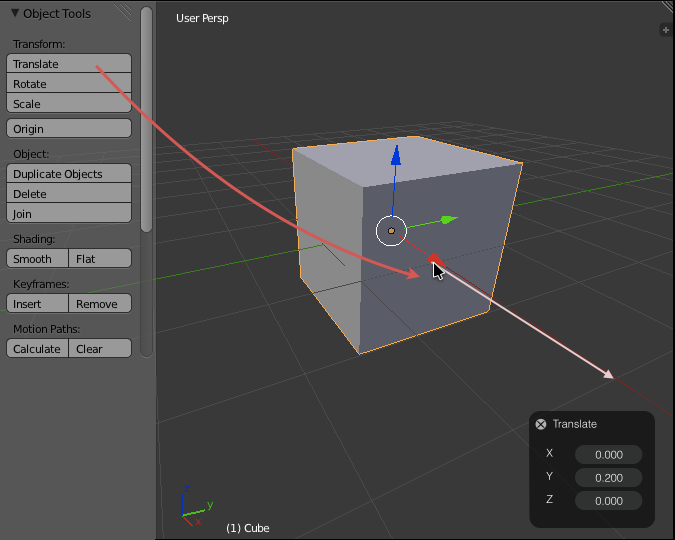 http://wiki.blender.org/uploads/9/96/Tool_workflow_2.jpg
Click here to see the animated version:
http://wiki.blender.org/uploads/f/f8/Modal_Tool_Workflow.gif
Advantages of This Solution
- Makes modal operators work when enabled from the toolbar or from a menu
- Unifies manipulators and tools, and enables manipulators for more than just Grab, Rotate and Scale
- Doesn't block user input while tool is active
- Allows for tweaking a transform both with freehand movement and numerical input
Tool Settings
When tool settings (Operator 'redo') were added in Blender 2.5, it enabled improved workflow where users can change settings and see the result immediately. Compared to entering settings before executing tools, it's faster and easier, because there's no guesswork involved.
However, there are currently some issues with the tool settings:
- Tool Settings react globally to any tool in any area of Blender, but they are only available from the 3D View. This is confusing, and limiting when the 3D View is hidden.
- The Redo-panel is very hard to distinguish visually from other panels in the toolbar. It looks like part of the tool list. This makes it hard to find.
- The Redo panel has a collapse arrow, but it doesn’t work as expected. Rather than collapsing the redo panel, it collapses an invisible panel *inside* the redo panel.
Possible Solutions
- Put redo panels into all the editors
- Would work, but clutter up space in all editors. Then you'd need to have the toolbar open in all the editors
- Move the redo panel into its own separate editor
- Better solution, but what if that view is not available? Say you are working in maximised view? And, it would steal space in the UI even when not applicable
- Make redo panel a floating panel that sticks to the view
- It would only appear after a tool en enabled. Is non-modal, and can be closed any time. And is visible even when toolbar is closed
Proposed Solution
Advantages of This Solution
- Tool Settings are visible even if the toolbar is closed
- It's consolidated into it's own floating window, so it can accept tools settings from all editors
- It's only visible when a tool is active
- It's non-blocking, and can be closed at any time
Manipulators & Tools
Manipulators in Blender can be used as a way to visually manipulate tools in Blender. this is very nice, but manipulators have these issues:
- There are only manipulators for Move, Rotate, Scale. The rest of the tools have no way to visually interact with them
- Manipulators are separated from their tools, leading to unneeded duplication in the UI. Users have to choose to Rotate via rotate *tool* or *rotate manipulator*
- They get in the way, because they are visible even when the tool is not active.
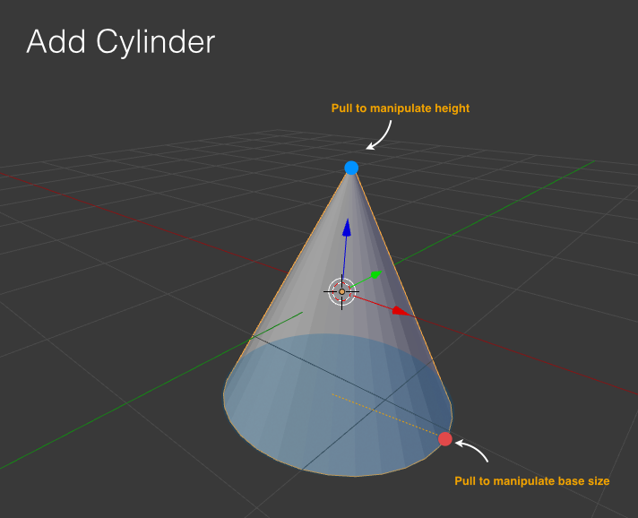
Some tools are very difficult to use without manipulators. For example:
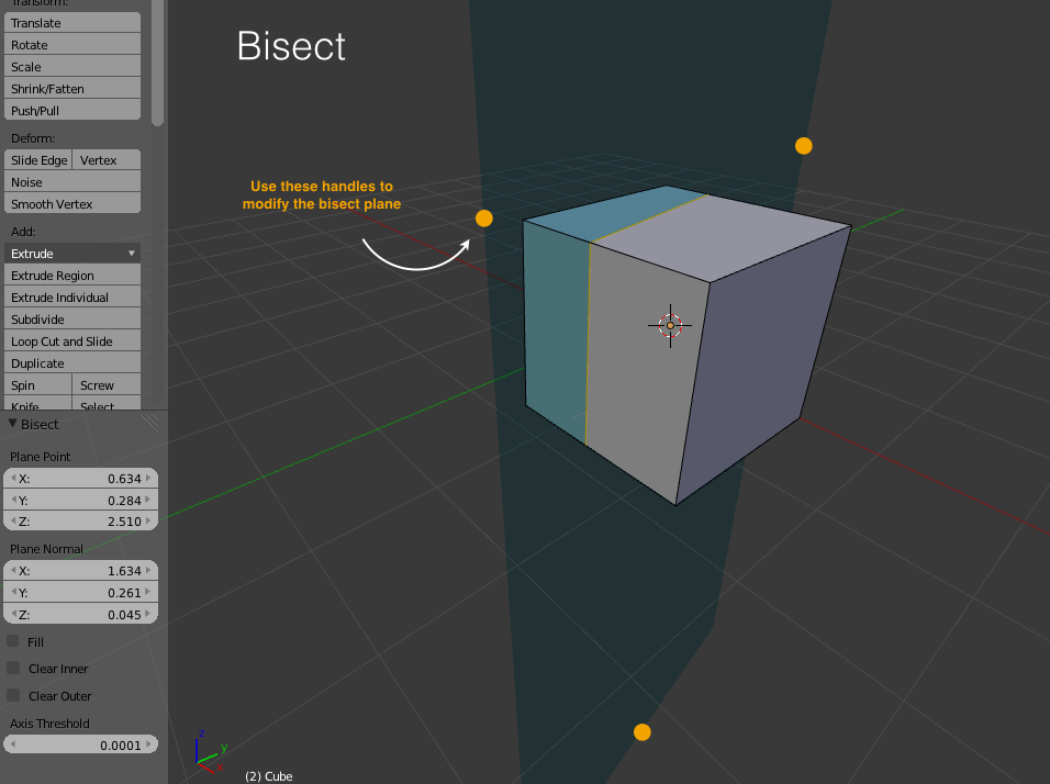
- Bisect (hard to see the plane. And very difficult to manipulate it via numerics)
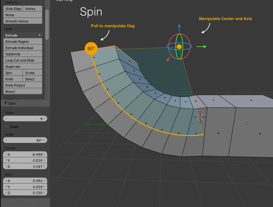
- Spin (impossible to see the centre point and difficult to work out the numeric rotation axis)
- Add Object (Setting location and scale via numerics is hard. You end up using scale tool instead, losing the ability to tweak vertices)
Proposed solution: Unify Tools with manipulators.
Advantages
- We can add visual manipulators for any tool
- Cleans up the UI and remove duplication of Move, Rotate, Scale in header & toolbar
- Manipulators don't get in the way as much because they will only be visible when the tool is active
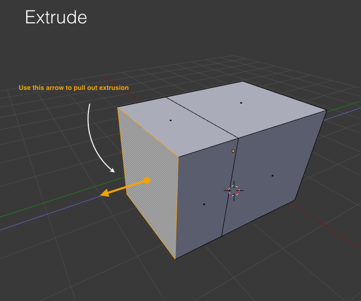
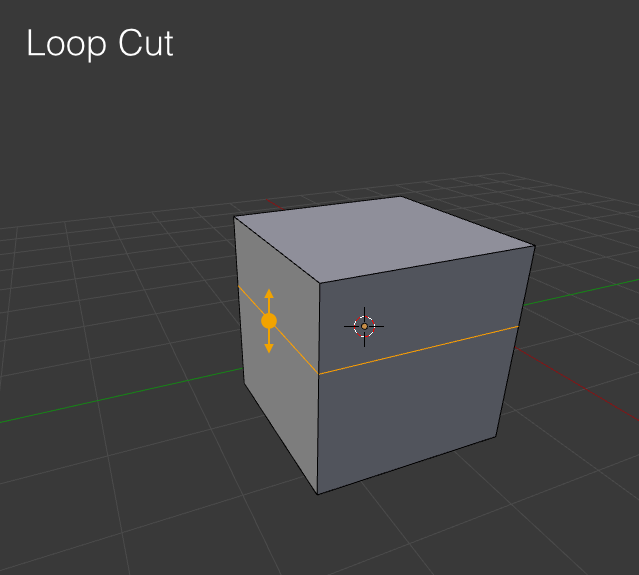
Here are some examples of tools with manipulators. Notice esp how tools like Bisect, Spin etc are now possible to understand and manipulate directly and visually.
Toolbar & Other Editors
A major limitation of the current toolbar is that it lives exclusively inside the 3D View. Blender has other editors that rely heavily on a list of tools, such as the UV Editor, and even areas such as the F-Curve Editor uses a list of tools.
There are a few ways to tackle this:
- Put toolbars in all editors.
- Easy to do, but takes up a lot of space
- Make a single, unified and context sensitive toolbar
- more efficient use of space and screen position, but clashes with the concept of cursor-sensitive active areas of Blender
Proposal 2
by PLyczkowski
Tool vs Operation
This is my understanding of these two separate concepts:
An Operation is an operator that runs once, is completed, and the user is presented with settings in the Redo Panel. Ex. - Subdivide.
A Tool is a mode that allows the user to make multiple changes to an object, and can be closed when the user is done. Ex. - the Knife tool.
Changing the cursor is the main indication to the user that he is in a tool mode, along with the tool name in the Redo Panel.
An Operation is much faster to use, because of it's non-modality, unless a string of actions is required - then a Tool performs better. Also, Operations that require user interaction (mouse movement) work bad when invoked from the toolbar - ex. Move, Rotate, Scale.
The modality of a Tool allows it to spawn manipulators in the 3d View. Examples of where such manipulators would be useful are Bisect and Spin operators.
I would see no problems in providing both functionalities for certain operators.
The Tool functionality would be the one put in the toolbar, while the Operation functionality would be chosen as the one invoked with a shortcut, but the user would be able to customize his shortcuts as to invoke the Tool with a shortcut, if he so preferred.
Move/Rotate/Scale - Tool version
Clicking on the Move button would activate the Move Tool and change the mouse cursor to something like this:
Then, clicking on an object would select that object, if it wasn’t previously selected, and start a move operation (tweak mode). In Edit mode, if something was selected, clicking and dragging would move the existing selection (it would move the selected elements). If nothing was selected, it would move clicked-and-dragged elements (tweak mode).
Right click to close the tool.
Similar Rotate and Scale.
Extrude - Tool version
Clicking on the Move button would activate the Move Tool and change the mouse cursor to something depicting extrusion.
Clicking and dragging on elements selected before the tool was activated extrudes selection, after extruding selection stays, tool does not close, user can extrude the same selection again. If clicking and dragging on an unselected element (single face/edge/vertex), this element is extruded, selection stays the same. User can constrain extruded element's movement mid-drag by using the X Y Z keys.
The tool would dependent on the selection mode chosen.
Right click to close the tool.
The Redo Panel
Currently Tool setting are displayed in the header and accessed awkwardly by using shortcuts specified there.
Moving the Tool settings to the same place as the Operation setting - currently it is the Redo Panel - would give the program more consistency, and would allow to avoid this awkward solution.
