Dev:Ref/Proposals/UI/Tab-Interface
目次
UI Proposal: Tabbed Interface For Editor Regions
Status Quo
One of the large problems with Blender's current interface is a lack of space. We simply don't have places to put everything in a nice, orderly way that also makes sense to users. This is a problem in many areas, but it is particularly prevalent with the 3D View Toolbar. Even with no addons enabled the toolbar is overtly large. With just a few addons enabled (that use the toolbar) it's really bad. With a lot of addons it's simply asinine.
Beyond that we also have a variety of different styles within within the interface, such as different styles of tabs that all provide the same basic functionality.
These are all issues we should work to resolve, while also constantly working to keep the UI simple, effectively, and customizable to user's specific needs.
Problem 1: Toolbar Organization
The toolbar (in all editors, but predominantly the 3D View) suffers from poor organization and many missing tools. There's not enough space to put everything, and so as new tools have been created they generally have not been added to the toolbar.
Problem 2: Addons in Toolbar/Properties Cause Lots of Scrolling
Anytime a user has more than a few addons enabled, that place panels in the toolbar/property regions of an editor, that region quickly becomes much too long and forces the user to constantly scroll to find the necessary tool/option. The alternative to scrolling is to constantly open and close panels, but this causes problems of it's own, as then tool/option positions keep changing. Forcing the user to relearn it's location every time they use it. This prevents muscle memory building and inevitably prevents the user from working as efficiently as they could.
Problem 3: Blender Users Multiple Tab Styles
Blender already has tab-like functionality in several places, most of which are not consistent with one another. Nor are they made clear to be tabs. These areas include: the properties editor, user preferences, and then within user preferences are the themes and addons.
Proposal
My proposal to fix these problems is to introduce a tabbed interface to two new areas of the interface and to improve the design of "tabs" in other areas of Blender.
Affected Areas
- Info bar
- Properties editor
- Editor Toolbars and Property regions (3D View, Movie Clip Editor, UV/Image Editor, etc)
- User Preferences
Info Bar Tabs for Screen Layouts
The [current screen layout] system works, but it's not very clear to the user how it works. I propose we move this to a tabbed system along the top of the info bar. These tabs are nothing more than layout presets. The user then has the ability to modify, add, or remove their own presets in order to configure their workspaces however they like.
This design uses more space than the current version, but it also more clearly describes the function to the user.
Properties Editor
The Properties Editor currently uses tab-like radio buttons to switch through the available regions, this is confusing. Most other places in Blender, radio buttons are used to define a sample of multiple choice options, with only one choice allowed. However, in the Properties Editor these radio buttons are used to cycle through different regions, which are mostly independent of one another.
To solve this confusion and lack of consistency, the top radio buttons can be tweaked slightly to present a more tab-like interface. This small change would introduce more consistency and make it clear that the regions are tabbed.
This change requires two main things:
- Remove rounding on bottom edge of buttons
- Add separator line between the tabs and the rest of the region, which inherits the active tab color.
Toolbar/Properties Region Tabs
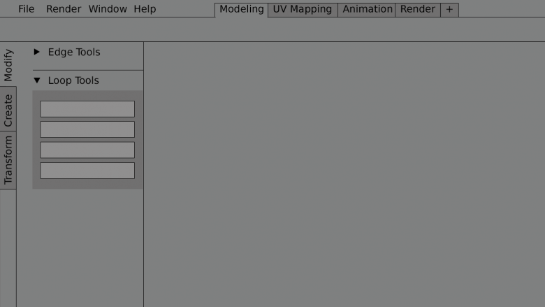
In order to improve organization and length of the toolbar I suggest we implement vertical tabs. These tabs allow much more logical sorting of tools. Each tab can show any number of tools and panels, but the point is they're orderly and only shows what needs to be shown. For example, if actively working on meshes in Edit Mode, then you might show the Modify tab.
Vertical tabs have been chosen because they work well within the space available. For specific points, see the Questions below. The end goal, and hope, though, would be to support both vertical and horizontal tabs. The user ought to be able to choose which style they prefer, simply by dragging and dropping the tab region into place.
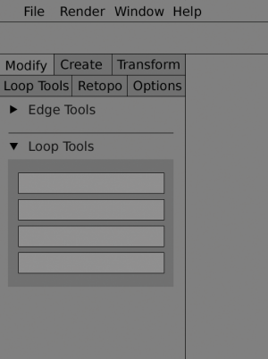
To give an idea of future possibilities for horizontal tabs, here is one option:
User Preferences
The same issue that exists with the Property Editor is also present in the User Preferences. The top radio buttons, used to change regions, are not clearly indicated to be tabs. By taking the same design as proposed for the Property Editor we can also improve the visual communication of the tabs here.
Addons
The addons region of the User Preferences is quite confusing, as it presents two sets of radio buttons. Both of these sets use identical designs, and yet provide totally different functions. The first function is to switch between Addons and other areas of the User Preferences, via the horizontally aligned buttons. The second function is to filter through categories (and sub categories) of addons. The only difference between these sets of radio buttons is one is horizontally aligned, and one is vertically aligned (with horizontal type).
The vertical radio buttons for changing categories are not much of an issue. The issue is using the same style of button for both the addon categories and for the user preferences tabs.
Themes
The issue here is the same as for [[#addons|addons]. Both of these are solved mostly by implementing the design shown shown above
Implementation
The development of these tab features and updates can become quite extensive. To help facilitate this it's likely best to break it into more easily attainable sections and work on one area at a time.
Development Rollout
In order to develop these tabs in a way that allows adequate testing, updating, etc, I suggest rolling out these changes one part at a time. Each of these items are pending developer involvement of course.
Toolbar/Property Region Tabs --D75- Custom Tab Support
- Icon Support for all Tabs
- Updated Property Editor tabs design
- Updated User Preferences tab design
- Updated Theme/Addon preferences tab design
- Info Bar Tabs for Screen Layouts
Pros and Cons
Pros:
- More organized, making tools easier to find
- Better placement and configuration for addons
- Takes up less space
- Clear indication to user how to use the UI
- Only show tools actively being used
Cons:
- Possible to run out of tab space (but should be plenty of room for default configuration and a few additional tabs)
- Fewer tools visible at one time
- Can force user to click over to different tabs for different tasks
Questions and Concerns
Why are tabs vertical instead of horizontal? Vertical text is difficult to read.
When implementing tabs we must consider where the tabs are being placed and what regions they're affecting. In the case of toolbars and properties regions, these are strictly vertically distributed regions with a much greater height than width. Due to the nature of working on widescreen monitors, these regions have been designed to sit along the side of the editor, using minimal horizontal space. This gives far more more to the user to work, but it also limits the horizontal space available for features like tabs.
Thus the vertical orientation of tabs works better for these regions. Vertically aligning the tabs makes more efficient use of space.
Regarding vertical readability, here's my suggestion for a simple solution of that problem User:Damirprebeg
Why not use marque text? Or why not rotate text 180 so that it reads from top to bottom?
Multiple studies have shown marque text to be much slower to read than either horizontal or rotated text. Horizontal text is the fastest to read, and thus the easiest to recognize, but due to the vertical nature of toolbar/properties regions the |rotated text is more ideal. As to the direction of the text rotation, it's largely personal preference. According to this study study there is very little difference is readability between left and |right rotated text.
Thus, to support rapid word recognition in situations such a labeling, horizontal text should be preferred where possible. However, when space constraints dictate that text be presented vertically, rotated text should be preferred to marquee text. - Michael D. Byrne, Rice University: http://chil.rice.edu/research/pdf/byrne2002hfes.pdf
Are tabs restricted to the toolbar or will they be added to other editors and regions?
The vertical tabs are being designed to be beneficial in all applicable editors (those with toolbar/property regions). They will be added to those areas that need them. Once the vertical tabs are fully implemented the hope and plan is to move forward with more unification of other tab-like areas of Blender.
How do the vertical tabs work with existing tabs in Blender? User Preferences, addon categories, Properties editor.
Once the vertical tabs are finalized the goal is to address the other, existing tabs, to make them more consistently styled. This includes making the Property Editor icon-tabs look more like tabs (mockup)
How can tabs organize tools well without causing user to switch tabs constantly?
Tab organization is to be task-based, such that most the tools a user needs during a specific task are grouped together. For example, Animation tools are grouped into a tab, allowing animators to stay within that tab during most animation tasks. We will work to minimize tab switching as much as possible through carefully thought-out organization. A user ought to be able to work continuously for periods of time without constantly switching tabs.
Tabs are more UI clutter, isn't "less" UI better UI?
Tabs both add and remove UI elements. They add a new clickable element to the UI (which can be seen as clutter) but when combined with smart organization they also greatly reduce the number of different elements on screen at one time. For example, rather than constantly displaying all mesh, animation, grease pencil, and curve tools, the UI only displays the tools associated with the selected tab.
In most cases tabs also remove the need for a scrollbar, thus reducing UI clutter as well.
How do tabs work with the existing panels? Will we no longer use panels?
Panels still work and will still be used. It becomes a hierarchy. Tabs are the top-level organization for regions, while panels are the mid-level organizer. For example, within the Animation tab you might have panels for keyframe tools, motion paths, and action/pose tools.
Using panels within tabs allows another level of organization and usability for artists, giving artists the ability to only show what is needed at the moment. Panels also help reduce vertical scrolling even further (as they have always done).
What happens when there's too many tabs and the text is not longer readable due to shortening?
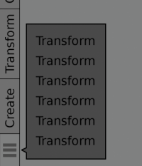
Currently tab text is shortened. In some cases this can lead to poor readability. This is where icon support comes in. See below.
What if scrolling is needed due to too many tabs?
If too many tabs are present, there there's a few options. The first option is to adopt the sliding feature that's currently present in the Property Editor, where you can slide the icons to the left and right. In this case it would be up and down.
The second option is to push extra tabs into a collapsed menu, similar to how many web browsers handle excessive bookmarks.
What about icon support in tabs?
Icon support for tabs is a much requested feature and something that is to be addressed. Icons can provide better readability and also allows for more condense tabs, even removing labels entirely in some cases.
What about custom tabs for more user control?
It is widely acknowledged that users want the ability to customize tabs. Options are being examined and considered. Custom tabs, including hiding and showing only the desired tabs, are on the short list.


