利用者:Erwin94/Keying
Color Keying
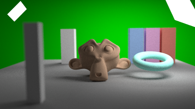
This page tries do give a brief introduction to color keying using the G-R/B difference process. The scene, that was used in the examples, can be downloaded here: ファイル:Keying intro.blend.
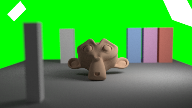
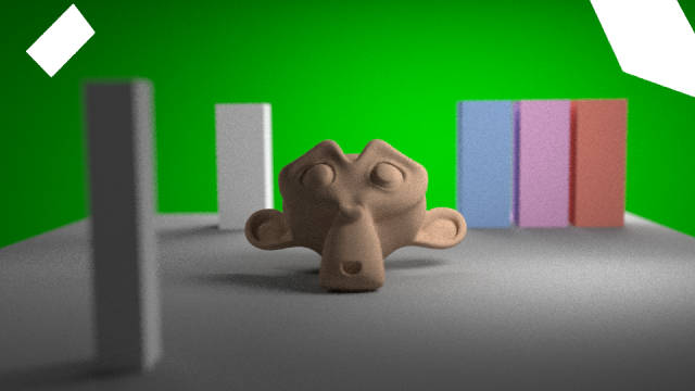
Let's start with a simple test case, a perfect greenscreen (i.e. exactly 0,255,0). For the rest of this page we will assume a green key color, everything works exactly the same for blue though.
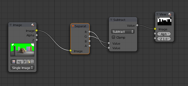
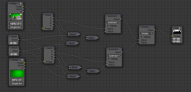
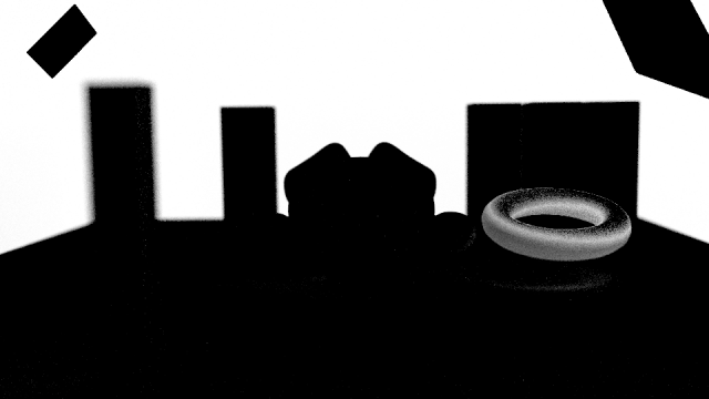
The basic idea of difference keying is, that we want to use the fact that the green channel is larger than the red or blue channel for green colors. Therefore let's try subtracting the red channel from the green channel:
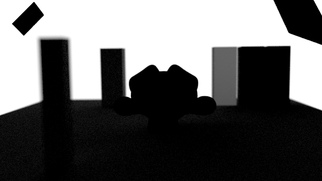
This results in this image:
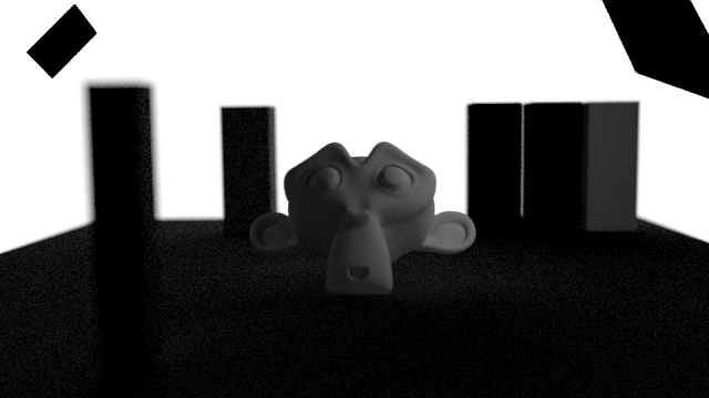
For the blue channel we get something slightly different. Some areas are better, while others are worse:
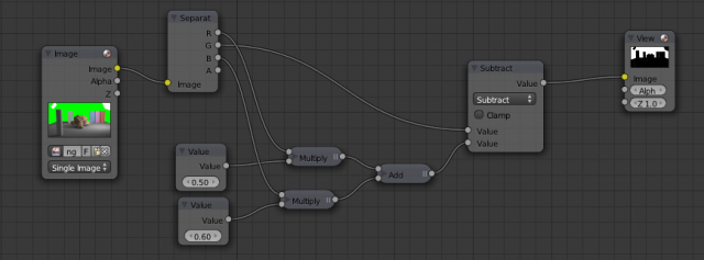
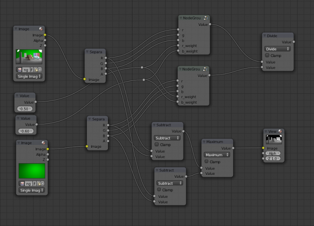
To get the best of both results, we can mix the red and blue channel together before subtracting:
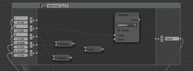
Note that we have introduced two factors for the mixing. These will be configurable parameters for the keying operation and will have to be set depending on the input image. For example, lowering the red mix factor will help make the edges of red foreground objects better if they are too hard.
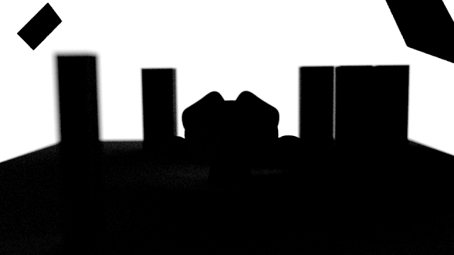
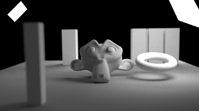
For our case 0.5/0.6 seems like a good compromise and results in the following image:
This already looks like a pretty decent key, so let's make it a bit harder (and more realistic) by introducing a non-uniform green background:
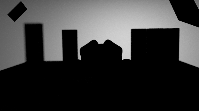
Simply testing this with our keyer results in the following:
Note that we still have a clean separation between foreground and background, but our background has become very uneven and it won't be easy to use this key as it is now.
Here we are going to cheat a little bit and assume you had the foresight while shooting your greenscreen footage to also get a clean plate of the greenscreen without any foreground objects infront of it. For a lot of real world examples you won't have this and there are ways to recreate it, but we won't cover those here. The composite nodes "Keying Screen" and "Inpaint" will help a lot in those cases.
This is what it looks like for our scene:
So how does this help us? Let's try running it through our keyer:
Ah, so in the background areas this leads to exactly the same gradient as our key with foreground objects.
We want those areas to be solid white again though, so let's divide the two keys:
Now our key looks good again:
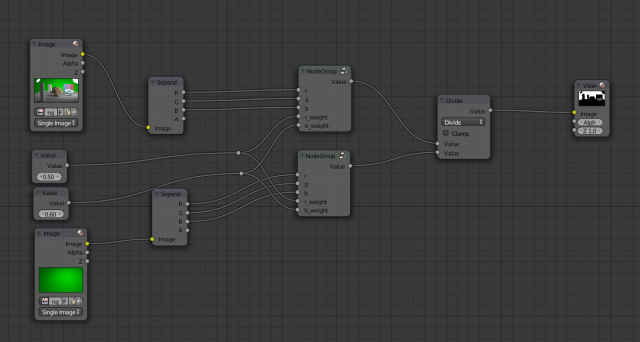
Since we are repeating ourselves a bit here, we clean the tree a little bit by creating a nodegroup:
Our keyer now looks like this:
So, let's try making it more difficult again. This time we add an object to the foreground that is closer to the key color, but should not be transparent.
This results in the following key:
Here, things start to get a little fuzzy. There are different ways to improve the key further, our choice here is mostly for its simplicity and because it is still rather general.
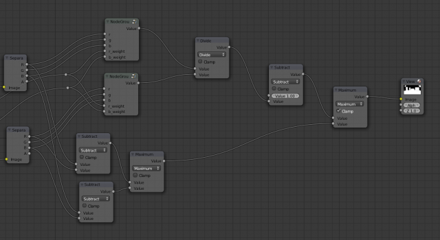
Since we now have a reference for the screen color, we know that any difference from it is likely to be due to a foreground object. We can simply subtract the screen red and blue channels from the corresponding image channels. This gives us a luminance key, i.e. everything with brighter red or blue than the screen red or blue will become opaque. We use the maximum of both differences to merge the keys:
This part of the key looks like this:
To merge this with our real key, we first invert our previous key, because we had a key value of 1 for the background before, while we want alpha to be 1 for the foreground instead.
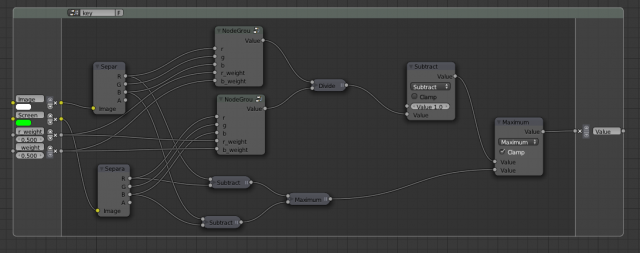
Cleaning up our node tree again, we create a group from all nodes.
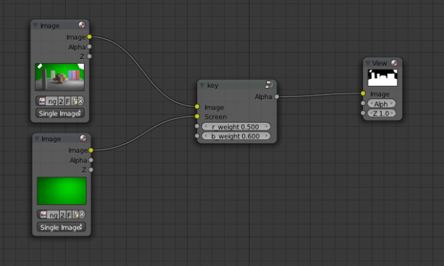
This leads to a nice reusable keying node.
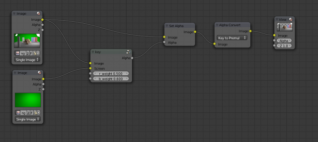
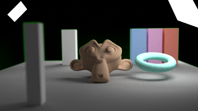
So how is this newly calculated alpha channel used? We can try simply setting the alpha of our image and converting it to a premultiplied image (which is what the compositor should output).
This results in green fringes though:
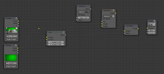
To understand what we have to do instead, we can take a look at how an image with alpha is composited over another image. If A is our (premultiplied) foreground color, B is our background then the composited output color C is: C = A + (1-alpha) * B. In this equation we already know C, alpha and B for the composite of our foreground over the greenscreen background. So we can calculate A = C - (1-alpha) * B:
This leads to the following result:
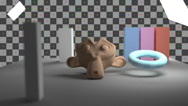
Composited over a different background it looks like this:
This already looks pretty good, but this is only the start of a good key for real world footage. Usually you will need a garbage mask to define which areas are always going to be transparent and a core matte to define areas that should be opaque. But this difference key works exceptionally well on edges, if set to the right red and blue weights. Sometimes different edges in an image need different weights, then the method should be to have two or more of these keyers and merge the results based on a selection mask (sometimes a hue key works well as a selection, sometimes a painted mask is easier).
Happy keying!
