利用者:Jeske/CleanerUIIdeas
< 利用者:Jeske
2013年7月2日 (火) 05:01時点におけるwiki>Jeskeによる版 (Created page with "== Cleaner UI Ideas == The purpose of this page is to collect mockups and ideas which can help make blender's UI cleaner and more pleasing, while still keeping elements and tool...")
Cleaner UI Ideas
The purpose of this page is to collect mockups and ideas which can help make blender's UI cleaner and more pleasing, while still keeping elements and tools easy to find. Some general thoughts before mockup links:
- reduce control contrast
- especially for less-frequently used controls like panel-editor-type-button, and the many pulldown menus within subpanels
- better use visual-waypoints
- make high-frequency, high-utility controls visually obvious, and allow the user to locate less frequently used controls relative to them
- increase disambiguation
- two controls that look the same should behave the same
- implying of course that two controls which behave differently should look different
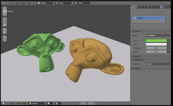
Here is a design concept from William Reynish's Cleaning Up Blender UI blog post.
This has several issues, but it also has promise. The things I like best about it are:
- more subtle panel-editor-type-selection corner buttons
- more obvious and lower-contrast layout/scene pulldowns (see blog for more detail)
I'm not as sold on the 3dview-header changes.
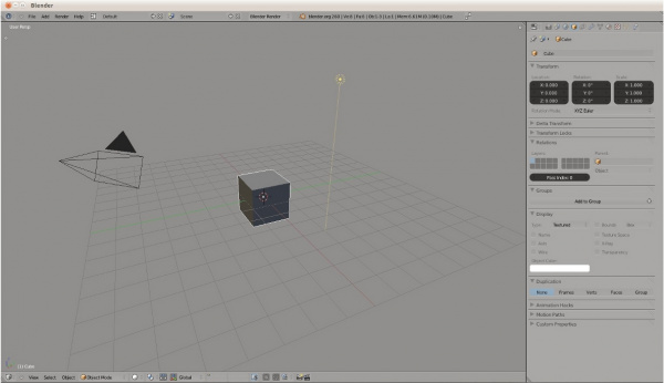
"Softblend Theme" - is just a color theme which downplays control contrast. It's not a property UI design in itself, and it has issues. However, it does open a window into making the UI appear less busy and cluttered.

