利用者:Venomgfx/User Interface
目次
- 1 UI Principles
- 2 Tabbed Navigation
- 3 Widgets
- 3.1 Proposal
- 3.1.1 Tool
- 3.1.2 Regular
- 3.1.3 Toggle
- 3.1.4 Radio Buttons
- 3.1.5 Checkbox
- 3.1.6 Menu
- 3.1.7 Menu Item & Menu Back
- 3.1.8 Tooltip
- 3.1.9 Scroll Bar
- 3.1.10 Progress Bar
- 3.1.11 Pulldown
- 3.1.12 Text
- 3.1.13 Number Sliders
- 3.1.14 Value Sliders
- 3.1.15 Popups
- 3.1.16 List
- 3.1.17 List Item
- 3.1.18 Box
- 3.1.19 Sphere
- 3.1.20 Buttons State
- 3.1.21 Icons
- 3.1.22 General
- 3.1 Proposal
- 4 Naming Consistency
UI Principles
- Simple to navigate, less mouse movement as possible
- Use motion to guide the user's attention and focus
- Use brightness to communicate depth (T38036)
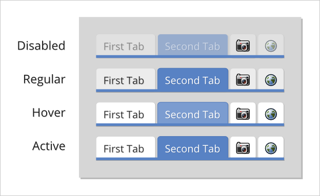
Group panels into categories, organized by using Tabs.
Widgets
We have way too many options. Some of the widget options are split, unrelated, not a lot of sense, or unused even. We also have a different active/selected color for every widget, this gives a lot of freedom but makes themes unnecessarily complicated.
Proposal
- Implement a "Basic Theme" creation by having 4 global colors for widgets:
- Widget Color: Regular, Active
- Widget Text Color: Regular, Active
- "Advanced Theme" creation let's you choose a different color for each widget, as it is now
- Simplify the drawing by making them non-shaded by default (still keep the option around in "Advanced Theme", to allow a "2.5x Theme", such as the current 2.4x Theme)
- Improve readability by having a constant padding/margin, across all widgets
- Outline color to use the widget's color, 20% darker
- Replace the emboss effect (basically a white shadow) with a dark, slightly opaque, sharp shadow
- Mouse hover a widget makes it 10% brighter
- A Disabled widget has 50% opacity
Tool
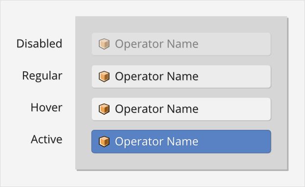
The Tool widget is a button that runs an operator. It can contain an icon, and its text is aligned to the left.
Some examples are:
- Translate, Rotate, Scale buttons (3D View toolbar)
- Render, Animation, Audio buttons (Render properties)
- Rewind, Play, Pause, Forward buttons (Timeline header)
Regular
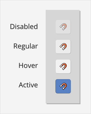
A button that functions like a toggle, it's usually icon only and has on/off status. In some cases, the off status displays a different icon.
Some examples are:
- Layers (Layer panel in Render Layers properties)
- Snap (3D View header)
- Preview (Timeline header)
Since functionality is so similar, it should be combined with the Toggle widget. The "Regular" name is also a bit confusing.
Toggle
A button that functions like a toggle, it's usually icon only and has on/off status. In some cases, the off status displays a different icon. (Yes, same description as the Regular widget)
Some examples are:
- Layers (3D View Header)
- Edit Selection Mode (3D View header in Edit mode)
- [F] Fake User button (Datablocks)
Since functionality is so similar, it should be combined with the Regular widget.
Radio Buttons
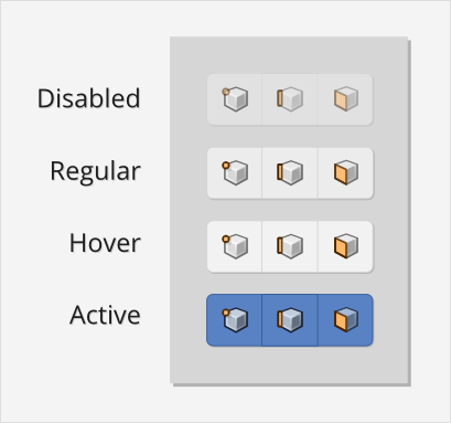
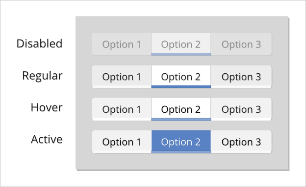
The Radio widget is a group of two or more buttons that have only one active at a time. It can contain an icon, and its text is aligned to the center.
Some examples are:
- User Preferences
- Properties Context buttons
- None, Metric, Imperial buttons (Scene properties)
Checkbox
(currently named "Option")
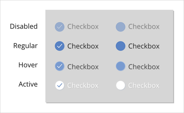
The Checkbox widget is a toggle with on/off status. It's often used in Panels' header as well.
Some examples are:
- Passes (Render Layers properties)
- Border/Crop options (Render properties)
- Shading options (Shading panel, "N" sidebar)
Menu
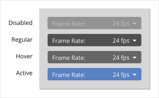
The Menu widget is just a dropdown.
Some examples are:
- Editors menu (left of every header)
- Render Presets (Dimensions panel, Render properties)
- Change Datablock (left of any Datablock buttons group)
Menu Item & Menu Back
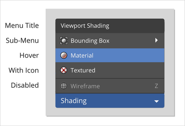
This are currently two separate options. They should be merged.
Tooltip
We got a great first redesign on master now. Maybe we can look into multi-line and cases where the Python line becomes useless because it is too long ("..."). Maybe don't crop at 50% but do it at 25% from left to right?
Scroll Bar
Smaller, Non-overlapping (to avoid jump when it is needed/not-needed)
Progress Bar
Include some kind of motion (animated bars or so) to communicate it's not hanging. Include a counter of the steps or percentage done/remaining.
Pulldown
It's like a menu, without the pill. e.g. Header menus
Text
- Change the cursor to Text when mouse hover the field, to better communicate we can input text there
- When editing the field, blink on cursor position
Number Sliders
Value Sliders
Popups
List
List Item
Box
Sphere
e.g. Vector Normals
Buttons State
Animated. Keyframe. Driven.
Icons
Alpha?
General
Axis Colors
Naming Consistency
- The Vectors pass in Render Layers is called "Vector", but the socket in the Render Layer node is called "Speed"
- Mapping mode is often called "Cube" (mostly in Blender Internal), and "Box" (mostly on Cycles)
