利用者:Broken/SummerOfDocs2006Restructure
目次
Synopsis
I will examine the structure of the manual between tutorials and reference and adjust it to be more clearly defined and separated, design a template for presenting tools in the reference manual, and apply it to the current documentation in order to unify style and increase readability and ease of information retrieval.
Breakdown (Problems)
The current wiki documentation suffers problems as a result of its collaborative editing, which make it harder for writers and readers alike to use the documentation. Because there is no standard way of presenting information, it is up to writers to come up with this themselves and describe things in their own individual way. Symptoms of this include:
Overuse of prose
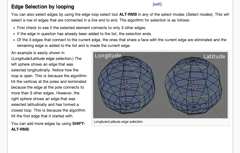
An example of this is in the page http://mediawiki.blender.org/index.php/Manual/PartII/Edge_and_Face_Tools , written by 'quartz'. I really don't like to pick on him though, he's done, and continues to do some excellent work in the wiki. The content of the documentation here is quite good, it's mainly suffering from the overall structural problems that aren't really his fault.
The documentation could easily become much more terse. Because it's written in paragraphs of sentences of prose, instead of skimming over through the sections to glean the required information, readers must parse all the text and process its grammar in order to find out each piece of information. This also involves using a lot of filler text, which makes the entries more daunting to read at a glance. Currently rather than a simple:
"Hotkey: A"
The page includes phrases such as:
"The tool is activated using" / "... to activate it press" / "... using the"
...in order to keep a sentence structure.
As well as being time consuming and burdensome for all readers, it also makes life much more difficult for non-native English speakers as they must also interpret the subtleties of the language in order to extract information.
Not only is an overuse of prose bad for readers, but it also increases the load on writers and translators, raising the barrier for participation. People may be turned off contributing to the documentation project, thinking that they must also be accomplished writers, capable of writing paragraphs of prose. It also means that translation is more difficult, since translators will have to translate entire paragraphs rather than just shorter phrases.
This is further worsened by:
Inconsistent use of prose
In order to find vital information such as what the tool does, what its hotkey is, what modes it's relevant to, the reader must read through a lot of prose. Sometimes a description of what the tool does is given first, sometimes how to access it in the UI is given first. The writing is always structured differently.
As an example here are some excerpts I took from the same page, with the amount that someone must read in order to find the hotkey:
"It is also possible to use a slightly different looping algorithm based on faces by using CTRL-ALT-RMB."
"The Loop tool allows you to split a loop of faces. This loop is defined using the same algorithm as described in the sections Edge Selection by looping and Face Selection by looping. The tool is only available in EditMode and to activate it press CTRL-R."
"Proportional face loop splitting keeps the shape of the newly cut edge loop the same as one of the edge loops that it cuts between, rather than cutting at a percentage along each perpendicular edge. Each edge is divided into two parts which are proportional to one another. In Proportional mode the 3D window header changes to (Proportional header) showing the position along the length of the currently selected edge which is marked in green. Movement is restricted to this length. As you move the mouse the length indicator in the header changes showing where along the length of the edge you are. Unlike Percentage mode, Proportional mode treats the edge as having a start and end vertex with the start marked by an enlarged vertex decorator; see (Vertex Marker). The start vertex, labeled as "A", can be flipped to the opposite vertex using the FKEY "
"Edge Slide allows you to slide one or more edges along faces adjacent to the selected edge(s) with a few restrictions involving the selection of edges. The tool is activated using CTRL-E "
The amount that one must read is different each time, as is the language used. There are no consistent places to look, or waypoints for the eye to search for and navigate around the page, which makes it quite difficult to find information quickly. Again, all of the text must be not only parsed, but also understood by the reader in order to find out each piece of information.
The above example of inconsistency was all written by the one author. You can imagine how much worse it is when there are multiple authors, from different backgrounds, with varying levels of writing competency.
Inconsistent content
A lesser issue is that the content of each entry is different each time. Some entries mention a tool's location in Blender's menu structure, some entries have additional technical information, some entries mention what modes the tool is relevant to, but many entries don't. There are no guidelines as to what should be included in an entry, leaving it all up to what an individual author can remember or choose. This can be frustrating for readers if they come to expect certain standard information from reading some entries and can't find it in others.
Since it's up to authors what they write, this is not something that can be solved by information design alone, but it can help.
Structure
I surmise that part of this confusion, and of the problems caused by prose, is due to uncertainty surrounding the purpose and structure of Blender's wiki documentation. Is it a manual to be referred to? Is it a collection of tutorials to guide new users through the process of learning Blender? Even though the manual is far more up to date, authoritative and thorough, there is also a separate 'Reference' section duplicating effort and gathering dust.
It is the element of tutorial-ness that is causing problems for the documentation as a user manual. The manual is trying to be simultaneously a 'quick start guide', a collection of tutorials for teaching, theory instruction, and an authoritative reference all within the same text. The documentation can support people of all kinds, but these various concepts need to be structurally separated (i.e. don't mix beginner's explanations with hardcore technical information). Especially on the web, where we have the power to easily hyperlink between tutorials and reference with ease, there's no need to (and many reasons not to) mix the two.
This topic has already been discussed on the bf-docboard mailing list, Glen Moyes provides a very good description of the problems and possible solutions here: http://projects.blender.org/pipermail/bf-docboard/2005-December/002563.html
Breakdown (Solutions)
These problems can be addressed in two stages.
First, the purpose of the manual's various entries must be affirmed as primarily a reference work, with tutorial content separated out (perhaps as prefaces or introductions to each chapter) and cross-linked. Improvements in this regard have already occurred since the mailing list discussion late last year, but it would be worthwhile to spend some time going over the entire manual, checking it and editing as necessary. Glen's proposals serve as an excellent guideline for how to progress.
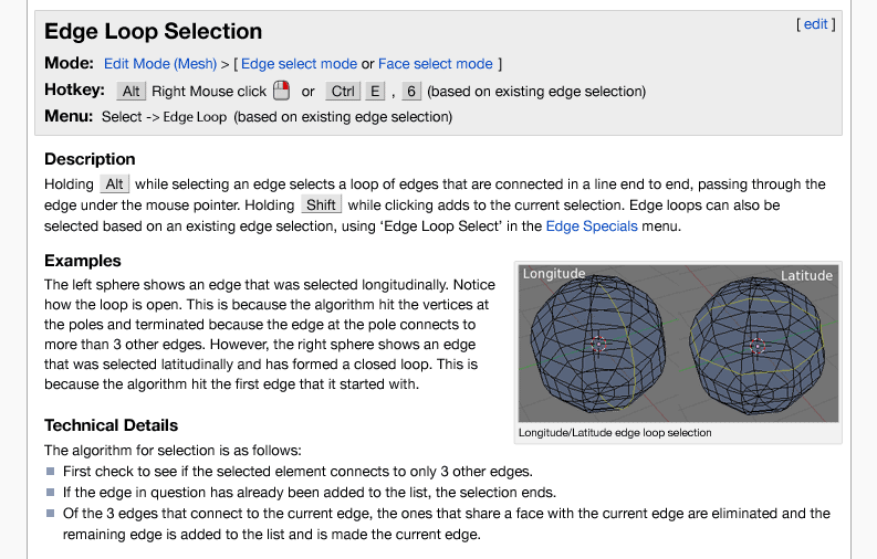
Secondly, the issues of writing style and use of prose can be solved by devising a standard template to use throughout the manual. Such a template would extract important information for each entry and present it clearly to a reader in a consistent way, so the same kind of information is always in the same place. Different types of information would be clearly delineated, so people can quickly find what they are looking for, and ignore information they're not interested in, without having to read the entire entry. It would also provide a good guideline for documentation writers, showing what information is needed, and making the process easier, more like filling out a form than writing an essay.
An initial example of how this would work is as follows:
Before:
After: (subject to further analysis)
Deliverables
- Restructuring the manual organisationally where applicable, including
- Separating out any theory and tutorial content from reference documentation
- Improving information design
- Devising and designing a standard template to use for presenting and describing Blender's tools and associated vital information.
- Implementing this template throughout the online wiki manual, including editing away excess prose to fit
While this project does not technically relate to 'Blender Basics Bootcamp', it will greatly improve:
- the professionalism and clarity of the manual itself, and direction for future growth
- the speed and ease of use of the current documentation by readers
- the ease of writing for documentation authors
- thus, lowering the barrier for participation and sustainably encouraging future contributions
and as such is an important and practical project to work on.
Biography
I have a comprehensive set of credentials for this project:
- 5 years experience as a Blender user
- 3 years experience as a volunteer to the open source project (website/proposals/development)
- Project Orange Lead Artist
- B. Design / Visual Communication (Hons) with studies related to this proposal including typography and information design
- Experience in teaching Blender to students, whilst at Montevideo Netherlands Media Art Institude, and author of video tutorials here: http://mke3.net/archives/tutorials/index.html
More information at http://mke3.net

