Dev:2.5/Source/UI/UIlayoutGuide
目次
Layout Guidelines
This page seeks to help unify button layouts in 2.5 with guidelines that help Blender's widget layouts become more consistent and easier to read and use. These basic guidelines ensure that everyone willing to help create and modify widget layouts have a common basis.
See also http://wiki.blender.org/index.php/BlenderDev/Blender2.5/WinterCamp/Properties for more details on laying out properties.
General -> Specific
On the top level, panels and the widgets within them must be organized in a way that is beneficial to the user. Starting with general items and ending with specific ones can help improve the readability of layouts.
Using the Object properties as an example, the most general widget is the datablock/name control, which should be placed at the top. Next are other general settings such as transforms and groups which affect the object in a very general way. Further down the list you then have things like Display, Animation and Duplication settings, so the order goes like this:
- Datablock
- Transform
- Groups
- Display
- Duplication
- Animation
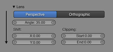
There is a clear progression here from general to specific, and from important to less important. This is also applicable within the panels themselves, as the following example shows:
As you can see, the most general control is at the top (Orthographic/Perspective changes the camera completely), whereas more specific and less important controls go further down.
Workflow
When making panel layouts it's also good to think about the workflow in which the widgets will be used. Using the Render settings is an example, the workflow will usually be as follows:
- Choose renderer
- Set items to render (Shadow, Ray Tracing)
- Set output size
- Set output directory
- Render
Users only have to worry about the output-related items at the end of the workflow when it is time to save the work. Therefore, these settings can be placed at the end in accordance with the workflow.
Dependencies
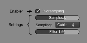
One of the most important things to communicate via the properties layouts is the dependencies between widgets. When this is done right, it can help users quickly understand how the application works, and workflow can be faster, with less need to search around in the UI, looking for related controls. This is especially important when you have a control that enables another, such as the following examples:
Here, changing the option at the top enables or disables all the controls below it. These types of 'enablers' are important to be visually placed on top of the widgets it activates.
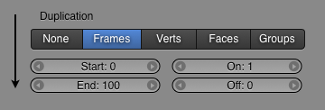
In the next example a toggle button changes the options available. Depending on which option you select, different settings will appear below it. Again, the dependancy is made clear by putting the main control at the top.
Disabling
When there are properties that prevent the usage of other dependent properties, disabling can be used to communicate this. Greying out buttons gives instant feedback about whether certain settings can be used in the current configuration, but leaves the layout intact, and the values visible. In older versions of Blender, this is done by removing the buttons from the display, however this should be avoided. Greying buttons out should be used since:
- It doesn't disrupt the layout, causing panels to resize and other controls to move around unpredictably
- It keeps the large-scale visual appearance of the window looking similar, so users can use the same navigation cues to find items consistently and quickly
- It allows users to inspect settings, even when they are disabled
Columns
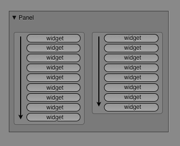
It's a good idea to use columns in a consistent way in the properties panel, as much as possible going from top to bottom and not left to right.
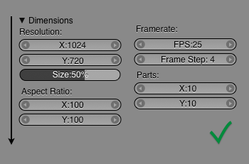
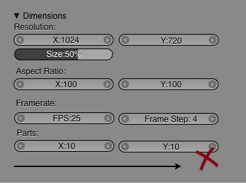
Following is a more specific example of how to organize widgets into columns. As you can see, in the first example the widgets flow from the top to the bottom, whereas in the second example they flow from left to right. The top image is easier to read, because the 'X' and 'Y' controls are organized below one another for quick eye scanning, and much more compact and explicit grouping. This is also much more like reading columns in a newspaper, and therefore makes more intuitive sense.
As much as possible use the top to bottom progression with columns.
This is especially important for lists of toggles, where its much easier for the eye to scan down the left edge of text like a checklist, seeing the labels and their selected states, rather than jumping horizontally from item to item (especially when the labels are of different lengths).
Lists
When presenting users with a long list of similar options, it's important to make it quick and easy to scan through. One way to improve the readability of long lists is to remove common starting words, like so:
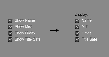
This means it's faster to identify the different words from the left because all the 'Show' items aren't obstructing the left side of the list. Additionally, it makes it faster to read because there are fewer words in all. Lastly, because the 'Show' item has been moved to the top of the list, you create a nice visual dependancy, making it easy to identify all these options as a group.
