利用者:Ack-err/GSoC 2013/Final Report
目次
- 1 Google Summer of Code report - Toolbar
- 1.1 1. Introduction
- 1.2 2. Current Toolbar Evaluation
- 1.3 3. Mockups and Initial User Feedback
- 1.4 4. Design Concepts
- 1.5 5. Concrete Improvements
- 1.6 6. Bugs and To Do
- 1.7 7. Future ideas
- 1.8 8. Conclusion
Google Summer of Code report - Toolbar
Google Summer of Code 2013
Vincent Akkermans
19 September, 2013
Work in progress
1. Introduction
This report describes the progress that was made during the Google Summer of Code Toolbar project. The aim of the project was to investigate and prototype possible improvements of the way in which Blender represents and provides access to its operators and tools. In short, the question was how the tool bar could be improved.
Presented below are the changes that were implemented together with the rationale for their design and the evaluation of their implementations. Some designs that were not deemed improvements and are currently not present in the code are still presented here.
The rest of this document is structured as follows. Section 2 briefly introduces the conclusions that were drawn after an initial evaluation of the current toolbar. Section 3 goes over the mockups that were made and the feedback that was given by users. Section 4 presents the higher-level design concepts that were used as the foundations for the new toolbar implementation. Section 5 describes each of the improvements at a functional and a technical level. Section 6 discusses some features that were left unimplemented and outstanding bugs.
2. Current Toolbar Evaluation
At the start of the GSoC an evaluation of the toolbar in Blender 2.67b was performed. This section summarised the conclusions from that evaluation.
Figure 1. shows the the toolbar, which has two main components: the Tool Shelf and the Operator Panel.

Figure 1. Blender 2.67b Toolbar
The tool shelf contains several foldable panels each of which houses several text-only buttons. The operator redo panel shows the options for the operator that was executed last. After an undo action the previous operator settings are no longer available.
Figure 1. also clearly shows the scrollbars that appear when the content of either constituents of the toolbar requires more space than is available.
The following things can be remarked of this toolbar:
- The space required by the tool shelf and the redo panel is almost always more than the space that is actually available. This entails that there is always a part of the toolbar that is hidden and that scrolling is almost always necessary.
- Scrolling is problematic because it requires a user to move the mouse pointer to the toolbar only to have to scroll back and forth in the menu and look for the text that resembles what you need. Moving text is hard to read and furthermore, because buttons move location, it is difficult for a user to track what part of the toolbar they're in. Especially if there are few visually distinctive markers. The advantage of having buttons visible at all times is that you can find the button you want easily and select it with a single mouse movement. However, for that to be possible scrolling should be avoided.
- The toolbar could make better use of horizontal space, especially given that vertical space is scarce.
- Improving the organisation of panels and buttons in the tool shelf and their representations would make it easier to scan the categories.
- Horizontal space could be used better by showing the appropriate short cut next to a button's label. This way the buttons could also act as a shortcut cheat sheet.
- Sparing use of icons, for example an icon per group or for frequently used buttons, could make scanning a long list of buttons easier. One would want to avoid creating long lists or grids of icons as they would become hard to distinguish.
- Currently the menu to add objects sits in the Info Editor header. The tool shelf would be a better home for this menu.
- The "operator redo panel" could be designed such that labels and widgets are not interspersed vertically. Labels would sit on the left, and widgets on the right.
3. Mockups and Initial User Feedback
After the evaluation described in section 2 the community on blenderartists.org was consulted.
In an iterative fashion 4 rounds of mockups were made, whereby each mockup took into account the user feedback that was given after the previous mockups. These mockups can be found on the blender wiki.
It seems to be a law of nature that for every positive opinion of a proposed design there is a negative one as well. However, a majority of users would agree that:
- The operator redo panel is problematic in both its placement and its behaviour. Because it is hidden when the toolbar is hidden, and the toolbar is not often used by experienced users, the operator redo panel is hidden most of the time, while it is a vital component of Blender's workflow.
- The tool shelf's organisation could be improved, for example, by making better and strategic use of icons.
- Customisability is a good thing in general. Most requested are the ability to position the operator redo panel and the ability to create custom arrangements of buttons.
4. Design Concepts
Although admittedly most improvements describe in section 5 are incremental and their designs and implementations rather ad hoc, care was taken to make sure they fit in a clear conceptual framework. This framework is depicted in Figure 2.
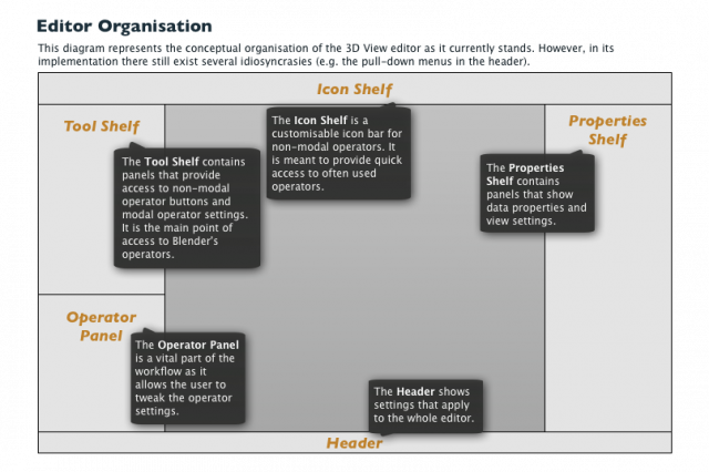
Figure 2. Current conceptual editor organisation
It should be noted that there are several idiosyncrasies that do not conform to the above diagram in Blender's interface. It is expected that they will exist for quite some time as moving closer to this concept will require many small changes, rather than big sweeping ones. A good example is the presence of the OpenGL Render buttons in the 3D View header.
Other design guide lines that were followed are as follows.
- Folding or even hiding panels in the Tool Shelf is an effective way to customise the shelf. This allows users to create a cleaner palette by removing buttons and panels they don't need in the activity at hand. For this to be effective panels should be more granular. That is, their content should be smaller and the decisions of what button goes in which panels should be made based on what activities they belong to.
- Strategic use of icons and button size will help to communicate importance, to better organise panels visually, and to save space.
- Popup panels or menus are effective ways of providing access to operators and operator settings, as long as they don't create modal interactions.
A different conceptual organisation, as depicted in Figure 3, was prototype, but discarded. Its main virtue is a clearer distinction between operator buttons and operator settings. Additionally, it provides quicker access to a larger and clearly organised collection of operators through the menubar. Because it follows a more conventional interaction it is expected that it would also result in better discoverability for new users. However, this concept would have been incompatible with all add-ons that present themselves in the Tool Shelf. Figure 4 shows a screenshot of a prototype that followed this concept. A video of the interaction is available here.
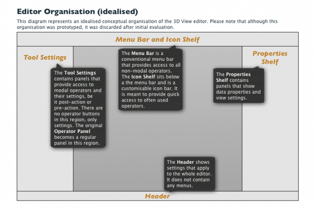
Figure 3. Idealised conceptual editor organisation

Figure 4. Prototype following the idealised editor organisation
5. Concrete Improvements
5.1. Proposed for inclusion
Tool Shelf panels
Functional description
The Tool Shelf panels in object and edit mode have been subdivided into more granular panels. This allows for more panels to be folded or hidden while leaving the necessary panels visible. In addition, commonly used buttons are now icon-only buttons. More text-only buttons should be substituted by icon-only buttons or icon-and-text buttons as soon as there more icons available.
In the organisation of each panel it was taken into account that the buttons that are expected to be used most often should be positioned at the top of the panel. Because these buttons are also icon-only buttons they also function as visual markers for the panel as a whole. Icon-only buttons are also shown as 1.5 times the normal height.
Furthermore, labelling groups of buttons with text is avoided as much as possible. The icons and labels of buttons and the organisation of the panels themselves should communicate enough context to not have to include separate text labels.
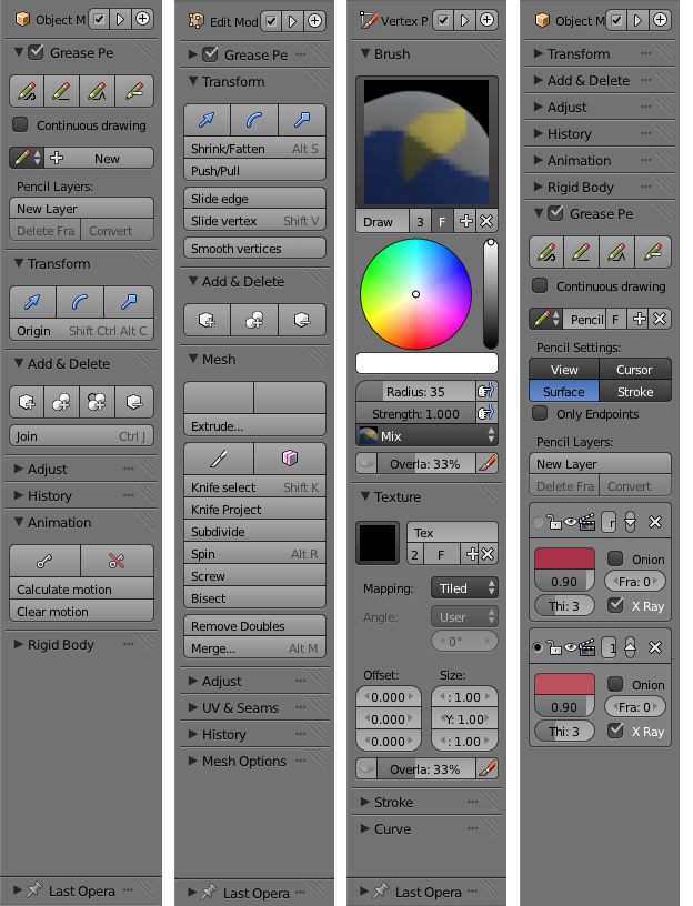
Figure 5. Tool Shelf in object, edit, and vertex paint mode. The image on the right shows the Grease Pencil panel.
Technical details
The changes to the tool shelf panels are concentrated in the U.I. python files (space_view3d_toolbar.py). Button height scaling is achieved by exposing the uiLayout.button_height float property in the RNA. It is a scaling value that is taken into account when ui_item_size is called.
Evaluation
Creating more granular panels is a successful way of enabling folding and hiding of panels to work well. Using a consistent height of 1.5 units for icon-only buttons is necessary to achieve a consistent look. It has been remarked that a row of icon-only buttons should either have two or four buttons to make divisions line up. However, one could also consider that dissimilar buttons should not be on the same row as to not falsely communicate the existence of a relation.
Also, the Tool Shelf happens to have groups of icons of similar colour. Although this was not intentional it does help to achieve a more stable visual look and colour coding. This could be considered as an icon guideline.
Grease Pencil panel
Functional description
Currently the interface for the grease pencil functionality is found in two different places. Firstly, the Tool Shelf shows the four buttons for the different drawing modes and a toggle button to enable sketching sessions. Secondly, on the other side of the screen, the Properties Shelf shows the list of pencils and the corresponding layers. This panel is dependent on the selected object, which explains the division of the grease pencil functionality between the two panels. However, for a user it is more practical to only have to look in one place when they are drawing with grease pencil. Therefore, the two separate panels are combined into a single one, which belongs to the Tool Shelf and is depicted in Figure 5.
Technical details
The Tool Shelf Grease Pencil panel has been removed from the Python files, and the drawing buttons and sketching sessions toggle button have been added to the Grease Pencil panel that is implemented in C.
Evaluation
The combination of the two panels into one is not expected to lead to difficulties, but rather to a more usable and discoverable interface. Although it does not immediately fit the concept as set out in Figure 2 (because the grease pencil layers could be viewed as properties of an object) the advantage of having the grease pencil options all in one place is assumed to outweigh this idiosyncrasy.
Tool Shelf popup panels
Functional description
The functionality to fold panels was of course already present. This allows a user to fold, and thereby minimise, panels that are not frequently used. However, the typical user interaction when a button in a folded panel is required is expected to be as follows.
- Look for the panel with the required button and unfold it.
- Click the button, activating either a non-modal or modal operator.
- Evaluate the result, think about the next step.
- Execute the next step, which is likely to be a common operator and is invoked through a shortcut or from a different panel.
At that point it is likely that the panel that was unfolded is forgotten and the user scrolls through the panels instead of folding the panels again.
To allow panels to stay folded, but still provide access to their contents the popup panel was implemented. It is shown in Figure 6. An ellipsis shown on the right of overy panel header. Clicking it shows the contents of the panel in a popup. The popup panel can be interacted with one would do normally with the original unfolded version. The popup panel stays open until the mouse pointer is moved away from it. This allows a user to reach a panel's content without having to unfold it.
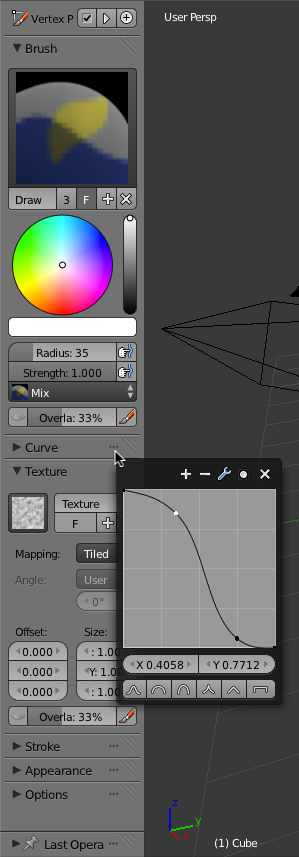
Figure 6. Each panel can be accessed though its popup version.
Technical details
The implementation of the popup panels is simple. Upon clicking the ellipsis the Panel instance is passed to the popup creation function (panel_popup_create_block). This instance is then copied and its PanelType's draw function used to instantiate the layouts and widgets. It is necessary to create a copy of the original Panel instance so that the offset can be reset.
Evaluation
A notable limitation of the popup panel is that they are not refreshed dynamically like normal regions are. That entails that the composition of the popup panel does not change like it should. A good example is the grease pencil panel, whereby clicking the new layer button does create a new layer, but the panel does not show this new layer. This is a limitation of the popup panel system the author would recommend is solved in some way before popup panels are introduced.
The ellipses are not very large and therefore the area that activates the popup panel is not easy to click. It has been proposed to add a key modifier such that click the header while the key modifier is activated does not unfold the panel, but instead activates the popup panel.
Hiding Tool Shelf panels
Functional description
Popup panels, as described above, are a good way of reducing the space that is required for all the Tool Shelf panels. However, in some modes there are many panels and even when they are all folded they take up half of the Tool Shelf. It is likely that there are a fair few panels that users never or very rarely used. To remedy this it is a feature was implemented that makes it possible to hide panels completely.
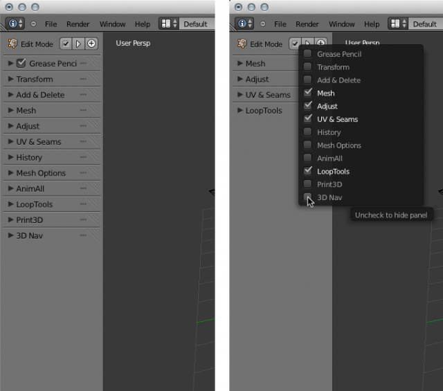
Figure 7. The Tool Shelf panel can be hidden with the menu shown in the image on the right.
Technical details
The hidden state of a panel is saved in the hidden flag of each Panel instance and as such it also saved in the blend file. This does however mean that a panel's hidden state is local to each file and cannot currently be transferred to other blend files. It is of course possible to change the hidden state of the panels in the default startup file.
It was requested on blenderartists.org that the menu include buttons to invert the selection and select or deselect all panels. Due to the technical limitation described above, whereby it is not possible to dynamically change the content of a popup panel, this could not be implemented. Although the buttons could theoretically be made to work, the changes in selection would not be visible in the popup and would make for a confusing interaction.
Evaluation
The ability to hide panels is expected to be an easily accessible way to keep the Tool Shelf tidy. Even if not used by the user, the current implementation is unobtrusive.
The menu would surely benefit from (de)select all and invert selection buttons. The icon that is used for the button that opens the menu, a checkbox, is not ideal as it is, to state the obvious, likely that users will interpret it as a checkbox instead of as a button.
Custom panels for the Tool Shelf
Functional description
The panels in the Tool Shelf are mostly defined by Blender's Python scripts and by addons. Although the Python scripts allow for quite a bit of customisability this is for many users not a viable manner of adapting the UI to their needs. The custom panels are an attempt to allow a user to create a custom panel.
A custom panel is created by clicking the plus icon at the top of the Tool Shelf. A new panel is immediately created and appears at the bottom of the shelf.
Operators can be added in one of two ways. Firstly, any operator button can be added to the panel by right clicking it and then selecting the right panel under the option 'Add to Custom Panel...'. Secondly, any operator button can be dragged onto the custom panel. Upon dropping the operator it will be added as the last operator in the list. An operator cannot be added to a custom panel if that operator is already present in that particular panel. Figure 8 shows the two methods of adding operators to custom panels.
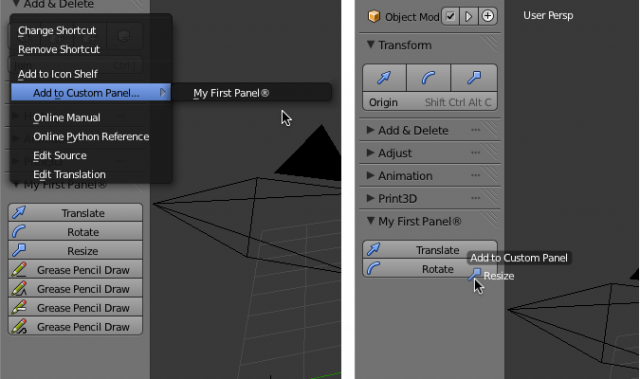
Figure 8. Operators can be added to a custom panel from an operator button's right-click menu or by dragging an operator button onto the custom panel.
A panel can be renamed or deleted from the menu that appears when the header is clicked with the right mouse button. Right clicking the operator button provides the option to remove that button from the panel, as depicted in Figure 9.
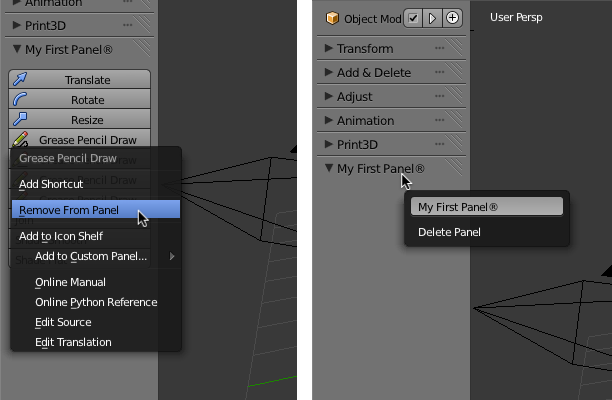
Figure 9. Removing operators and renaming and deleting a custom panel.
Lastly, the buttons in a custom panel can be reordered by dragging them up or down.
Technical details
Blender's implementation of panels relies on the fact that each instance of a Panel has a corresponding PanelType.Panel instances are saved in the blend files, whereas PanelTypes are loaded and registered at runtime from C or Python code.
To allow for custom panels, of which it is very likely that more than one exists at a time, their corresponding PanelTypes are created and registered dynamically. That is, each custom panel has its own panel type. Panels and PanelTypes are marked as custom through the PNL_CUSTOM_PANEL and PNL_CUSTOM_PANELTYPE flags.
A custom panel needs to keep track of what operators were added to it so that buttons can be drawn for them. The Panel struct was extended to include a list of OperatorListItem structs. These represent the properties of the buttons that are created by the custom PanelType draw function. They save the operator name and the properties with which the operator should be called.
Because panels and panel types are linked by their idname it was necessary to generate these names for custom panels. These names range from "custom panel 0" to "custom panel (MAX_CUSTOM_PANELS)".
The drag and drop system to reorder buttons within the panel does not make use of the Blender's general drag and drop system. This approach was chosen because originally overlapping regions did not have preference over regions that simply appeared later in a ScrArea->regionbase list. However, that was fixed later on, and perhaps the reordering of buttons should now make use of the normal drag and drop system. That way the visualisation of the drag and drop could be improved.
Evaluation
A weak point of the current custom panel implementation is that it is not communicated clearly what is a custom panel and what isn't. Similarly, it could be confusing that buttons in a custom panel can be removed whereas buttons can't be removed from normal panels. Also, it is not easily discoverable that the right click menu with which a panel can be renamed or deleted even exists.
It is currently not possible to add dividers between buttons in a custom panel. It remains an open question how this can be done best or indeed if it is necessary. Ultimately, a customisable panel would allow more ways of specifying the properties of buttons, such as having multiple buttons per row and the option to choose between icon-only, text-only, or icon-and-text buttons.
Operator Panel changes
Functional description
The Operator Panel is complained about by many. It is an important part of Blender's interface, yet it is difficult to use. The changes to the panel are simple, but hopefully effective.
Firstly, the panel now resizes automatically so that users will not have to manually adjust the height of the panel by dragging the divider between the Tool Shelf and the Operator Panel. However, it is not always desirable to have the panel open. Therefore, the panel can be folded like a normal panel by clicking its header. Figure 10 shows the panel in its folded and unfolded states.
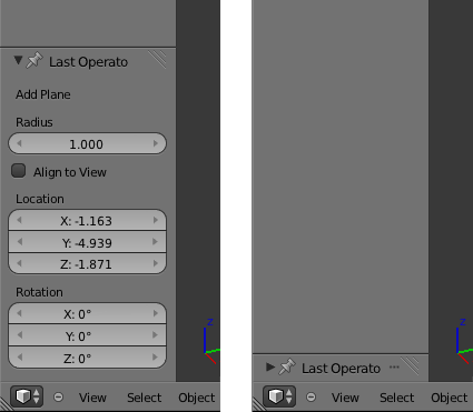
Figure 10. The Operator Panel in its unfolded and folded states
Secondly, the Operator Panel can be separated from the Tool Shelf. That is, it is possible to hide the Tool Shelf by pressing the T key, while leaving the Operator Panel visible. This can be achieved by pinning the panel with the pin icon in the panel's header. Figure 11 shows the panel in its unpinned and pinned states. Please note that for this feature to work you must enable Region Overlap in the user preferences under the System tab.
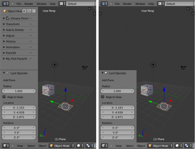
Figure 11. The Operator Panel in its unpinned and pinned states
Technical details
The logic to set the size of the Operator Panel region is in the region_rect_recursive function. The pinned property is saved as the PNL_PINNED panel flag.
The logic for automatically setting the height of the panel is a combination of the code for tagging the region for a redraw in ui_handle_panel_header and the code for preventing a draw loop in view3d_props_area_draw. It is necessary to draw the region twice because the height of the region can only be set once the size of the panel has been determined, for which the panel has to be drawn first.
Evaluation
Although it is expected that the new Operator Panel behaviour will ease some of the complaints by users, the panel still imposes quite a bit on the tool shelf. Ideally the panel would be an application wide panel, rather than a panel in the 3D View, Clip Editor, and Image Editor.
Undo System changes
Functional description
The undo system in Blender has two main undo stacks: the object undo stack and the edit undo stack. In addition there is an operator stack that keeps track of the operators invoked by the user. This last stack is used to show the history list and allows redoing the last operator. However, because the undo stacks and the operator stack are not integrated, after a typical undo and thereby rolling back the undo stack one step, the operator stack is cleared. This is done to prevent the different stacks to become unsynchronised.
The operator properties that are shown in the Operator Panel are based on the operators stored in the operator stack. Because this stack is cleared after every undo, which is a frequent event, the Operator Panel is not able to show any properties after an undo. The changes that were made to the undo system were meant to integrate the undo stacks and the operator stack so that the Operator Panel always shows the right properties, even after an undo.
Technical details
The integration of the undo stacks and the operator stack is achieved by saving pointers to Operator structs in the UndoElem structs. The operator stack is then rebuilt after every pop or push of the undo stack. If the undo stack at hand is the object stack, then the operator stack is built only from the object stack. Similarly, in edit-mode the operator stack is built only from the edit undo stack.
The object and edit undo stacks use different UndoElem struct definitions. The code that builds the operator stack can however accept both types of UndoElem structs by placing the operator field directly after the next and prev fields. This way both types of structs can be cast to a special UndoElem struct that defines only the first three fields of the other two.
Evaluation
Although it would be hard to argue that this change is not beneficial for any type of user, the implementation itself could best be seen as an intermediary step towards a full integration of all stacks. The two undo stacks and the operator stack should ideally be a single, more easily manageable, stack.
In testing the changes it became clear that there are many corner cases, whereby combinations of wmOperatorType flags produced unexpected results and crashes. Because these changes affect the core of Blender it would be advisable to either review them very carefully or perhaps even postpone their inclusion until they involve a full rewrite of the different stacks into one.
Icon Shelf
Functional description
The need for a customisable interface has been touched upon above. This need, and the insight that many users hide the Tool Shelf and would rather have a bar of icon-only buttons, led to the development of the Icon Shelf, depicted in Figure 12.
![]()
Figure 12. The new Icon Shelf. In the first image all dividers are unfolded, whereas some dividers are closed in the second image.
The Icon Shelf is customisable bar of icon-only buttons. By default it sits at the top of the editor and can be hidden like any other region. Buttons can be added by dragging any operator button to the shelf or by right clicking such operator buttons and selecting the "Add to Icon Shelf" menu item.
Buttons in the Icon Shelf can be reordered by dragging them to the left or the right. Dividers between buttons can be added to aid in the visual organisation of the shelf. A divider is added by right clicking any button in the shelf and choosing the "Add Divider to the Left" menu item. This way of adding dividers was chosen over a drag and drop solution because it is actually faster.
Dividers can also be reordered be dragging. Furthermore, a divider can be folded and unfolded by clicking it. This has the effect of hiding the buttons to the right of it and to the left of the next divider.
A button or a divider can be removed by right-clicking it and choosing the "Remove from Icon Shelf" menu item.
The icons for the operators are chosen automatically. The manner in which this happens is described in the next section. If an OperatorType does not have an icon associated to it, then the first few letters of its name are used to give an indication of the button's function.
The Icon Shelf can be hidden by dragging its inner edge to the outer edge of the editor, similar to how hiding Header works. Just like with the Header, the Icon Shelf's height snaps to its normal height or to zero.
The Icon Shelf is mode dependent. This means, for example, that the buttons that are added in object-mode will disappear when switching to edit-mode, in which other buttons can be added.
Finally, the setup of the Icon Shelf is saved in the blend file and cannot currently be exported to or loaded from a file.
Technical details
The technical implementation is rather straight forward and is similar to the implementation of the custom panels described above.
The drag and drop system for reordering buttons does not make use of the general drag and drop system. The properties of the buttons to draw for the Icon Shelf are saved in OperatorListItem structs, which are in turn saved in the ARegion's operators list.
Evaluation
The usefulness of the Icon Shelf will rely heavily on the percentage of operators that have icons associated with them. Otherwise most buttons will be labelled with abbreviated text, in which case the custom panels are a better way of customising the interface.
The Icon Shelf drag and drop code could be rewritten to make use of the general drag and drop system, rather than make use of a custom handler.
There is no doubt that dividers are useful. However, the usefulness of being able to use them to hide buttons is not so clear.
Operator Icons
Functional description
In order to be able to give every operator an icon some changes had to be made to the icon system. This change does not immediately affect users, but is a change under the hood.
Technical details
A separate icon file has been added to the source code. This file should contain all the operator icons.
The wmOperaterType has been extended in two ways. Firstly, it now has a default_icon field of type int, which can point to any icon and of course defaults to ICON_NONE. Secondly, it has an optional icon function that returns the appropriate icon given the current context and operator properties. If a poll function is present it overrides the default_icon.
This facilitates using different icons for conceptually different operations, but are implemented with the same operator. A good example is the need to have different icons for the different grease pencil modes.
The default_icon field or the icon function is used to determine the icon only when in the button definition functions the ICON_AUTOMATIC definition is used.
6. Bugs and To Do
Several tasks remain to be done in order to properly complete the new features that are proposed for inclusion.
- Dynamic popup panels (such as the Grease Pencil panel in the Tool Shelf and the panel hide menu) cannot currently be refreshed dynamically.
- When a grease pencil button is reorderded in the Icon Shelf it causes other grease pencil icons to not display correctly.
- When the Toolbar region is switched to the other side of the 3D View with the
F5Blender is caught in a loop that is related to font drawing. - Shortcuts for folding, hiding, and pinning the Tool Shelf and Operator Panel separately has not been implemented yet.
- The default startup blend file should contain an Icon Shelf with reasonable default buttons.
- In the reorganisation the ruler/protractor tool has become homeless and should be added to the Tool Shelf again.
- Implement the new features for other editors where applicable.
- Operators cannot yet be dragged to custom U.I. areas from the operator search box.
- When the Operator Panel is hidden or folded and an operator that always requires interaction with this panel, it could be unhidden automatically.
7. Future ideas
Operator Browser
There are around 1500 operators in Blender, some of which can be found through the Tool Shelf, others in the Header menus, and others still through the search box. The discoverability of the operators could be improved by extending the descriptions of operators and providing an interface for browsing operators and their descriptions.
Operator Properties for Operator Panel
Many operator properties are not useful when they are displayed in the Operator Panel. Furthermore, many operators have many properties and this causes the Operator Panel to require a lot of space. To remedy this operator properties could be marked such that they do not show in the Operator Panel when they are not useful there.
8. Conclusion
TO DO