Dev:Ref/Proposals/UI/Top Bar Reshuffle
UI Proposal: Top Bar Reshuffle
-- Brecht 21:34, 20 November 2013 (CET)
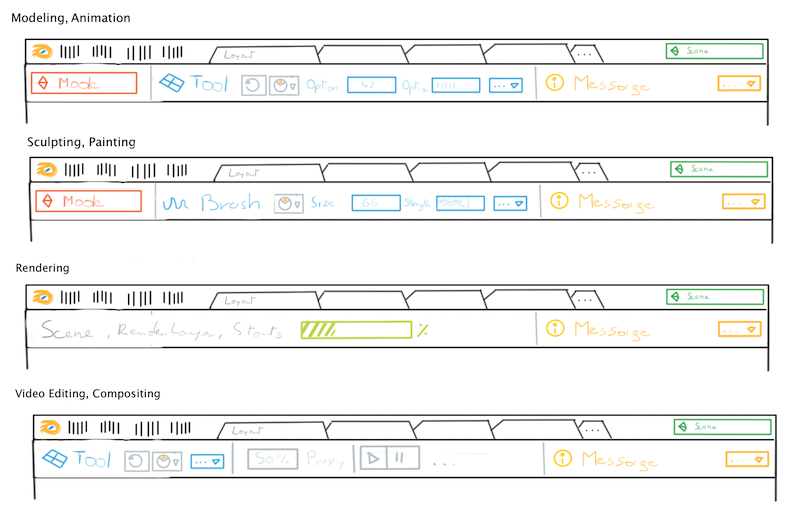
The idea is to have two top bars:
- The first bar is a bit more narrow and contains menus, screen layout tabs and a scene selector.
- The second bar can vary depending on the screen layout (or even not be there). It consists of various sections that could be chosen per screen layout.
- Red: object mode selector
- Blue: tool settings panel, with icon + name of tool, repeat button, history button to fold out history of tools, and tool settings with button to fold out more advanced settings that do not fit.
- Yellow: info messages similar to what we have now appearing. When there is no message this could be compact showing just a button to see the history of messages (or it could compactify after a few seconds like it does now). It could even always be compact and show messages as tooltip like message bubbles that overlap.
- Light green: for render window it could show stats and progress.
- Other things that could be here: playback buttons, proxy settings, scene stats, .. or whatever type of thing addons wish to make available here.
Jobs (render, bake, ..) are a bit unclear here.
- They could fit next to messages or be integrated with it somehow, like a message with a progress bar and cancel button.
- Blocking jobs could take over tool settings and show progress bars etc.
Self-Evaluation
Pro:
- Object modes have global effect, so show global
- Clear place for the tool settings panel
- Make room for screen layout tabs
- New sections in this bar could be python defined.
Cons:
- Making things global gives some friction with the multi editor concept.
- If you make own screen layouts you need to do more work setting up this second top bar.
- Is there really enough space in one bar for this (the mockup is narrow though)?
- Quite a bit of work to implement :)
