Dev:Ref/Proposals/UI/Mode sensitive outliner
目次
Problems
- The outliner is redundant for the most of the other modes. It lists, selects and manipulates the hierarchical order of objects in the scene and that is as far as it goes. It cannot manipulate their materials, textures, the other types of data blocks to a great extend.
- There is no easy way to select multiple materials and delete them in blender.
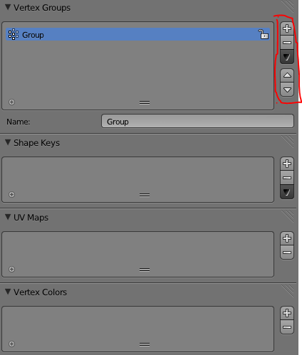
- Data block lists are scattered winthin the tabs of the properties editor.
- This is getting worse as blender accumulates more new features. The properties window duplicates some of the functionality of an outliner by containing these lists. Object data lists are starting to show up in the N-panel of the viewport as well as other strange places. Consistency is getting somewhat lost.
- The outliner cannot talk to the properties window.
- The LIST type panels are always restricted to their respectable PROPERTIES panel tab. You can NOT drag them out of there - restricted to move in your workspace layout.
- For materials and textures list- when you scroll down to change their properties, the actual lists get out of sight. So you need to scroll up back to the top to get back to them
- A lot of duplication of the + (add), --(remove), V (bring menu), up (move up), and down (move down the list) buttons. Currently these buttons are visible more than 3 times in the Properties tab.
As a result
- It adds to the need to scroll inside the properties window and that gets very bad when you have extremely populated lists
- It creates extra navigation work for the experienced users when switching between modes. You need to get to the appropriate tab and scroll down to the appropriate list.
- It also adds to the learning curve for the new users- having to learn more locations.
Proposed solution
My proposal is to take inspiration from Modo's outliner and even push it further.
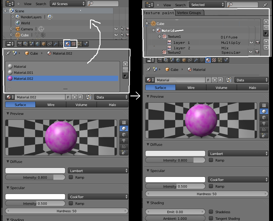
Make the outliner more dynamic - let it take some of the load of the lists in the properties editor so they can be shown in one consistent location.
It can also be smarter- trying to guess the list you need to get to depending on the editing mode that you are in. (optionally - with a little pin to disable that)
- when you are in object mode it shows objects in the scene tab and "texture paint"(to be renamed to "Materials") tab
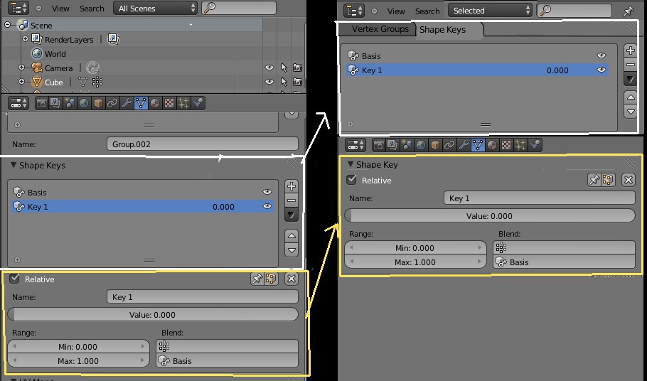
- when you are in edit mode it shows vertex groups and shape keys
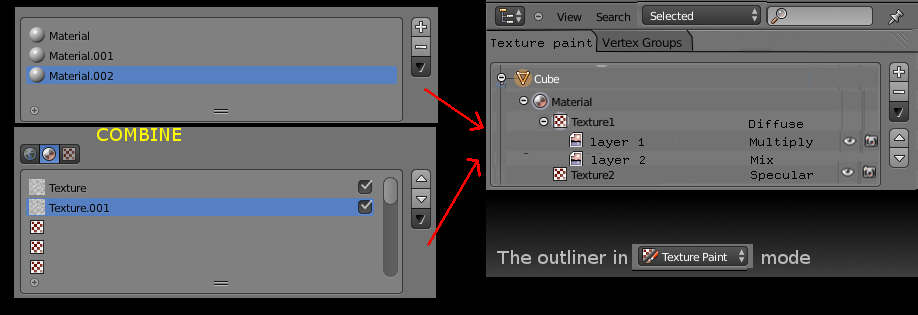
- when you are in texture paint mode it shows materials and parented to them - the textures and lets you tab to vertex groups (useful for masking)
- when you are in vertex paint mode, it shows Vertex layers and lets you tab to vertex groups
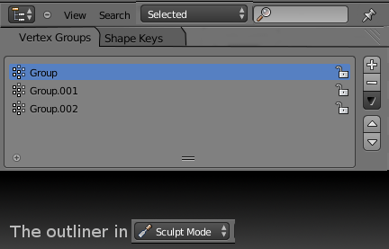
- When you are in sculpt mode, it shows vertex groups (useful for masking!) and lets you tab to shape keys
- When you are in weight paint mode it shows vertex groups
Adding to that the outliner can talk to the Properties window. If you select an item from it like a material, the properties window can show it's properties immediately. A texture would open that texture's properties, and so on. This time though, having the choice of a better overview of all the textures and materials within the scene. Not just the drop down list. Maybe drag one or multiple textures from one material to become a child of another material. Or dragging a material of one object to another object in the 3d viewport would link it.
The outliner can also take some of the functionality of the properties panel that it's lists have and unifying it consistently (same location for the add/remove buttons).
The Properties window can show the sliders and buttons needed to assign values to a selected Shape key or vertex group.
The textures and materials outliner mode for example could show the mode in which the textures are (bump,diffuse,etc) This can ease a future design for texture painting where you might need to have multiple (standard) image layers(normal,multiply,other mode) be children to a texture (set to diffuse for example), which is in turn a child to one of the materials of the active object you selected. so this could be a hierarchy designed to be convenient to the user and the mode (in this case objects-->materials-->textures-->layers
Note that above mockup also suggests merging the materials list and the textures list in one- so we have to tab less between them and we have a better overview.
If that were to happen then of course we will have to make World textures children to the world and Brush textures children to the active brush. Having them in an outliner list like structure will allow you to get rid of the three texture tab buttons that we currently have - they will be more visible.
On LIST Panels in the PROPERTIES editor being moved to Outliner tabs - pros and cons
While this may sound scary to some users, you must consider:
PROS:
- Separating the LIST panels from the PROPERTY editor area means that a list will never ever have to get out of sight again when you scroll down to change some of it's selected item's properties. Good example for that is the textures list and the materials list. You have to always scroll back to the top in order to change to another material or texture to edit.
- It makes your LIST panel more flexible to move in the layout when it's not restricted to the PROPERTIES window. Think of it as being a part of an outliner workspace area, which you can place anywhere on your screen and it will not drag all the sliders and buttons that the Properties editor comes with.
- If they are tabs, consider that it may be possible to drag them out of the outliner. Dragging a tab out is not a new
idea. Web browsers have had it for ages.
- We can still keep the LIST panels in the Properties window as they are now. Just have them collapsed when not needed.
CONS:
- The properties window becomes dependent on the outliner (both must be visible).
To combat that, the properties window can still have it's own way of switching between items to edit. Or a button to quickly open the outliner. Or the legacy List panels still available but capable of being collapsed.
- The outliner becomes dependent on the properties window. If a properties window is not visible when in fact you need it after you have selected something in the outliner.
A possible solution to this might be in having the relevant Property tab/panel pop up when you double click an entry in the outliner. If the property window is already visible, it automatically switches to the relevant tab/panel. If it's not visible then it might have to do the one thing blender never ever does- pop out in a new window.
Design challenges
A redesign such as this calls for new functionality in blender that is currently non existent. It might need some trial and error to see what works best.
- Do we keep all the legacy property lists just the way they are and have this outliner functionality be optional?
- Do we move the entire property list panel with all of it's buttons to the outliner or do we only have the list with some information of the mode an item is and an add/remove button? Then have these manipulation buttons/sliders in the properties window?
- How do you select an active Object's datablock entry to edit (materials, textures,etc) while the outliner is not visible?
A)Perhaps by using the legacy drop down list to get to them? But getting to them through that list currently also means changing them to any one of all the existing ones.
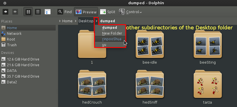
B)Perhaps by clicking on the hierarchy line to bring down a menu of the active object's existing datablock entries). So clicking on the Materials entry (in example bellow), brings down a list of all of the Object's materials.
This is similar to how navigation bars work in some file managers on linux. Clicking an arrow between two directory buttons allows you to select any of their respected other sub-directories.
example of dolphin file manager using this feature
proposal by Blurymind / Todor Imreorov
