Dev:Ref/Proposals/UI/Increase whitespace
< Dev:Ref | Proposals | UI
2013年12月1日 (日) 03:56時点におけるwiki>Esalbergによる版
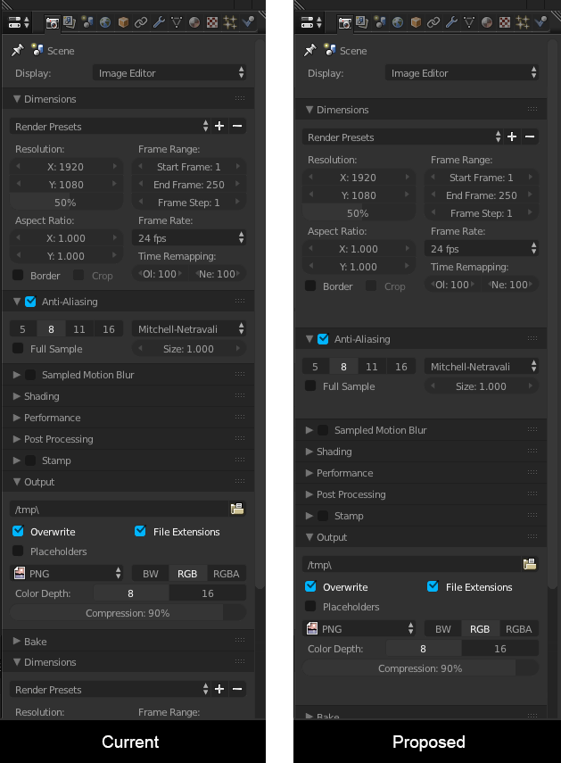
Increase whitespace in the UI
Considerations
- One of the reasons why Blender is considered hard, or having a complex UI is because there is very little space between widgets and panels. This makes panels look busy and cluttered.
- Experienced users can also benefit from more whitespace by finding things quicker due to visual grouping.
- More whitespace means more scrolling
- Some users might want to scroll less, or just like the old look
Proposal by Januz
- Hand control over the gutter for splits, rows and panels to themes.
- Decide on sensible values for the default theme (needs to be discussed)
