Dev:Ref/Proposals/UI/Fonts
Fonts
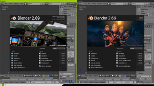
The default Blender font is a widely-spaced font; I recompiled Blender with the Droid Sans OTF font directly from Google's webfonts repository. The text is narrower and very slightly shorter; I find that it works better (more compact).
Splash screen
I also updated the splash image (ignore the image, I couldn't find the original image for the background, so I used another one) with Roboto Condensed and a better attribution font (Roboto with a dark shadow). Additionally, I erased a one-pixel strip on the left and right edges of the image to allow the splash screen border to show through (this is much more visible with the Blender 2.4x theme). What does everyone think about this?
Possible issues
The text may look a bit horizontally squished to some users.
