Dev:Ref/Proposals/UI/Ribbon Bar
Blender needs a ribbon bar across the top. It would eliminate the need for the toolbar, most of the Info bar (if not all), the entire properties region at the right side of Blender, and the bar at the bottom of the 3D View. A ribbon bar would make Blender's UI much more cleaner looking and user friendly. It would be a great benefit to both new and advanced users.
In his book Don't Make Me Think, Steve Krug says:
"[Tabs] are self-evident. I've never seen anyone --no matter how 'computer illiterate'-- look at a tabbed interface and say, 'Hmmm. I wonder what those do?'...tabs are so visually distinctive that they're hard to overlook...If done correctly, tabs can add polish and serve a useful purpose...As interface devices go, they're clearly a product of genius".
This is what a ribbon bar is:
SCREENSHOTS FROM OTHER SOFTWARE ARE NOT ALLOWED ON BLENDER.ORG WEBSITES
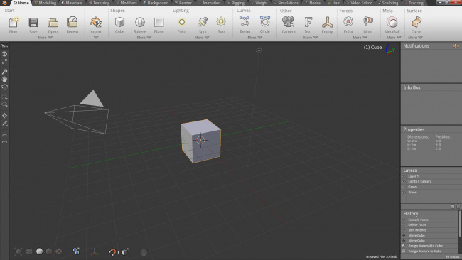
Andrew Price gave a good mockup on how this can be implemented in Blender:
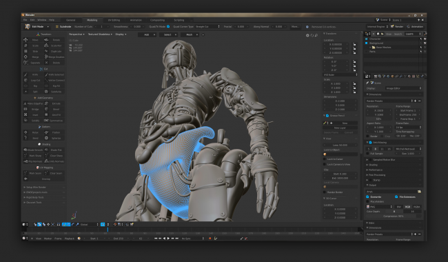
Brecht van Lommel also has a ribbon bar in his proposal:
The ribbon bar would be very customizeable as well. Users would be able to customize what they want in the main bar, and put the lesser used functions in the "More" drop down as seen in Andrew's proposal above. There would also be a "Custom" tab for addons, like there is in Autodesk Maya. Tabs may also be hidden if the user wants to.
The Microsoft Developer Network has some questions to consider when deciding to use a ribbon bar:
- Do users have trouble finding commands? Are users requesting features that are already in the program?
If so, using a ribbon will make commands easier to find by having self-explanatory labels and grouping of related commands. Using a ribbon also scales better than menu bars and toolbars for future growth.
- Do users have trouble understanding the program's commands? Do they often resort to "trial and error" to select the right command or determine how commands work?
If so, using a ribbon with results-oriented commands based on galleries and live previews makes commands easier to understand.
- Are the commands presented in several locations? Are commands presented in menu bars, toolbars, task panes, and within the work area itself?
If so, using a ribbon will unify the commands into a single location, making them easier to find.
- Is the improvement in discoverability, ease of learning, efficiency, and productivity worth the cost of the extra space and the need for tabs to organize commands?
If so, using a ribbon is an excellent choice.
Here's how ribbon bars/tabs are implemented in other 3d programs (click on them for larger image):
SCREENSHOTS FROM OTHER SOFTWARE ARE NOT ALLOWED ON BLENDER.ORG WEBSITES
If anyone has any constructive criticism about this idea I'd love to hear it. I'm very open to ideas and critique. Please put it in the Discussion page of this proposal.

