Dev:Ref/Outdated/Proposals/UI/Info Architecture/Design/Alignment
< Dev:Ref | Outdated | Proposals/UI | Info Architecture | Design
Button Alignment
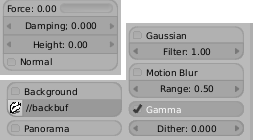
These are rules for use of Auto Aligning (initialized by uiBlockBeginAlign(block) and ended with uiBlockEndAlign(block) This is targeted at coders who are adding new buttons, in order to keep the UI consistent.
- Toggle, Number, and Slider buttons can be auto aligned if they affect the same setting or closely related settings (eg. R/G/B number fields).


- Radio (row) buttons should always be aligned with their other mutually exclusive options. Don't align more than one set of radio buttons with one another.


- Menus can be aligned with Number, Slider, or Toggle buttons if they affect the same setting or closely related settings. Don't align menu buttons to other menu buttons.


- Avoid aligning any buttons with Labels. This way all buttons that aren't aligned will keep their rounded appearance.

-- JasonSaunders - 28 Sep 2004

