Dev:2.5/Source/UI/Keyboard Layouts
Keyboard Shortcuts
Blender has long used keyboard shortcuts as a vital or even main method of input. Keyboard shortcuts are a very fast way to call commands, and make fast workflow possible. Blender has quite a good layout for these shortcuts, which are very consistent across editors and modes. This consistency makes it easy to use muscle memory and transfer between different areas of Blender without switching mental models.
Over time, however, the keyboard layout has become more cluttered, with actions attached to almost all key combinations on the keyboard. Many older secondary actions now enjoy primary placement and can be invoked without holding down a modifier key, while more used actions are hidden behind multi-key combinations. For Blender 2.5, a little bit of cleanup would be in good order.
Additionally the computing landscape has transformed quite a bit since 1995 when Blender was initially designed. For one, laptop computers have all but replaced the traditional desktop as our main computing devices. This has implications for the keyboard layout, because it means we can't rely on users having numeric keypads. Additionally, certain keys are a little dangerous to use for primary commands, because they are likely to not exist on foreign keyboards.
Also, operating systems have come and gone. Blender originated on the IRIX platform, and has been available for a myriad of OSs since. Today, the industry has centered around three main OSs: Windows, Linux and Mac OS X. These OSs actually share many of the same conventions for basic operations, such as saving, opening, quitting, copying pasting etc (Apart from the Macs use of the Command key to replace Ctrl). To better fit into modern conventions, Blender can adopt standards for these basic operations.
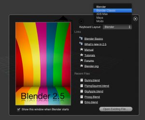
Although Blender 2.5 will allow customizable keys, it's absolutely important that the default layout is absolutely as good as we can make it. This is what the large majority of users will use, after all. Additionally it's important to remember that 2.5 makes it possible to have a set of default keyboard layouts to choose between, and the old 'Classic' layout can be one of those options.
Aspects to keep
- Consistency across editors and modes
- Basic operations: G, S, R for translation, H for hide etc.
- Alt as inverse operation
- Most key bindings should stay the same, to ensure a smooth transition from 2.4x
Aspects to change
- Even more consistency across editors and modes
- Should work out of the box on laptop keyboards
- Move to standards for things like saving, quitting, opening, copying, pasting etc.
- Get rid of illogically grouped items, such as the 'Specials' menu
- Mainly use single keys or one modifier. Minimize use of shortcuts like Ctrl-Alt-Shift-M. This is hardly a shortcut anymore.
Ideals
- Consistency, both within the app and with others (where it makes sense)
- Directness (whole point of shortcuts are that they are fast)
- Make keys easy to remember by using starting letters, or even the letter as a symbol (as Y for split).
- Take into account the position on the keyboard. Right handed people find it easiest to use the left part of the keyboard.
- Ergonomics should be considered, especially when using modifier keys, so that all combos are easily reachable.
While making changes to the keyboard layout, I've assumed that by the time 2.5 is released we have a nice radial menu system, like the one Matt Ebb designed a few years ago. What this means is that keyboard shortcuts can be grouped in more clever ways, because invoking commands is much more efficient when you have multiple choices. This means that, for example, the pivot options can all be called from one keyboard command instead of five individual ones, and be at least as efficient, if not more so, because the single keyboard command is easier to remember, and more likely go get used.
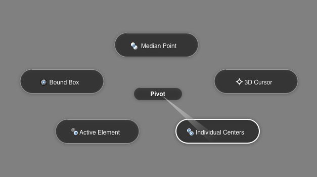
With this in mind, I've moved things around a bit. For now, I've concentrated on the 3D View in Object and Edit mode, because the rest of the editors and modes usually use a subset of these keyboard shortcuts. These are the main changes I've made:
List of changes
- Mode Selection gets primary position (1,2,3,4,5,6 keys). Old Tab key was only useful when there were only two modes.
- Edit Mode Vertex/Edge/Face mode selection is also moved to same mode switching area (8,9,0)
- View Selection is done using Shift+1,2,3 for front, left and top view. 4,5,6 for back, right and bottom view.
- Mirror command is now consistent across modes (M key)
- All viewport display options are now accessible by pressing the D key
- All pivot options are now accessible by pressing the . (period) key
- All special selections can be invoked with the T key (Inverse, Similar, Edge Loop, Ring, More, Less etc)
- Subdivide is W key, same as old 'Specials' menu, but without the random specials.
- Replacing specials, is a more context sensitive toolbox, invoked with Space.
- Delete has been moved to the Backspace key
- Opening, saving, copying, pasting, cutting and quitting now use standards.
- Changed F-key commands to reflect the new buttons window tab order
- Changed Merge (alt-m) to J. Makes makes joining/merging much faster
- The new context search is so useful it deserves a quick, easy to remember key. I've assigned it to tab. In some cases this new feature almost makes shortcuts irrelevant - certainly the really obscure ones involving four or five keys in combination.
- Changing layers can be done using Ctrl+1,2,3,4,5,6,7,8,9 keys
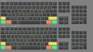
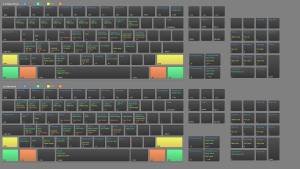
See these images for comparison between old and new layouts:
Notes on the new layout: There are now a few buttons that have no actions assigned to them. Either we can think of stuff to put there, or we can leave the space free for future use. Namely X, J, Z, Q keys, as well as special character keys have room for new operations.
Additionally, since 2.5 supports custom key maps, I expect the old keymap to continue as a separate option.
Mouse Buttons
Just as important as keyboard commands are mice buttons. Blender has long had a very different approach, using the right mouse button for selections, and the left mouse button for a mixed collection of operations. This has proven to be problematic in practice though because of these reasons:
- Slows down users who use multiple softwares, where all others use left button for selections. Users have to constantly switch mental models when switching between apps.
- Is all but incompatible with one-button mice
- The mixed collection of operations assigned to the left (primary) mouse button have turned out not be very primary at all
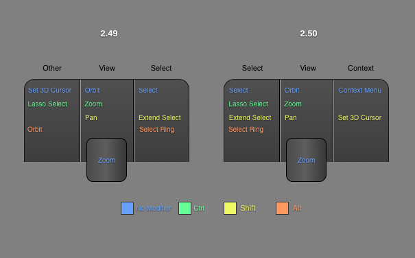
With this in mind, I've reorganized the operations performed with the mouse buttons. While view operations were always consistently assigned to the middle mouse button, selection operations sometimes happened with the left mouse (Lasso select) and sometimes on the right. Below I've attempted to make the use of mouse buttons more consistent, and more standard, making transitions between apps as painless as possible.
A note on tablets: I've focused on making something that works for mice. Tablets are a special case that should be handled differently, and need a different assignations. Luckily this is possible with 2.5.
