Dev:Ref/Outdated/Proposals/UI/Info Architecture/Design/Controls
< Dev:Ref | Outdated | Proposals/UI | Info Architecture | Design
目次
Blender UI Controls Proposal
Using the knowledge, experience and feedback from the updated UI controls in the Blender 2.30 release, I have designed and implemented an updated, 'evolved' set of UI controls for a future Blender to use. Changes and tweaks have been made for both functional and aesthetic reasons.
History
Blender's UI controls have evolved since version 1.80 for a number of reasons. Let's take a trip down memory lane.
- Blender 1.80:
The first blender UI controls I can remember using. Strong and chunky. Nearly all of the different types of functionality are represented with the same visual appearance.

- Blender 2.0:
Blender 2.0 (from memory) brought a lighter style of UI control with thinner lines and text. These controls were an improvement in that they were less visually dominant, making the buttons window much less complex and distracting. Nearly all functionality is still represented the same way.

- Blender 2.30:
Blender 2.30 was a transitional update, with the new default 'Shaded' style, designed to modernise the visual appearance, while also giving a better representation of functionality such as in the updated popup menu design, the 'flat' text and number fields (including the helper arrows to communicate Blender's number field functionality better). Some buttons still remain identical, however, such as action buttons, radio (ROW) buttons, toggle buttons even though their functionality is different.

- Blender 2.31:
Blender 2.31 brought the introduction of the 'Rounded' style, made possible by the updates in Blender 2.30. This introduced the 'Align' feature, which allows buttons to be aligned to the one shape instead of separate buttons. The alignment of buttons were done rather haphazardly, mainly based on rules of thumb or cleaning up the panels' visual appearance, rather than based on communicating functionality, or from any defined UI theory or guidelines.

- Blender 2.32:
Blender 2.32 updated the 'Shaded' style to use the alignment code, which while improving the visual appearance, also introduced confusion with the old problem of different buttons functioning differently but looking the same.

Analysis
Though the new styles of UI controls since 2.31 have been generally well-received, there have still been areas in which they can be improved. Feedback from Blender users has helped here, too.
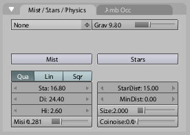
- There has been slight confusion from the 2.30 sliders. Sliders in Blender are very efficient, since the clickable area is very large - you can click and drag anywhere on the slider to increase and decrease the value (see Fitt's law). Confusion arose from the fact that the slider 'handle' in 2.30 was very thin, leading some people to believe that they had to click on the handle itself to manipulate the value. The 2.30 sliders were a compromise/transition from the traditional 'handle on a line' style slider, to one like a filling thermometer, that better represented visually the percentage of the value that the slider is representing (setting and visualising a proportion is the key difference between sliders and normal number fields). Unfortunately this compromise wasn't 100% successful, and can be improved by rejecting the 'handle' idea all together, and fully emphasising the 'thermometer' aspect, which is a much better way of representing Blender sliders' functionality, which don't require a user to drag a handle anyway.
- Action buttons, toggle button and row buttons in 2.30 still had the same appearance even though they acted differently. Traditionally in past Blender versions, row buttons were joined next to each other horizontally, while other buttons had spacing between them. With the new alignment feature though, this has been lost, with any aligned buttons looking like row buttons, regardless of their functionality (witness the disastrous 'Mesh Tools 2' panel for an example). This can be improved by further differentiating the controls from each other.
- The 'Rounded' UI control style was an interesting addition from an aesthetic perspective. It fits in with the other curved elements in Blender (window and panel headers) much more seamlessly, and also helped create a more distinctive Blender style. The idea of button alignment also works much better in the Rounded theme than the Shaded theme, since there is much more contrast between the curved ends and straight lines in between aligned buttons.
Proposed Solution for Blender 2.37 / 2.4
- Example panel:

This new design addresses the problems in the 2.30 controls while updating for further benefits and prettiness :) Major differences are:
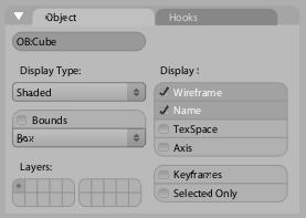
- New toggle buttons.
Toggle buttons now look quite different to action buttons, with a more subtle appearance. They now display a check mark, consistent with standards in Windows and Mac OS X, and also giving a stronger link with the menu item check marks already in Blender. While the toggles can be used for any purpose, they are optimised for being stacked vertically, acting like a checklist (which looks great when aligned). The text is also aligned left, which helps considerably with finding the item you're looking for quickly. The eye can quickly scan down the left edge, and see both the text labels and the toggle state in the one glance. This is much more difficult when the text is centre aligned, as the left edge (where the eye starts reading from) moves left and right, causing the eye to meander around as it follows the text down.
When used in the layer buttons, at a small size, the check marks are replaced by small dots.
The small space needed on the left of each button for the check mark causes overlap on some of the buttons in the 2.34 button layout - this is why it will help to bring these controls in at the same time as a new button layout, so the size can be accounted for in the design.

- New Sliders
The sliders have been updated to completely get rid of the 'handle on a wire' idea, and use more of a 'thermometer filling up' metaphor. As mentioned when the last sliders were introduced in 2.30, this better visualises the main purpose of a slider - to set a percentage or proportion, more than a specific value. With the 'thermometer' approach it's very easy to see at a glance what the proportion is, by judging the length of the dark line. This design fully integrates this idea, improving on the somewhat compromised version in 2.30. It's also more effective in communicating how Blender's sliders work - you don't need to click and drag on a handle, you can drag anywhere on the slider itself to change the value.
Another change is that unlike in previous Blenders, a user can now click directly anywhere along the slider, to have it immediately 'fill up' to that point. A demo movie is available here.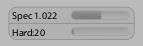
- Smoother, less intrusive appearance
The buttons now take advantage of OpenGL antialiased lines for a much nicer visual appearance compared to the previous pixelated edges, especially those that sometimes appear on the curves of the rounded theme. Combined with a lighter button outline, an advantage of this is that the lines of the buttons don't compete so much with the lines in the text labels, making the text easier to read at a glance. They also use rounded corners to help distinguish between aligned and non-aligned buttons, and of course it looks nice too :)
to be continued!