利用者:Gaia.clary/list interface improvements
Proposal: Improvement for Listboxes in Blender
This is a proposal for improving the look&feel of list boxes in the Blender user interface. The reasons why i was looking into this:
Reasons
Rigged characters often use a lot of shape keys and vertex groups. The provided lists quickly get unhandy and it can be time consuming when you are looking for a specific entry. Think of a character with 100 shape keys for example. So we where discussing 3 improvements for list boxes:
- resizable list box
- list filters for search
- add level of hierarchy (like with outliner)
The first 2 improvements have been discussed so far. The third idea (hirarchical display) has not been commented although i think it is still a good way to organize large lists of shapekeys.
Mockups
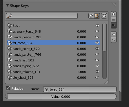
This is my personal favorite: I have replaced some of the controls to save visual space. I placed the filter field on top because i believe that is the most comfortable location for the filter. And i added a drag handled to the lower right corner of the list box so that it becomes easy to resize it. I believe this is a standard way to do such things:
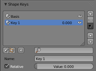
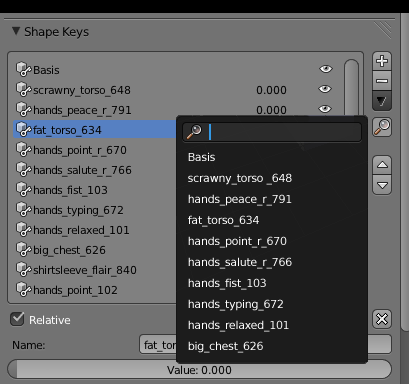
A developer has mentioned that it might be not possible to create such a listbox because the Blender user interface does not provide the necessary features. The following 2 variants may be easier to implement:
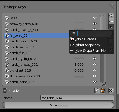
These 2 variants use a popup that shows up with right click. I personally do not like this approach because the filter is not instantly visible. And if you want to change the filter you always must mouse click first.
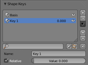
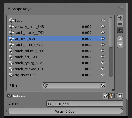
This is one of the first variants with a filter field at the bopttom of the list.
