利用者:Jeske/MockupIdeaToolsActionsMenuButtons
Mockups Requested for Tools Panel Action Menus !!
The blender Tools sidebar can contain operator action buttons which have menus for variant-selection. However, when they appear, they look exactly like normal pulldown menus which don't actively do anything and are not operators.
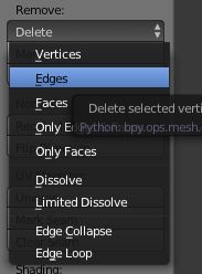
For example, the object edit mode "Delete" operator is an OPERATOR ACTION with variant selections like "Verticies", "Edges", "Faces", etc.. Here you can see it collapsed and after clicking.
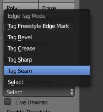
In the same sidebar, the "Edge Select Mode" pulldown controls how edge-select-mode behaves. It is not an operator or action itself, yet it looks exactly the same. Here you can see it collapsed and after clicking
How could this be better?
Replace Operator-Action expand buttons, which more clearly communicate that they are action buttons which open into menus, and not pulldowns.


