利用者:Jeske/MockupIdeaVideoEditing
目次
- 1 Mockups Requested for Video Editing
- 2 Idea: visual track strips
- 3 Idea: better but non-visual track strips
- 4 Idea: show "effect" or "transition" attribute curves directly on the strip
- 5 Idea: Show "Transition" Block on VSE strip
- 6 Idea: Preview - better "channel selector"
- 7 Idea: Preview info and video controls
- 8 Idea: control "render" output settings without using 3dview property panel
- 9 Idea: Improved Graph Editor Visuals =
Mockups Requested for Video Editing
Blender Video Sequence editor contains digital video editing functions. After loading video and audio clips into the video editor, they can be sequenced, overlapped, clipped, transitioned, spliced, etc. It's very powerful, but not very friendly to either non-Blender users or non-3d users. This page contains a set of ideas to change that which need mockups.
The following tutorial contains a basic overview of the Blender Video Sequence Editor:
Minor mockups would be helpful to make small improvements to the VSE.
Major mockups would be helpful to fully re-fresh the VSE UI design (while fitting within the UI style of Blender)
Here are some competing packages we can draw inspiration from, or not! :)
- Pro
- Avid - Youtube Tutorial <- good tutorial integrating functions Blender separately has in VSE, motion tracking, compositing all from the Avid video-sequence-editor.
- Lightworks (more for broadcast)
- Consumer / Pro-sumer
- Final Cut Pro Youtube Tutorial <- great tutorial to watch
- Sony Vegas - Youtube Tutorial
- Adobe Primere - Youtube Promo Video - it's a marketing video, but also a really good view of their UI
- Adobe After Effects - Youtube Tutorial
- AVS4YOU - Youtube Review
- Camtasia - Youtube Tutorial
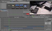
Here is a screen layout of the current Blender Video Sequence Editor... It has many of the right elements and a start at the right capabilities... next step is a bit of polish and additional functionality
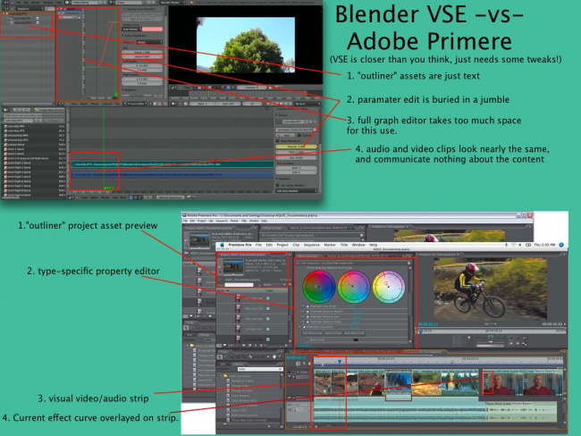
Take a look at this quick Blender VSE vs Primere Pro visual comparison.
Idea: visual track strips
- add track headers
- show visual audio-vu meter and video-thumbs in track-strips
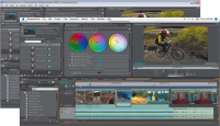
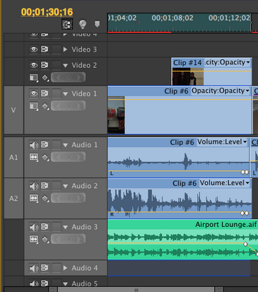
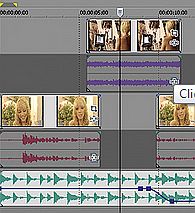
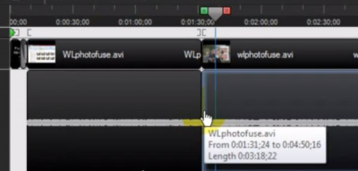
Inspired by visual track strips such as Adobe Premiere, Sony Vegas, and Camtasia...
Adobe Primere...
Sony Vegas..
Camtasia..
Idea: better but non-visual track strips
- add track headers
- visually distinguish audio from video, but don't actually show content on the strips like above
- simplify/improve the track-titling (show internal clip name, instead of full path?)
Inspired by current blender track strips, Adobe After Effects, and Lightworks..
Idea: show "effect" or "transition" attribute curves directly on the strip
Reference screenshot Camtasia Studio ... one line per effect
Reference screenshot Sony Vegas ... one graph overlayed on video strip
Reference screenshot After Effects ... paramater editor in the clip header
Idea: Show "Transition" Block on VSE strip
- some visual for showing a "transition block" and name/visual
- some visual for showing/editing the 2 inputs to the transition effect
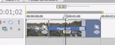
Screenshot from Sony Vegas showing "Page Roll" transition connecting two other clips to it's left and right.
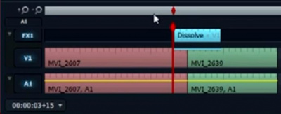
Screenshot from Lightworks showing "Dissolve" transition between two clips..
Idea: Preview - better "channel selector"
- ability to select "active", "output", or any specific track number
- optional: ability to select from a visual pulldown, like the visual-clip mockup above
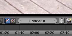
Reference screenshot of current Blender channel selector...
Idea: Preview info and video controls
- add minimal info about the output to the preview display
- resolution (final-render, preview-render, viewed-pixels)
- time information ( output time / percentage / frame number )
- prefer to use vertical real-estate, since today's video clips are often wide-aspect-ratio... perhaps akin to the 3dview subtle "lower left" into text
- come up with a way to get a better layout of video controls near the preview
- possibly through "header button customization" on the standard timeline panel
Sony Vegas:
One option with blender 2.67b:
Idea: control "render" output settings without using 3dview property panel
VSE output is affected by settings in the global properties panel. This is confusing for VSE-only users because the settings related to VSE are intermixed with 3d settings. There is also little utility to having this global properties panel on the VSE screen-layout all the time.
The goal here is to come up with a UI idea/compromise which makes the right settings accessible to VSE users, without confusing them with other settings or going to a 3d screen-layout.
VSE-related settings include:
- Render - where does F12/Ctrl-F12 render display?
- Dimensions - size/framerate of output video
- Output - file locations for output
- Post Processing - can turn off the sequencer
- Stamp
However, the global properties is filled with 3d settings not applicable to VSE-only projects:
- Anti-Aliasing - maybe?
- Performance - maybe?
- Sampled Motion Blur
- Shading
- Freestyle
- Bake
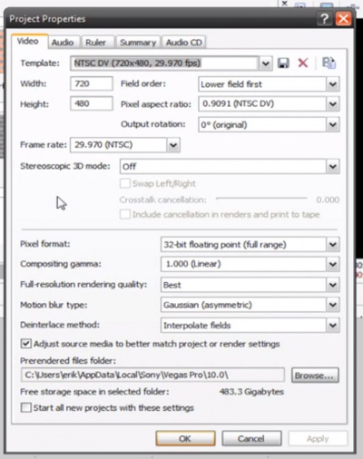
Here is the Sony Vegas "video properties window" popup for reference:
Idea: Improved Graph Editor Visuals =
It could be easier to..
- ..tell which curve is selected in the 2d view
- ..distinguish the cursor from flat curves
- ..see the points regardless of the curve color
- ..tell when points are selected/active
Idea: Improved attribute value editing
Editing an attribute in the Graph Editor right now is a bit confusing. See this current screenshot of the "default" property panel appearance. In this case we have a simple "volume" parameter of an audio clip selected in the VSE:
- It's pretty hard to find the "Value : 1.000" field, and there isn't any confirmation that this will actually edit the volume value.. since it doesn't say volume anywhere.
- This could take it's queue
