Dev:2.5/Source/UI/UILayout Design
目次
Text Categories

Since all the UI data should be allowed to be registered for translation the used texts in Layouts have to be retrieved or stored somehow. Let's classify UI texts in the following categories:
- Buttons View name ("Object", "Mesh Tools")
- Panel Names ("Transform Properties")
- RNA group/Template labels ("Image Link")
- Button Common label ("Clipping", "Location", "Radius")
- Button Own label ("X", "Y", "Hue", "Start")
- Button "value" (name or number+metrics)
The top level (1 and 2) can work based on a Python registry, to allow UI designers to categorize the top level navigation layouts.
The RNA group label is for exceptional cases, to allow to further group items within a panel. It can also allow to give a title to templates you use within a panel. RNA groups or Templates can be a "panel" too, or get drawn with a collapseable state (like constraints, modifiers).
The names from categories 3 to 6 come from RNA.
Text Font & Color
For each of the above categories, text font and style can be defined using themes.
Choices could be:
- Regular, Bold, Italic
- Point size (relative, based on zoom level)
- Emboss style, soft shadow
- Text color
Icons
Icons are only used in these cases:
- Buttons too small to contain text
- Popup/Pulldown menus
- Toolbox or radial menus
- Tool (Operator) Buttons
- Locations where linkable data can be dropped
Style hints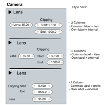

We can configure the Layout Engine to allow 'styles' for hinting how you want text and widgets to get a relation to other elements. The "styles" will be hardcoded properties of the Layout engine.
- Panels
Title: font type, bold/regular, shadow, text position
Backdrop, and/or header, and/or divider - RNA Group/Templates
Same properties as for Panel.
When Templates are collapsable, a way to retrieve collapsed name or icon (modifier name, etc). - Collumn and alignment hints, this can vary within panels.
- Widget collections
To be able to create the case like three buttons, labeled "Location" and with names "X Y Z" and its values, such collections have to be defined together. That way the 'style' hint can figure out how to draw this.
The illustration here shows three methods. The layout engine could support all.
Additional widget information

Even though panel definitions are "free", there are some cases when Blender could add additional UI info or elements too.
- Function Curve, Expression, Driver icon/widget
Assuming that every RNA item is animatable, it would be useful to indicate that a value has a function curve or driver, and even allow to activate/view/remove this.
Same goes for an expression, it should be editable somehow. - Indicating whether the widgets are usable according context (can be greying/blending out)
- Indicating whether the widgets are locked, like for library linked data
Similarly number buttons and sliders should provide access somehow to min/max ranges
Text inside or outside?

Here are a four variants showing inside or outside layouts. Each version has its pros and cons, so the layout engine could support this, and leave it to the available space, or other considerations to use the style that fits best. Based on further experiments with the layout engine a default can be defined for the UI.
Aspects we should pin down however:
- Define minimum displayed and/or edited precision for values
- Define minimum amount of characters we should accept to work in any layout, so translations can anticipate on this as well.

Sliders
For number buttons to get displayed as sliders a common rule can be defined as well. Examples:
- Only draw slider when value itself is not very important, but the visual representation is
- Only use sliders for fixed-range buttons, with an obvious range people could know.
Widgets
For each widget type, and for each widget-theme, the code will provide the following functions:
- handling callback, defining the input methods
- layout callback, to give hints for text or widget alignments (open topic though)
- drawing callback, optionally respecting aligned/merged buttons
Target is to provide for every type a visual style, clearly showing its functionality, and fully respecting themeablitiy and blending (for inactive).
The drawing code can provide the following basics to construct widgets:
- controllable soft shadow rect (texture)
- button backdrop, rounded, antialised, shaded, textured
- button outline method, rounded, antialised
- text/icon softshadow rect
- text/icon drawing
Major issue: in order to get crisp AA, all buttons and texts should be drawn on precise pixel locations. To allow zooming in/out on the interface (within limits 0.5 - 1.4?) it might work best to make the Layout Engine scale button coordinates according the view matrix, and correctly clamp them to integers.
Widget types:
- Icon toggle button
- Row button (exclusive "enum" values)
- Option button (also "bit flags")
- Tool/Operator button
- Number button
- Number slider
- Text string button (to rename data)
- File name button (separate design?)
- Linkage "Library" button (Object, Material, Parent, etc)
- Linkage data name button (Bone, Vgroup)
- Popup settings button, with optional text, icon or both.
- Popup linkage button (Materials, Bones, etc)
- Pulldown menu button (to invoke pulldown)
- Pulldown menu item (and menu backdrop + title)
- Button-less icons (open-close triangle, delete cross, ...)
- Color picker Swatch
- Color picker fields
- Normal button (rotatable sphere)
Widget Category: Number Button

Style options:
- Common label on top, or on the left
- Own label inside or outside, both with good visual alignment or separation
- Alignment as collumns as well as in rows
- No merged-aligned anymore? Only horizontal?
Functionality:
- Left and right hand widgets allow to mouse-drag values
- Center click allows to type values
- Method to inspect and change min/max range
- Method to view animation data
Widget Category: Number Slider
Style options:
- ...
- ...
Functionality:
- ...
- ...
Widget Category: Toggle
Style options:
- ...
- ...
Functionality:
- ...
- ...