Dev:Ref/Outdated/Proposals/Usability Project

提供: wiki
移動先: 案内検索
Usability Project

This page is a draft and will collect proposals to solve annoyances in the User Interface.

Note: Here the term "UI" is used in a general sense of "interaction of the user with the data", not only in the sense of the User Interface layout/behaviour.


Useful threads


Panels

Properties

Problem Suggested solutions Tradeoffs

Endless scrolling, due to inconsistent height of ui, due to:

  • foldable panels
  • variable order of panels (with tablet very easily accidental)

Use a second header of "tabs" like the context selector in properties panel.

Panels tabs.png

(in the mockup there are no icons in the 2nd row of tabs)

This would:

  • make foldable panels unuseful
  • greatly help muscle memory
  • permit to keep the properties panel in a square-ish view, no need to have long vertical views (takes a fraction of the space on the screen)

Searching information goes from just looking to clicking small targets.

  • maybe CtrlWheel Template-MW.png to switch tabs?
    • Just bigger target and requires key+mouse coordination. Still leaves plenty of blank space for those that have screen area avaliable.
  • Better muscle memory, but perhaps worse spatial association.
  • Using icons only to describe the contents of the tab wont be very coherent. At least dual encoding (icons + label) is needed, which however requires more space for each tab.
  • Icons will be very abstract and difficult to create and read.
  • What if there are many panels, like in the Particle Tab? There is much less horizontal space than vertical space, and we may wind up with a problem where panel tabs are hidden.

Allow collapsing panels with numeric keys, a la view layers.

Not so discoverable.

ScrollWithMnemonics.png

Add mnemonics to the panel headers:

  • Allows any panel to be jumped to by pressing the associated key (underlined).
  • Shows where each panel exists in the scroll bar (overlaid).
  • Text in scroll bar is distracting - but, it could be made invisible until Alt is pressed.
  • Is more a poweruser feature, then a helping guide for new users.

Endless scrolling, due to inefficient choice of arrangement of ui elements.

Examples:

  • checkboxes vs icons
  • extra vertical spacing around labels (below panel titles, above labels in tool panel)
  • See mailing list thread TODO port here that info
  • Removing spurious spacing (10 pixels) gets a full button for every two panels
Blender-minus10pix-spacing.png

?

Variable panel width makes some labels text show only partially

  • Fixed width panels, large enough to make room for the needed labels text

?

Toolbars

Problem Suggested solutions Tradeoffs

Last operator area and tool area conflicting

  1. See how Gmail handles this: left toolbar has 2 panels, Folders and Contacts: hovering the mouse on the upper panel enlarges the Folder panel, hovering the mouse on the lower panel enlarges the Contacts panel. (TODO: screenshot)
  2. Separate toolbars so people can arrange them as they want.
  1.  ?
  2.  ?

Properties panel mixes view (per view), object/cursor (general) and tool (grease) panels

  1. Split into related groups
  1.  ?

Last operator workflow problems

?

?

Stacks and slots

Ordering

Problem Suggested solutions Tradeoffs

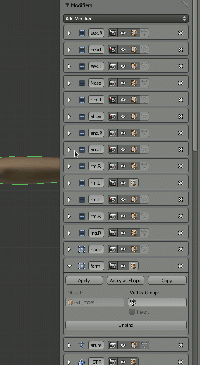
Re-arranging items in stacks uses small arrow buttons, requiring lengthy and error prone operation to reorder in long lists (production rigs can have many modifiers or constraints on an object or bone).

This applies to:

  • modifiers
  • constraints
  • materials slots
  • texture slots
  • logic bricks

In some cases, you have to fold an element to be able to rearrange it (i.e. logic bricks): this is smart but slow and painful to work with.

  • Use Drag and Drop to reorder items
  • Since Modifiers and constraints already have a 'header' area, blank spots on it form a useful drag and drop target
  • Remove the up/down arrow icons, decreasing visual complexity and giving a bigger target to DnD
Dnd mods.gif
  • Removal of visual arrows reduces discoverability; possibly solvable with a visual 'drag target' to click on (I don't like this because it makes the ui look messy again, implies that such a target is the only place you can drag from, and in practice I've found new users need the little triangle areas pointed out to them anyway)
    • Hide the arrows except for mouse hover and selected panels, if that does not mean other widgets will move around
  • (unlikely) accidental reording. If this is an issue, solvable with a order-lock, a simple undo, or a modifier for the drag.

Visualizing

Problem Suggested solutions Tradeoffs

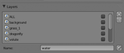
Only 5 items are visible in the scroll area in stacks, to see other items you need to scroll a lot.

Usability render layers.png

Valid for:

  • render layers slots
  • textures slots
  • materials slots
  • particles slots
  • vertex groups slots
  • shape keys slots
  • uv texture slots
  • ......
  • Let the user enlarge that area dragging the bottom border like we can do with panels.

Elements creation

Problem Suggested solutions Tradeoffs

Not possible to duplicate elements (constraints, modifiers, logic bricks), you have to recreate each one by hand. Forces you to rearrange, and as see above this is painful.

  1. Shift-D
  2. Ctrl-C/V
  3. Especially for logic bricks, box selection and then duplicate/copy selected elements would be a good sprint
  1.  ?
  2.  ?

Relations

Outliner

Problem Suggested solutions Tradeoffs

Clicking on icons doesn't always open the correct context in the properties panel. (TODO: screenshots)

Examples:

  • clicking on a mesh icon takes you in edit mode
  • clicking on a constraint takes you to the constraints context
  • clicking on a material icon does NOT take you to the material panel
  • Prepare a full list of inconsistencies, discuss and fix them

?

We can see what an object is referencing, but no way to see who references my object (for example which objects are using a certain material)

  1. restore the OOPS (with editable relations)
  2. list objects under a material or under a meshdata in a new outliner menu, the "datablock" menu shows too intricated information (TODO: screenshots)
  1.  ?
  2.  ?

See also:

Objects renaming

Problem Suggested solutions Tradeoffs

Renaming doesn't always update relationships that involve those object

Examples:

  • renaming objects updates contrained object (ok)
  • (TODO: file other cases I had problem with renaming --mindrones 18:51, 21 January 2012 (CET))
  • Prepare a full list of inconsistencies, discuss and fix them

?

Communication

Dangerous operations

Problem Suggested solutions Tradeoffs

You can do operations on hidden but selectable objects, and suddenly you find objects in weird places.

  • Warn the user in tricky situations in some blocking way that can be easily escaped, like when you click on ctrl-S -> popup that can be escaped or accepted easily.
  • Do not allow selecting of hidden objects.

?

Contextual information

Problem Suggested solutions Tradeoffs

Selecting the Game Engine we can see working constraints even if they aren't used in the game

  1. Grey them out
  2. Change theor panel color to communicate that they won't work in the current Engine
  1. Greying them requires to switch engine while working in the file.
  2.  ?

Icons

Problem Suggested solutions Tradeoffs

Some icons are not well designed or used.

Example:

  • outliner, objects have the mesh icon, while in the context bar the object is a yellow cube.
  1. Use same icon everywhere
  1.  ?

Disuniform information

Problem Suggested solutions Tradeoffs

Some panels don't have the appropriate information at the right place.

Examples (let's add the more we find here):

Render > "Dimensions" panel
Start/End frame -> BAD, you wouldn't look for time stuff there
Fluid > Domain > "Fluid" panel
Baking options are all around: bake button, bake path, time options are not well grouped together, mixed with domain options
  • Group stuff properly

?

Menus

Dimensions

Problem Suggested solutions Tradeoffs
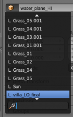
Usability dropdown adaptive height.png

When we have lots of items in a menu, we have to scroll a lot. Only arrow keys or mouse wheel work for this, clicking or hovering the arrows widgets does not scroll as expected from many other software that implement this.

  • A desirable solution would be to enlarge the menu so that it takes all the available vertical space.

Can result in massive menu sizes, chaotic.

  • The focus is 100% in picking something (a blocking operation), using the screen is not a waste, and there is no chaos, items are sorted.

Views

Dimensions

Problem Suggested solutions Tradeoffs

UI forces you go fullscreen and back all the time on small monitors

  • adaptive view dimensions: hovering on an area enlarge that one more than others, say 30% more than others (TODO: screenshot)

?

Object creation defaults

Problem Suggested solutions Tradeoffs

Default orientation for created Bezier Curve is bad for generating solid of revolution

  • Shape rotated 90° in X and Y so to be aligned with front view and ready for application of a "Screw" modifier set on Z axis

?

Bigger controls for Color Ramp

Problem Suggested solutions Tradeoffs

The arrow controls for the colors in the Color Ramp are way too small, they're hard to work with.

  • Make the arrows and color box bigger

?


Edit Mode Wireframe toggle for Subsurfaces in 3D viewport

Problem Suggested solutions Tradeoffs

When working with subsurfaces the wireframe gets in the way and it's difficult to properly perceive the shape of the object.

  • Ability to hide wireframe and vertices in the 3D viewport when working in Edit Mode on Subsurfaced meshes.

?


Template table to file new stuff

Problem Suggested solutions Tradeoffs

problem 1

  • solution 1
  • solution 2

?

problem 2

  • solution 1
  • solution 2

?