Dev:Ref/Proposals/UI/Analysis Bcon13
目次
Blender UI Analysis
There are many ideas and mockups to improve the Blender UI. If we want to make Blender significantly more user friendly however, I believe we have to think about the big picture and the hidden trade-offs, and there's little discussion about that. This is an attempt to analyze some of the issues that are not very visible but quite fundamental, and challenge interested users or developers to come up with solutions.
Flexible Multi Editor
Blender screens are divided into multiple editors like the 3D View, Outliner, Properties Editor, etc. This means you can create your own screen layouts, use multiple editors of the same type, mix 3D view editing with compositing, and do many other things. Important to understand is that each editor is like a mini application on itself, while still sharing some things with other editors.
This is quite flexible but leads to a number of design problems. Other applications may have flexible layouts but usually do not take the mini application concept quite this far, and have a tighter coupling between editors.
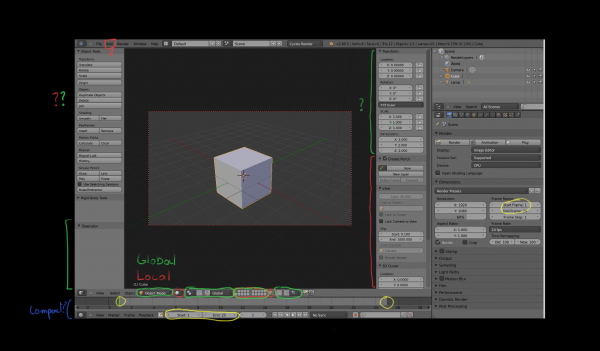
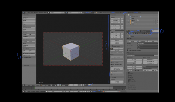
One issue is that some UI elements are duplicated between editors. Each 3D view can have the same header, toolbar and redo panel visible. While you can try to organize a UI layout to do avoid this duplication, this is often not done, because it's not so simple. For one, headers contain a mix of global and per editor state, and you may need to keep the per editor state visible. Second, if you have smaller 3D views, the headers and toolbar also simply do not fit, and you have to do a lot of scrolling.
It would make sense to pull some global state and toolbars out of the 3D view, but then where do they fit? They are still related to the 3D view and wouldn't make sense combined with a sequence editor for example. This is where the idea of each editor being their own mini application gets problematic, if everything stays within a single editor things are clear, but if you need tighter coupling between editors it gets quite fuzzy in arbitrary screen layouts.
Questions
- How can we avoid unnecessary duplicate UI elements?
- Which UI elements should be pulled out of individual editors and become global?
- Where do the toolbar, redo/tool panel, scene statistics, job progress and warning messages, .. fit?
- If we have per editor toolbars, how can we fit them well in layouts with small/split editors?
- What belongs in headers and properties panels and what doesn't?
- Can some editors like the timeline be made more compact?
Non-Modal, Non-Overlapping
The Blender user interface is mostly non-modal and non-overlapping. Non-modal means you do not have popup windows that block you from doing other things while the window is open. If the interface is non-modal it means you change some settings, and see their effect or test them out without having to confirm and reopen the popup window each time. Non-overlapping means you generally do not have overlapping windows. You have editors side-by-side and can edit in both without one blocking the other, and you spend less time moving things out of the way.
While this is nice we still have problems in Blender here. One obvious problem is that there is lots of scrolling. This isn't automatically solved by going modal or overlapping, and many applications suffer from this, but it can be just as frustrating as having to rearrange windows or go back and forth with popup windows. There is of course only so much information you can display on a screen at the same time and no ideal solution exists. But what can we do to improve this? You can turn scrolling into clicking by making a deeper hierarchy, for example turning panels into tabs.
The other problem with the non-modal, non-overlapping paradigm is that your screen layout may get more messy. If you want to edit a painting brush in another application, you might open a window, edit the settings, and close it again. Once the window is closed all that brush editing stuff is out of the way. In Blender you would scroll down in the brush toolbar, and open the texture tab in the properties editor. Once you are done tweaking, you have changed the interface and you need to restore it again.
Similarly, many users keep the 3D view properties region open. One reason is that they want to see the object transform properties all the time. But even without you see users editing toggling the normal display in edit mode, and just leaving the properties editor scrolled down and open. If this was in a menu, or a modal window, the settings would not stay there and clutter up the UI.
Going multiple times into the menu or window and editing things can be frustrating too of course, but perhaps we can do more to help users keep their UI layouts clean and uncluttered. Some applications for example have overlapping UI elements that allow non-modal editing, while encouraging the user to close that UI element once done.
Questions
- How can we avoid scrolling, going and back and forth between tabs, and other repetitive actions?
- How can we organize buttons into UI regions so that just the important ones are shown all the time?
- How can guide users to keep a clean UI layout with space for data, instead of buttons everywhere?
- Which UI elements would be acceptable to make overlapping?
Follow the Data?
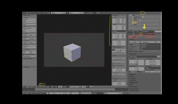
Another way Blender works different than some other applications is in how you open an editor and select the data to edit in it. If you want to edit a material in Blender, you would open the material properties or node editor. If it's the material on the active object, it would be already there. You may select a different material slot. You could also use pinning and select a totally different material, though this is not a feature used often.
In other applications the usual way would be to double click the material in an outliner or other place, and it opens an editor in a new window or changes the properties editor to show the material. Tree views and node graphs in other applications are much more central to how you select which data to edit, while in Blender you more often go to the editor and select the data there.
Which data an editor shows can be confusing. It can be some data based on the active object, or something you pick in the editor. One bad example is the image editor. You can locally choose to open an image. However if you enter edit mode it will switch to an image assigned to an active face in the mesh, so suddenly it starts following the active object. You can prevent that if you pin the image. If you render it might change your image to the render result.
That it automatically changes the image in the image is of course quite convenient in many cases, as having to select the right image from the list of images each time is tedious. But perhaps it's a problem that should be solved in a different way.
Another problematic case is for example when you paint on an image in a material. With Cycles you paint on the image in the active texture node, but this node is only visible as active when you open the node editor, and even then it's not communicated well. The 3D view follows the active scene > active material > active texture node > image path, but how can you communicate that in the 3D view?
So, there exist roughly 3 ways to select which data to show in an editor: follow active data tree, select from list or tree view in editor, and select elsewhere in a tree or graph. It would be good to clarify how this should all fit together.
Questions
- How should selection in the 3D view, outliner, properties and animation editors be synced?
- Should we make selection of data to edit more outliner based?
- Would you keep the tabs in the properties editor, or replace that by clicking on elements in the outliner?
- How does the concept of an active data tree fit with the ability to click and select arbitrary datablocks in the outliner?
- How can we communicate better which data is being edited in each editor?
- How do you open the appropriate editor automatically when double clicking on data?
Tools
Blender has a workflow that is mostly suited to working with shortcut keys. While practically all tools are available in menus, and there exists a toolbar, it's still quite different from other applications due to the way tools work in Blender.
Part of that is the Object > Action > Setting workflow, see this Blender 2.5 design document. What it comes down to is that you first select and object and then apply the tool to it immediately, instead of selecting a tool and applying it to an object.
It makes for a quick workflow in Blender, where you do not have a "select tool", and can do immediate actions with a single keyboard button press, while the editor focus follows your mouse position. But it's also quite non-standard.
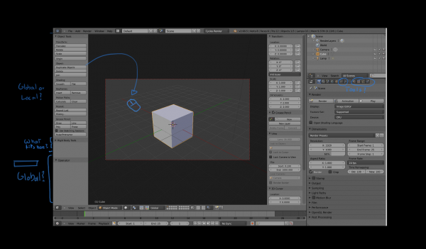
This workflow impacts menus and toolbars too. If the tools depends on the viewport position, and multiple 3D views are open but you have a single global toolbar, you would need to pick the 3D view to apply the tool in. If the tool depends on the mouse position in the viewport it's even more important to do that, while right now it starts with the mouse position on the toolbar button, which makes clicking on Translate in the 3D view toolbar, or clicking to add a node in the node editor toolbar behave quite strange. We could add view or mouse position picking for these cases.
Another problem we have now is that the redo panel is in the 3D view, but actually is a global state and should be usable for other editors too. Lifting that out of the 3D view fits the internal design fairly well, but in terms of UI layout also needs some thought. It might make sense to have a horizontal redo panel right under the main info header.
Questions
- Do we keep the Object > Action > Setting workflow for all tools, or should we deviate in some cases?
- How can we make toolbars and menus behave better for tools that depend on mouse position?
- Where does the redo / operator settings panel fit in the layout?
- Should material, texture and modifier tools exist, or do we keep that out of the toolbar?
Discoverability
Some features in Blender are difficult to find if you don't know where to look. That's a challenge for most complex applications, but looking at the default screen layout doesn't make that particularly easy.
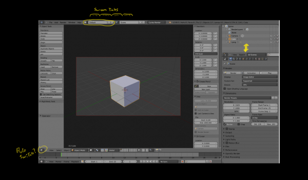
Screen layouts are quite difficult to find. We do have Animation, Compositing, .. screen layouts, but if they would show as tabs at the top of the screen, they would be easier to find, although they would of course take up more screen space.
We also have no global list of menus with nearly all options, or global toolbar that you can browse. It's per editor and you have to know the right editor to find the tool in. A 3D view specific toolbar covers many tools but still leaves other difficult to find. If we have good screen layouts that cover all editors, this may not be such a big problem.
Part of the problem is in the workflow that you often have to go to the editor or tab, and then find the data there, rather than clicking on data in the outliner to edit it. A more powerful outliner where you can add data and edit it by double clicking would help.
Further, tooltips are quite short and don't really explain much of the feature. Longer tooltips with documentation links and even images could make learning about features faster.
Questions
- Should screens be shown as tabs?
- Should the toolbar be global, per editor, or some combination?
- How can we open the appropriate editor when clicking on data in the outliner?
- In general, how can we make it easier for users to find the appropriate tool or editor to perform some task?
- Do we add buttons for viewport navigation without shortcut keys?
Priorities and Trade-offs
Adding features is something developers can do incrementally, but removing or changing features is also important. However if a developer tries that, there's often a storm of discussion that follows. We need a good UI module team would can confidently make such though decisions.
Most mockups and ideas are about adding things, but the overall user interface already feels cluttered, and adding more and more is not going to help. We need clever solutions to simplify the UI, and though decisions to decide what belongs at the top level of the user interface, and what should be moved some clicks further away in the hierarchy. We need to make decisions when to follow UI standards and when to do our own thing, taking pros and cons into account.
Something that comes up occasionally is to have a newbie and pro user interface, or to have a user interface that can be configured to match various other applications. However I do not believe this is a solution. For one, designing a single user interface is already work enough, we do not have enough developers to do this. Secondly, while you may be able to change superficial things, there is a lot of invisible workflow as I have explained above, and you can't simply make that configureable, it runs very deep in the way everything is designed and fits together.
Overall Layout
There are real trade-offs and puzzles to solve that you don't encounter when looking at individual parts of the UI. Some questions to think about:
Questions
- Which UI elements should be added to top level of the UI?
- Which UI elements should be removed from the top level and where should they move to?
- Which information should be drawn over the 3D view?
- Do you make UI elements smaller to save space or keep them the same size?
- Can scrollbars be hidden or somehow be made more compact?
- When you compare a modelling to animation or compositing layout, which parts of the UI are shared?
