Dev:Ref/Proposals/UI/Blender Node Editor -
current issues
The node editor is already quite excellent. Here are however a few new feature proposals to improve on an already great design. I would Like to address a number of minor issues and solutions to them!
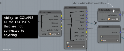
- Some of the nodes are very tall- taking up a lot of space and adding visual clutter all the time. A lot of their outputs are often not even used. You can hide them, but it is not communicated that sockets have been hidden (1)
- The input and output nodes inside a group node can get quite far apart, forcing the user to Pan around the node view quite a lot in some cases in order to get to them. This gets troublesome when you need to for example connect a node at the end of your pipeline, to the input node of the group. When you have lots of spaghetti its kinda hard to see. (2)
Design proposals
- For problem number 1: Add a dashed line or some sort of a visual hint that there are sockets in the node that have been hidden. Clicking on the dashed line could uncollapse it.
- For problem number 2: Add the ability to "Pin" a node, so as to stop it from moving in 2d space as you pan the view.
Design Proposals by Todor Imreorov. blurymind@gmail.com - april 2015
