Dev:Ref/Proposals/UI/Cleaner Panel Lists
Cleaner Panel Lists
Current Issues
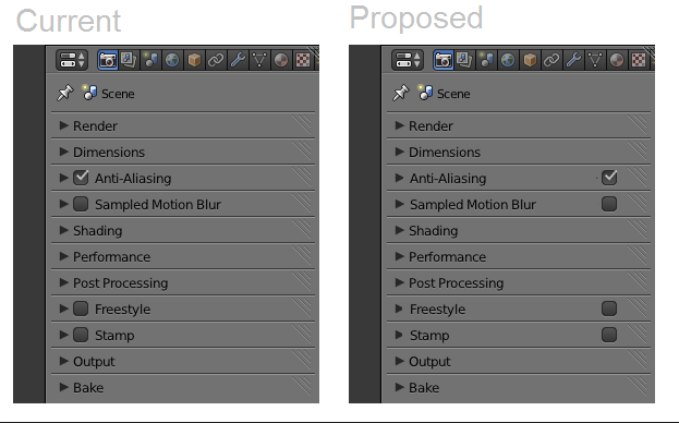
Panel lists are messy.
Text lists that are aligned to the left allow for quicker eye-scanning:
Blakenator
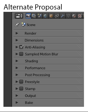
While having text lists that are aligned to the left allow for quicker eye-scanning, having the checkboxes on the left allows for greater clarity on what is enabled.
An Alternate Proposal (hopefully the best of both ideas):

Object Data Properties Behavior
The new behavior of the Object Data context of the Properties editor, where changing the name of the group happens in the list is really quite helpful. However it could be improved further, if, when the user clicked on the plus button to add a new item (for example, a vertex group), instead of having the user double click on the default name "Group" to edit the name, the default behavior was for the item to open with "Group" ready to edit, so that all the user needed to do to change the name was start typing. "Group" (in the case of vertex groups) should still be pre-populated in the list, so that if the user wanted the default name, the only action needed would be to accept the name by pressing enter, but if another name was preferred, all the user would need to do is start typing.
Brasshat 08:13, 29 September 2014 (UTC)
