Dev:Ref/Proposals/UI/Properties Tabs as a customizable Dock
reference to the proposed tabs in the properties editor: https://developer.blender.org/D667
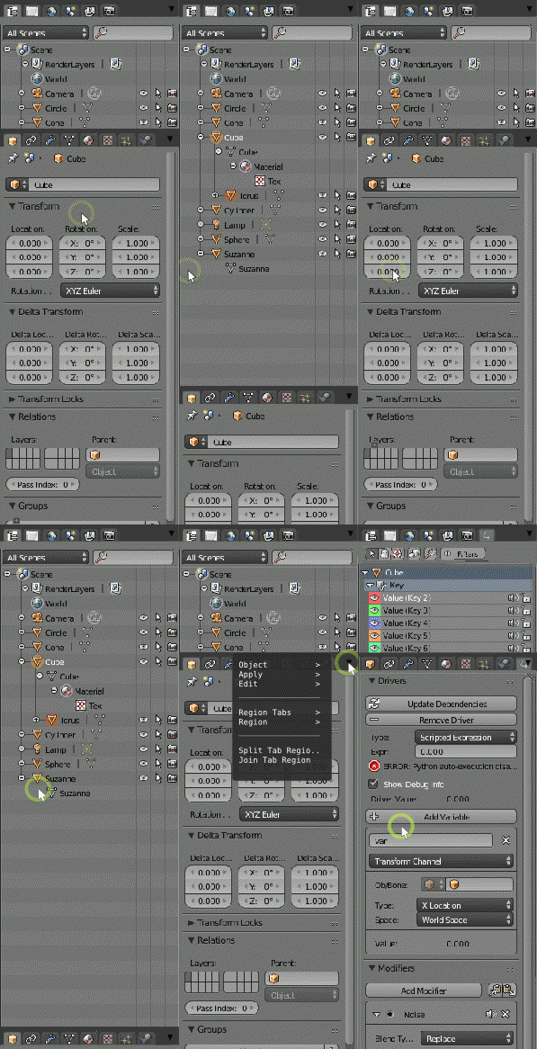
This proposal is about making the properties editor a "Sidebar" of a sort, similar to what many graphics programs use. The solution addresses many problems, so I'll go over them one by one.
1.
To many horizontal tabs: the tabs no longer fit in a reasonable width, which will get worse if real tab elements are used.This makes horizontal scrolling necessary to see all the tabs.
Solution: use two banks or regions of tabs that automatically focus on the active tab; providing room to work. Each bank can be collapsed with a MMB click, and recalled by clicking a tab.The amount of focus given to the active tab could be a percentage of total editor height, or a user preference.
2.
Confusing Organization: The current tabs are a mix of both scene properties and object properties with no clear division.
Solution: One bank of tabs is for selection,scene organizing and scene settings, the one below is for (active selection) properties. The select>edit_selection_properties concept could in theory extend to more than objects- we could use the same paradigm for editing things like render layer properties, or drivers as given in the example.
3.
Crowded and Clumsy layout:the current layout of the outliner above the properties editor is space inefficient, and very clumsy in practice. The user must resize the outliner and properties editor during normal workflow just to have space to work.
Also the area as a whole is too crowded for additions like layer manager, or for addons to define additional tabs
Solution: The design proposed automatically focuses on the active tab and lets you work efficiently.A layer manager can be added in the scene tab bank. Addons can define additional tabs.A drop down for each tab can contain less used tab specific functions as well as layout options.
4.
Unresponsive outliner: the current outliner does not "talk" with the properties panel very well: the user should be able to click on a material or modifier in the outliner or layer manager and have the relevent tab activated.
Solution:Integrating the outliner/scene manager and properties editor to display the tab relevant to the selection.This could include selecting a modifier in the outliner and tweaking the settings below, or selecting a render layer, and having a tab activate in the properties area to modify render passes.
Here is a gif to demo functionality:
Russcript
bahlerb3(a)live.com
