Dev:Ref/Proposals/UI/Splash Screen Close
Close Button on Splash Screen
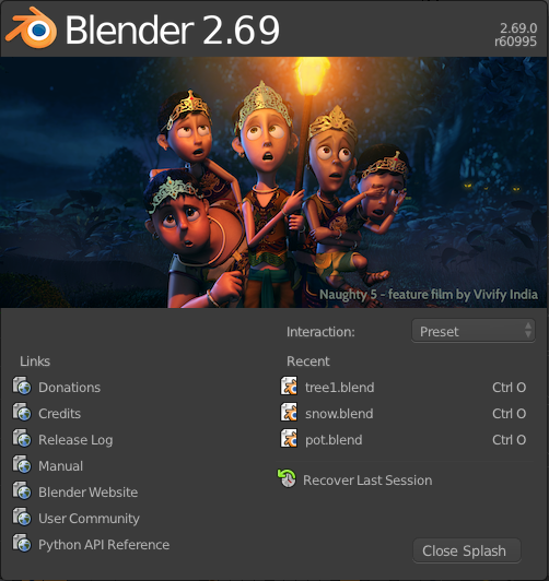
New Blender users can become confused when they open Blender for the first time and the first thing they see is the splash screen. The user will presumably want to close the splash screen and start blending, but they see no close button anywhere. They might click around and figure out that they simply have to click outside of the splash screen to "close" it. Or they may have to Google their problem to find a solution, which is a bad user experience.
Feedback
Expected Behavior
Having a close button is probably good, but need to be very careful the user does not become confused as to the purpose of the close button. Many splash screens are used to validate software licenses and such, and so when the license is invalid it often has a "Close" button that actually quits the software. Obviously we don't have this in Blender, but need to be careful people don't get the impression that that's what it does.
-- Jonathan Williamson
Okay, I updated the mockup, so now the button says "Close Splash" instead of "Close". Better now?
-- esalberg
