Dev:Ref/Release Notes/2.40/UI
目次
3D View
Lamp Visualization
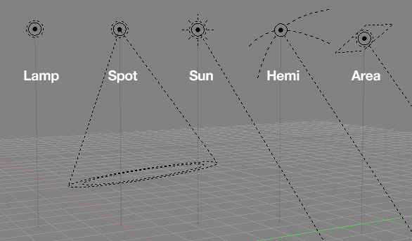
The visualisation of lamps in the 3D View has been updated. Each lamp now has a distinct visual appearance, that hopefully gives a better idea about how the lamp works, i.e. an omnidirectional lamp is represented as a point source, a sun lamp is shown with the typical sun rays, a hemi lamp is shown with arcs representing that the light is coming from a hemisphere direction, not just a single point.
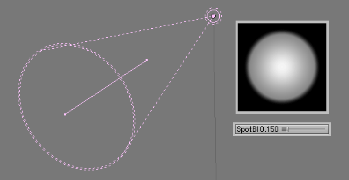
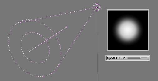
More information is displayed now - the dashed circle surrounding each lamp represents whether shadows are turned on or off, and a new circle inside the base of the spot lamp cone represents the SpotBlur falloff value.
- Lamps also have a theme colour in the 3D View. The Alpha value controls the transparency of the vertical 'stand' drawn from the lamp to the grid floor.
Camera visualization
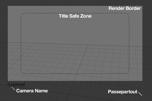
The in-camera view has been updated for a less intrusive appearance, and more customisability.
- Showing the title safe zone is now an option in the camera edit buttons. It's not very useful if you're not making stuff for video/broadcast so you can turn it off.
- Passepartout is now an option per camera, rather than per scene. Old files get converted over nicely with this so if you had passepartout on before, it stays on the cameras. There is also a new 'Alpha' slider, which controls the transparency of the mask.
- There is a new option to show the current camera's name at the bottom of the in-camera view, to help keep track of which one you're seeing when using multiple cameras.
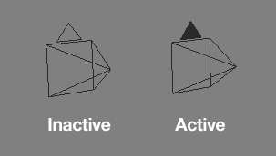
- In the 3D View (non-camera view) the active camera is drawn with a filled triangle for the active camera, while non-active cameras are drawn outlined, to help visualise which one is active.
Object Centers
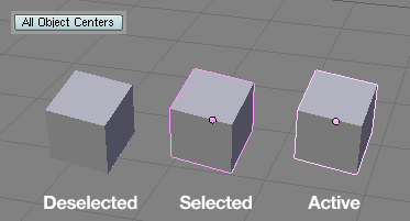
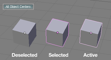
The Object center dots have been updated and given a new look. The new default setting only draws Object centers when the objects are selected or active, with the selected or active theme colours. They can be switched on for all objects, as in versions before 2.40 in the View Properties Panel. You can also save that as a default setting in the .B.blend.
The new center dots are drawn with OpenGL, and their (and lamps') size is customisable in the User Preferences "View & Controls" section.
Notes:
- Removing the old glDrawPixels() for centers or lamps not only makes Blender faster, but also prevents crashing on a couple of cheaper 3d cards (as reported for S3 and Intel on-board cards)
- Lamps and centers are drawn fixed size, in pixels. Also the 'sun' lamp draws screen aligned now.
- Center dots now also draw in blue to denote Library linkage or to show that an Object has been linked to other scenes.
- When objects are empty (no vertices) they will always draw as a center dot.
- Added theme setting for center size, and initialization
- Started removing calls to glBlendFunc(). Regular alpha drawing should become standard, and the (very) occasional exception should return this to default after usage.
Transparency
Actually nice feature too: when using Scene "Set" option, that scene draws its transparent and x-ray stuff independent of the 'foreground' scene. That means that x-ray in a set will be always over the set objects, but stays behind the current scene.
For transparent it works the same though... meaning that solid objects from the foreground scene will always draw over transparent from the "Set".
Note; this only is true for the 3d window, or the OpenGL render, not for actual rendering of course.
Clipping Planes
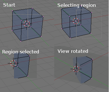
You can now define your own clipping planes in the 3D view, to isolate parts of your scene. Press AltB in 3d window, draw a rectangle, and it becomes a clipping volume of 4 planes. You then can rotate the view anyway you like. Works for each 3d window individually.
Disable it with another AltB press.
Window Management
You can interactively select which window space will be "kept alive" and what will be destroyed, when joining two windows.
http://e-learning.vslib.cz/~hnidek/pics/interactive_joining_of_scrareas.jpg
Menus
Plain Toolbox
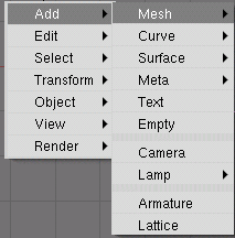
This changes the toolbox (space menu) to have the first level aligned vertically. Works much easier that way, and since the items open either left or right, it doesn't flip order of the contents for it either.
To allow people to test (and to compare) it's a user menu setting (in View & Controls, "Plain menus"). I've turned this on by default though, since I propose to not have it a user setting. User setting can be removed later. Long wanted hotkey support for opening and closing sublevels of pulldowns with arrow keys has also been added.
I didn't add the commenting out of correcting pulldown menu order, which is based on location of the originating button in the UI. This uncommenting didn't solve anything, since button definitions itself can be flipped too. (Example: the data browse menus in top bar need to be corrected).
I can imagine the order flipping is sometimes annoying, but it still has reasons to be there;
- The most important / most used items are always closest to the mouse. (like opening properties panel, or "Add new" for material.
- It follows muscle memory and 'locus of attention' (mouse position). menus are configured to open to the top for bottom headers, and to the bottom for top headers. We can expect the UI is configured consistantly for headers, so in general the menus will appear consistant as well.
Where menu flipping fails is especially for alphabetic listings, like in the menu button of fileselect. However, that one should be configured to open by default to the bottom, so ordering is consistant as well.
Popups
Error and OK messages now have icons, to better see at a glance what sort of message it is.
Button Panel changes
Layout changes
There is now a new sub-context ("tab") for all physics related button panels, located inside the Object context. There we can find now Particles, Fields & deflectors, Soft Body and Fluids.
Buttons that need Blender data names (ID's and Bones) now auto-complete names with a press of ⇆ Tab. Just press ⇆ Tab and it completes up to the level a match is found. If more matches exist a menu could pop up, thats for later.
Buttons window tab cycling - Repeated presses of the F7 key to go to a buttons context will now cycle through the sub-tabs within. For example, when at a different buttons window context, pressing F7 twice will cycle through to the Physics buttons tab, pressing F10 three times will cycle through to the Sound buttons tab, etc.
Text button editing
Text buttons now allow a selection too (like any textbutton in other UIs). By default, on activating a textbutton, the entire button text is selected when you enter the button. A single arrowkey or LMB ![]() click reveals the cursor then.
click reveals the cursor then.
Available hotkeys while editing include:
LMB ![]() : If inside the button, places the text cursor at the clicked position. If outside the button, confirms/finishes editing
: If inside the button, places the text cursor at the clicked position. If outside the button, confirms/finishes editing
LMB ![]() drag: Selects the text between the start and end point of the drag.
drag: Selects the text between the start and end point of the drag.
← Backspace: Deletes selected text, or backspaces a character
⇧ Shift← Backspace: Deletes all, as before.
Del: Deletes selected text or forward deletes a character
⇧ Shift←: Extends the selection left
⇧ Shift→: Extends the selection right
←: If there's a selection, move the cursor to the left edge of the selection, otherwise move the cursor left a character.
→: If there's a selection, move the cursor to the right edge of the selection, otherwise move the cursor right a character.
↑ / ↖ Home: Move the cursor to the beginning of the line
↓ / ⇥ End: Move the cursor to the end of the line
Ctrl← and Ctrl→: Jumps between special characters such as spaces, directory separators, etc.
Tab cycling through buttons
You can now cycle through all number/text buttons in a Panel by pressing ⇆ Tab. At the moment it skips buttons with tab completion (object names, bones, constraints) Press ⇧ Shift⇆ Tab to cycle backwards (any modifier will do btw).
Color Picker
Number fields have been converted to sliders and the color picker has been made wider. Sliders are more useful for something like RGB and HSV because they're fixed range values. A hex button for entering HTML-like colors has been added (eg. #RRGGBB, can be entered both with and without the hash sign). This should completely replace the former strange N functionality in buttons windows, and even add hex support for buttons which didn't have it before.
Notes:
- There are small rounding errors still
Colorband
CtrlLMB ![]() click inserts a new 'key' in the ColorBand, with color/alpha as defined by that position.
click inserts a new 'key' in the ColorBand, with color/alpha as defined by that position.
Oops Schematic
Drawing has been sped up.
CtrlRMB ![]() on an image in the oops view, activates images in the UV/Image window. Faster way to flick through images.
on an image in the oops view, activates images in the UV/Image window. Faster way to flick through images.
Outliner
Since clicking on outliner items activates/selects, and not all outliner elements allow selection (like scene, mesh, material, etc) there's another alternate selection method needed, for selecting the actual entries in the outliner.
It works by leftclicking (click-drag works too) outside of the outliner icons or texts. This allows rapid selecting, without any change in the other windows.
Then press W or RightMouse for an operations menu. Based on the selection you get a menu with options. Currently available;
Video demo: メディア:Outliner select.avi.zip
- Objects: Select/Deselect/Delete
- Materials: Unlink
- Textures: Unlink
- Bones: Select/Deselect/Hide/Unhide
Notes:
- Mixed selections give an error.
- Selection doesn't flush down into closed outliner items.
- Selection state is persistant (saved in files), and unique per Outliner window, so can be used as sortof temporal grouping.
Hotkey ⇧ ShiftA: select/deselect all open outliner items
Misc
Added hotkeys for rendering animation (CtrlF12) and playing back animation (CtrlF11) similar to rendering a still with F12 and showing it in the buffer with F11.
Added additional ⇧ ShiftSpace to fullscreen/tile window spaces. So much more convenient than Ctrl↑ / Ctrl↓ since you don't have to take your hand off the mouse!
Removed clipping conventions for setting startup window size in Blender. Meaning, for dual monitors you can start blender on a negative starting size too, like blender -p -1280 0 1920 1280
Added changing the extending / extrapolation type of the IPO curves of selected actions in the action editor (to the menu
Added 'Set Smooth' and 'Set Solid' to the mesh edit mode specials menu/toolbox/3d view menu so you don't always have to keep switching back to edit buttons.
Added copying curve resolution settings to the copy attributes (CtrlC) menu
Libraries
Test for using Library files for synchronizing partial data. This functionality is going to be in Outliner, for now only use for testing while consulting me. :)
New option in File → Append window, Sync Pose. When pressed, you can append/load an Object of type "Armature", this then replaces its "Armature" and "Pose" with the selected Objects. After that it deletes the appended object.
Note: it currently appends also Objects when used in Pose Constraints...
