Dev:Source/Modifiers/UI
目次
Modifers UI brainstorming
It's accepted that the current (bf-blender cvs) UI for the excellent new modifier system is a work in progress and can definitely be improved. The major thing that it's lacking is being able to see an overview of the current modifiers that are applied to your object.
Panel context
The modifiers panel is currently in the Object buttons context. While this may or may not reflect the internal workings of the code, it tends to break workflow with the Edit buttons context, especially when the formerly edit buttons subsurf controls are now separated from other related controls such as smooth shading and autosmooth. The modifiers also only work on Meshes and they change the Mesh obData, and although having mesh-specifc panels (i.e. effects, particle interaction) in hte Object button is not without precedent, it's not consistent with most other Object controls, which edit the object, not obData.
The modifiers would be better suited to the editing buttons context, and I'd recommend moving them there.
Panel layout/interaction
It's important to be able to have a good overview of the various things that are acting on the model, and to have quick access to the controls that govern their usage. Two possible options I came up with include:
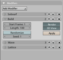
(Very rough and quick mockup alert)
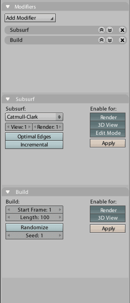
Separate panels with a 'manager'
This would have a master 'manager' panel which lists the modifers in order, with separate panels for each modifier.
Pros:
+ Flexibility for moving panels, hiding, docking, is already built in to Blender. It's also very adaptible to either horizontal or vertical buttons layouts.
+ Developers get a lot of space to use when creating modifiers, which may be useful for more complex modifiers (like Wave)
Cons:
- Extremely space consuming, especially if modifiers don't need it all (like Lattice, for example)
- Because of the number of panels, it could get very overcrowded, and may need its own sub-context. Horizontal

Vertical

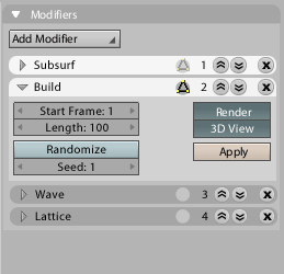
Single expanding panel
This would behave similarly to the current constraints panel, with the modifiers shown as little pseudo-sub-panels inside the main one that can be folded and unfolded with a disclosure triangle.
Pros:
+ Space efficient - modifiers only take up as much space as needed
Cons:
- Currently there's no built-in functionality for dragging and dropping to re-order modifiers, so you'd have to use little 'move up' and 'move down' buttons
To make it work better for horizontal layouts, we could make it so that when the panel grows too long, it splits itself off into another panel beside it. Numbers in the little pseudo-headers could indicate the order of the modifiers in the stack. This could be a good thing to do for others like the constraints panel, too.
Horizontal

Vertical


Edit: it looks like 'bart' has a similar idea over here: http://www.neeneenee.de/blender/features/#27
- modifiers_singlev_cage.png: