Dev talk:Source/Blender/Proposals/2.50 UI design
discussion page for UI proposal
目次
- 1 DISCUSSION GUIDELINES
- 2 UI proposals
- 3 About usability
- 4 Aligorith's thoughts
- 5 Yves Poissant's thoughts
- 5.1 Non overlaping windows (esp. file selection)
- 5.2 Single main menu
- 5.3 Context enabled/disabled menu items
- 5.4 Explicit focus change
- 5.5 3D Views as objects
- 5.6 Button views as objects
- 5.7 Right-mouse contextual menus
- 5.8 View zoom command menu
- 5.9 Auto-dismiss popups
- 5.10 Shortcut keys
- 5.11 Click-hold
- 5.12 Widgets / button panels
- 5.13 Buttons
- 5.14 Button panels layout in button views
- 5.15 Named Layers
- 5.16 IPO quaternions
- 5.17 Outliner view
- 5.18 Oops view
- 6 Menu System
- 7 Editing Panel UI
- 8 Artist and Designers vs the Digital Interface
- 9 Render Output and Encoding Settings
- 10 Old/New UI switch
- 11 Several Problems with new UI
DISCUSSION GUIDELINES
Add new sections when starting a new thread, it makes the page easier to navigate and easier to edit, don't use lines (-------)
Add subsections for lenghty replies, use inline edits with indentation (:) for shorter replies.
Sign your replies (--~~~)
Please keep in mind that this is a wiki, not a forum.
Instead of everyone adding a new section, try to put in the appropriate section. I wont move others work, but it would be great if each could move stuff where it belong. If the answer is very lengthy, put at least a tittle just below
Create corresponding entry on main page
UI proposals
- Top Level
- Single main menu
- Context enabled/disabled menu item
( I disabled explicit focus changes, because it steared too much controversy, mostly because lack of explanation and misunderstanding. I'm preparing a document showing what i think for preserving speed access but get good contexts still)
- platform dependant or common file selector
- file selector space and selector used when opening a file should be split
- Input methods
- Standard widgets
- Editors
- Outliner
- put kattkieru's proposal on its own page
kattkieru's reply
In reply to Shul: - I, too, agree with many of the PDF's observations.
- Blender *is* easy to use, once you've learned it-- it's main problem is that it's hard to learn. Things are esoterically named and you don't always find buttons or functions in areas where you'd expect them. An example is the Retopo tool -- it sits in a panel with the UV sets and mesh settings when it is obviously a Mesh tool. However, the Mesh Tool panels are pretty full, and it's actually longer than the other panels so that when you hit Home to frame all panels the rest shrink in an unpleasant manner.
The real issue here is, I think, that Blender's interface needs to separate actions / tools from variables / settings -- an Attributes Editor. I'm thinking about how to propose this, but the ideas are still pretty new in my head. Essentially, there needs to be a whole space devoted to variables for both selected objects and selected tools, where User Data also shows up and is keyable.
This can be combined with the current methods, too. Since the upcoming release will be introducing a modifier stack, the active tool's modifier entry in the stack can be viewed in the Attributes Editor and be modified. For example, at the moment a user can hit the E Key and drag in the viewport to extrude a face. However, with the modifier stack entry visible in the Attribute Editor, the user could then modify the extrude more if they wanted to, such as changing the number of divisions, modifying the angle or curvature, changing the rotation of each division, and so on. Done right this wouldn't piss off old users and wouldn't interfere with the keyboard shortcut workflow, but would be a boon to users both old and new.
- Not a fan of drag and drop primitives. Seems like a waste of time, especially since they won't appear exactly in the 3D scene where you want them. Clicking an icon button that creates prims as they are right now, at the 3D cursor, might be nice for new users. I actually think that Blender needs a Shelf Space like Maya, XSI, and (in a different way) Cinema 4D have where users can dock icons for tools they use frequently. The defaults for this would be sets based on action types -- creation, modification, surfacing, etc.
- Usability. There is absolutely no reason why speed of use should *ever* be sacrificed. Blender's one major leg over the competition is that an experienced user can do things in it in a fraction of the time they'd take in other packages. (I went through that with something myself last week in Maya; what would have taken me a full day ended up taking me 20 minutes in Blender. I composited renders from each package together.) Usability should be improved without sacrificing speed. If usability sacrificed speed, we'd have Modo (which is an excellent program that's just now approaching what Blender was three years ago in many ways). Modo's choice to keep the 3D views drawing while you resize viewports is a valid one usability-wise, but makes the redraw VERY slow, and therefore less useful to people who try to shave time off wherever they can.
Cinema 4D is another good example of speed being sacrificed over usability. There a lot of tools in C4D that can function as five or ten separate actions in Blender. The problem is that in order to switch between the modes on those tools you have to go into the UI; you can't just hit a key combination without scripting it all out. Because Blender doesn't stack similar tools into one tool with options, you can do things in seconds with keyboard shortcuts that take considerably more time in other apps. You may think this contradicts my above notes on the Attribute Editor, but it does not. That would have settings for one tool, not modes for turning one tool into another.
- Something nobody's really gone into: we need the option to set rotations on bones to Euler by default, and the ability to change the Euler order. I didn't think that having only quats was an issue until I started doing curve cleaning on quat rotations. It's a headache.
- Curves. The twisting needs to be fixed (it's been an issue for as long as I can remember, and I've been a Blender user since before 2.0). Blender also needs to be smarter with curves and curve operations -- you shouldn't have to match the origin of two curves to get them to line up.
- What ever happened to the Nurbana merge? There was some guy who was going to merge his Nurbs tools into Blender and then vanished? Nurbs haven't been refreshed in ages and they really show it.
- Don't know if this was fixed in 2.46: When using a mesh object to change a bone's appearance, the mesh object should appear the same scale as it is in the scene regardless of the scale of the bone. There is no reason why you model something to scale and then have to resize it once you assign a bone to that mesh shape.
- I haven't submitted this as bug report but it's annoying: in 2.46 the crazy space fixes are brilliant, but the manipulators do not move to where the adjusted positions of vertices, faces, etc. are after they are effected by the modifier stack. The manipulator handles should also move to where the component they're editing is after the modifier stack is applied.
- Oh, one more thing. Setting manipulator handles to Normal doesn't work as expected. In fact, most of the time the handles don't point along the normal that they should be using, or at least that I'm accustomed to seeing in other packages. I'll explain this more clearly later.
~ kattkieru
Lukep's reply
kattkieru, could you move (or even better summarize) some of your excellent ideas about outliner and drag&drop in the proposal page ? I agree almost 100% with your ideas (in fact i came with the same results independantly and almost put it in the pdf). Update -- I have gone ahead and created the page
the rest of your ideas are good too, but need a bit more discussion and refining, i feel.
please note this discussion page is not for feature request but discussion about proposals in the main page ;)
Lukep 17:40, 6 May 2008 (UTC)
kattkieru's second reply
Wow am I glad I sat down to do that outliner bit. ^_^;
I know the Nurbana thing sounds more like a feature request than a UI discussion topic, but I don't think so. Nurbs in Blender are inherently hard to use because of their current methods of manipulation -- interaction through the UI. Simple things like how the Nurbs point cage is drawn need help. On the sphere, the point cage appears open at one end, and that's confusing. It's also not easy to tell which points are being selected when you try to click on the end points, say if you want to make a hole in the top of a nurbs sphere. It's not a huge deal for me; I don't use Nurbs. It was just something I was thinking of as I looked through the different parts of Blender that could use a UI refresh. So apologies if that was off-topic.
Euler, too, is a UI option that I think falls more under UI than it does under features. I'm currently a student at Animation Mentor. For years I'd never thought much about the difference between Euler and Quats, but now, having animated (at this point) eight or nine shots over the last four months, I can say they're an absolute necessity when the time comes to clean curves. From a user perspective, only offering Quat-based rotation channels can be quite frustrating. When it comes time to final an animation, having three channels that connect visually to local rotations is very important to a fast workflow.
The other option would be to set everything to Quat but allow objects and bones to switch to Euler. That'd keep with old-hat Blender expectations while allowing a better system for certain body part animation. But the choosing of the rotation order is paramount for this to be useful to anyone.
- The Euler representation issue is really a UI issue. I does not change the way the actual interpolation is managed inside Blender. It only changes the representation. And that is UI. I agree with kattkieru that the Euler representation is and absolute must-have. Trying to tweak Quat rotation IPOs is just too mind bending to be of any use. Might as well just remove those channels from view. -- Ypoissant may 9, 9:45
- I agree this is a good option to have, an whether it is an UI issue or not isn't really important, as far as I'm concerned it's not a 2.50 issue. It can be added right now or after 2.50. Same goes for NURBS. -- Brecht
- If that could be added right away, then that would be really usefull for the current Blender Bootstrap Animation Classes that we are running on BlenderArtists. -- Ypoissant ma 9, 10:40
- Well, what I mean is that 2.50 should not blocking anyone to work on it, but still someone has to take the time to implement this (non-trivial) feature. -- Brecht
-- Kattkieru
About usability
Could people define usability? I always took "speed" as part of usability (fast or slow to be used), while learnability as another front. Things can be easy to learn and hard to use later, and the complete opposite, hard to learn, and easy to use once you know how (best being easy in both cases, obviously, but not always possible). So which version are we using? The one that covers all everyone can thinkg about (usage, learning, "it looks cute", quick to be coded...) or a more specific one? Thanks.
Gsrb3d 18:43, 6 May 2008 (UTC)
- You will notice that I dont use usability in the pdf, for exactly that reason, the definition is fuzzy ;) usability is usually seen as a combination of coherence, feedback & fluidity. I prefer we focus on the base terms which are much more precise. learnability is also a very fuzzy term. Lukep
Aligorith's thoughts
Some thoughts on lukep's analysis:
- Local Menus - I don't see a problem with this. Having to drag the mouse all the way over to a 'central'/'main' menubar to get to the menus which apply to an editor in another part of the window seems to be more of an annoyance than a positive thing. Also, needing to explicitly identify an editor as being active in order to see its menus is too clumsy to be helpful. Having to explicitly set the focus can also be confusing for the user (unless implemented carefully), as they may not remember to change focus when going to perform another action.
- Currently, when several windows/views are opened at the same time, it becomes impossible to get all the menu options, the 3D manipulation options and the view options all visible at the same time in the menu/tool bar. We then have to scroll the menu/tool bar. And that is much more complex and inefficient than to move the mouse to a main menu. Beside, on OSs where the convention is to use a single main menu bar, this gesture is automatic for all users. Actually, getting to a child menu requires to stop and think for a split second which is disruptive. -- Ypoissant may 9, 9:15
- Hmm you know how most of our window managers have an 'autohide' for the launch/menubar? What if the blender menus could be fully expanded after hovering the mouse over the menu for a half second or so? Then you could get the full width to see any obscured option. LetterRip 06:54, 25 May 2008 (UTC)
- That is an interesting suggestion that is worth exploring further. One caution I would like to add regarding that sort of expansion/collapsion (I just invented that word) is that the current design of auto-hiding of popups and sub menus are sometimes frustrating. Moving the mouse cursor just off the retention area will result in the menu or popup to disapear and then the whole selection operation needs to be redone again. This may not be a big issue on a 800x600 screen because the retension area is relatively large but it becomes annoying on 1920x1200 screens because the retension area is relatively small. So if that kind of technique is further used, care should be taken when designing the auto-expand / auto-collapse UI feature so it does not become a new source of frustration. -- Ypoissant may 25, 9:50
- Hi there! I'm new in this discussion, but I have been working with Blender for a while and thinking about that problem with menu options that can't fit once user has split the screen several times. My idea is to arrange windows in such way that windows of the same type must be next to each other and all have one common header they are linked to. Also this header should span all the windows of that type, and there mustn't be more than one header of the same type present in the screen. This could be easily achieved if one more option is added beside the SPLIT option on the window edge, it will be the SUBDIVIDE option, and it will work by actually subdividing one editor into two VIEW SPACES, that cannot be turned into some other editors (for that the SPLIT option should be used). Each view space should only have one little button in the corner that uses that 'autohide' feature which displays the menu similar to what we have now under the VIEW button in the 3D view header. Hope this makes sense :) -- User:Markomedia june 24
Some thoughts about other notes:
- Drag drop of primatives - Bad idea. Small icons showing general idea of primatives is OK, but a gloated list of images previews of primatives, from which they are dragged onto the screen isn't.
In general, I'm opposed to the idea of drag and drop. However, as long as it doesn't become the only way that things can be done, that's fine. The problem with drag and drop is that it is either a pain to keep mouse depressed while dragging, or a when movement was not intended.
- Attribute Editor - the general idea can be good in some situations. However, it is critical to avoid the "Property Table" syndrome (see VB6 and K-3D for examples), where properties are simply arranged with one property per row, in a long, alphabetically order list or such. The main problem with these is that properties are usually grouped in ways which mean that even related settings need be found by moving up or down, sometimes by large amounts. While poorly grouped settings can be just as bad, they are not as bad as having settings stored in a monolithic grid or equivalent.
- Most software solves this by allowing the user to filter down the attributes visible. The attribute editor would be a major reworking of the Blender systems, including a flag for every attribute that says whether the attribute is Visible, Keyable, etc. Maya got this right. In general, we wouldn't have to worry about the list getting too long because the number of attributes most people tend to edit is small. On bones where custom attributes would be used to drive other objects and deformations, you could just have the attribute window scroll. Also, the main values -- position, rotation, scale -- should always stay at the top. --kattkieru
- At least one issue that the properties paradigm would solve is the plethora of cryptic acronyms and abreviations that now serve as names on too many buttons. The property paradigm would allow to label those properties with much longer names and descriptions right there. And tooltip (when hovering) would be essentially used as a popup help system instead of a hunting-down-properties system. Binary type properties are easier to figure when their state is clearly marked as "ON" / "OFF" instead of figuring that the button looks pressed or not. Nominal properties are also easier to figure when their current value is displayed instead of seeking which one of the many buttons is actually pressed. There are many many advantages to the property representation paradigm and this should not be dismissed a priori. Because property values are all aliigned along a vertical column, scaning their values is much more efficient than scanning among a free grid of disparately dimensioned and positioned buttons. Properties can be organized into collapsible groups, sub-groups, sub-sub-groups, etc. Like any other paradigm, properties should be organized in a well thought out and designed way. Not just dumbly into alphabetical order. -- Ypoissant may 9, 9:30
- I don
t think that plethora of cryptic acronyms is such a big problem. 1. If you are working with 3d software you have to learn tecnical terms. 2. English is not my native language. Lerning the english word "Raytransparency" for me is the same as learning "Raytransp". 3. Most of the times I need to find the position of a button. Closing my eyes I have a picture of the workspace in my mind and I ask myself: in which area can I find the Raytrans Button. When I have localised the specific area on the monitor, I have to find the right button among the others and Iam mostly depending on a clear button structure. Only in the last step I identify "the right button" though its name. A good and organised structure, assisted by colors is important. To find positions easily is more important than to have "easy to read buttons". --Toni Grappa 20:26, 10 May 2008 (UTC)
- I don
- I totally agree that the presentation structure is more important than the naming. But that does not mean that naming is not important. I suggest that both the presentation structure and the naming be considered and taken care of in a future UI redesign. One does not oppose the other. -- Ypoissant may 11, 1:20
- My intention in not to discuss only in "black and white", but my english is poor. Sorry for that. Changing things has something to do with "find a new balance" or find "new compromises". --Toni Grappa 09:40, 11 May 2008 (UTC)
- OK. I understand that. -- Ypoissant may 11, 14:00
I acknowledge that in some situations it may be helpful to be able to do that, but if such a display exists, it must not be the only option. However, such situations where they are useful, are limited to when operating on data from several sources (which doesn't happen, as Blender has a good operating-on-active-item concept).
- boneshape-size issue - sure, it's hard getting the shapes to be the right size when assigning them. However, it's a bad idea to make them independent of the scaling on the bone they represent, as that means that it is no longer possible to visualise scaling of bones.
- I think I was misunderstood there. It shouldn't really be independent of the scaling, but when you first assign the shape it should match, visually, the shape's original size in the 3D view. Scaling up and down afterwards would, naturally, scale the shape, but in relation to that original size. --kattkieru
--Aligorith 04:15, 7 May 2008 (UTC)(Sign)
I agree with Aligorith. drag&drop will make the whole thing harder to use in the long run, but I thought it would be a good idea since you got to have some visual Q for new users. doing the space->add->choose primitive sequence is not intuitive, and I learned it through maya (I think..).
- How long does a beginner needs to understand the mecanism of Space -> Add -> something - 30 seconds. This is nothing in comparison to a menue, which occupies working space and bothers me for the rest of my blenderlife. --Toni Grappa 16:24, 10 May 2008 (UTC)
- I make a distinction between time to understand a mechanism, time to learn about a mechanism and time to integrate a mechanism (what some people call muscle memory). Of course, it just takes the time to read the description to understand the "spacebar" access to adding items. But it can take very long before learning about it. It actually takes all the time to search the documentation provided the new user already know the keywords (the Blender vocabulary) to look for in the manual or the time it takes to read the manual until reaching the section that explains this. The simple fact that this mechanism needs to be explained in order to be able to start adding primitives and other stuff is a sign of peculiar design. There are other more conventional access mechanisms that new users will try first. And the time it takes to integrate that mechanism is also much longer. After using Blender full time for 4 months, I still sometimes have to stop and think about that mechanism. This happens more frequently after I have used another application for a while. -- Ypoissant may 11, 1:35
Some months ago I was working with PS and wanted to close the application and hite Q. Nothing happend. This cannot work, I said to myself, Q has changed to Strg-Q. :-) What I want to say is, that Blender has its individuell solutions in some areas, that work fine and like Ton said, quality is the most important thing. We should not dispose Blenders indiviual quality solutions only to become more "conventionell". To be individuell is no quality em si, so for example I like the idea of having context menues using right click, even if this means, we have to kill one of the "holy cows" in Blender. --Toni Grappa 14:40, 11 May 2008 (UTC)
- For one thing, I don't suggest that we kill any of the Blender's "holy-cows". And I don't think the ongoing discussion is made in that spirit either but I can only assert that position for myself. Given the strong reactions to any suggestions of UI changes from Blender's old-timers, I think the old UI will need to stay there in some form of another. But another UI needs to be designed. I believe the event system refactoring is being done in that spirit.
- Now, that Blender have its individual solutions and only its individual solutions is an issue. When people work on some OSs, there are some necessary conventions that are learned and integrated. I understand that some OSs don't have those conventions and even don't have any strong conventions and so to the users of those OSs, it may be hard to see the point. But people who have chosen to work under Windows or under OSX have adopted those systems because they like the conventions. People who like Windows will dislike Mac conventions and vice-versa.
- I think we need to define "quality" before we can accept that as an argument. I have 14 years experience designing UIs and in the begining, I actually sat long hours observing users using computers and applications and noting their reactions, confusions and efficiencies. I don't write that as an argument of authority on the subject but I just want you to understand that for me, "UI quality" is quantifiable and the quality can be explained and if we can keep the discussion on the "explaining" level and supplying examples, then we can progress. Conventionality is a strong quality because the user don't have to switch gears and think before doing an action. When conventions already exist, it is much more efficient for the user to be able to rely on already acquired automatisms. There is already a lot of places in Blender, because of the application's nature, where UI design needs to be imaginative and creative and where the user needs to learn and integrate new concepts with new ways of using them. I don't see any reason why already conventional ways of doing things would need to be redefined. As for Ctrl-Q, I would have a lot to comment about the choice of shortcut keys but that will be for another topic. -- Ypoissant may 11, 13:50
As for usability, I worked in the field and I can tell you that like lukep said, no one really knows what its about exactly but the common definition would be something like "easy to use, in all areas", the reason for this vague definition, I suspect, is that usability comes from the users definition book, and they never bother on formally defining anything.
So again, in order to ease the use of new users while not harming the current flow we know and love I can think of some suggestions: 1. have an easy, regular and advanced layouts, where one can start from the easy and *work with it* , and it prepares him/her for the next level
2. have more (much more) visual Qs and hints in blender (for example, if you see the user fiddles about without pressing anything for more than 30 seconds, show a tooltip saying "would you like to jump over to our site? we might have some good tips for you to use)
3. think about the way things are organized. I know that the current clutter is because of evolutionary work, but with a new UI we can change this, and lukep had lots of great ideas.
The above is not mutually exclusive, all points can be done in the same UI.
As for the attributes idea - I have mixed feelings about it as well, since searching in an attribute list is not easier than searching anywhere else (on the contrary, if you need to press a key to get there, or scroll there, its harder)
Oh, and please don't go with the floating gimp-style of windows, its horrible :-)
--Shul 06:47, 7 May 2008 (UTC)
Yves Poissant's thoughts
I supply the following critiques, comments, suggestion with the spirit that they could be interface modalities that would be available on the corresponding host OS platforms. I don't think that Blender UI default behavior should be dramatically changed but I think that more host OS conventional UI modalities should be available as options for those who desire them.
The following is just the tip of my thoughts on Blender UI. I would have much more to say but that is a start. If anyone is interested in some particular aspect, I can eleborate more and even do mockups.
Non overlaping windows (esp. file selection)
Nice concept overall but overused in inappropriate places such as the file open and save where the presentation is unconventional and the file and folder navigation is also unconventional. The algorithm that selects which view is to be replaced by the file list is unexpectable and can appear in very small windows depending on the project so the workplace sometime needs to be reconfigured and resized to accomodate a good file list view and navigation. This is a place where the non-overlaping window paradigm breaks down. This operation should use whatever platform functionality there is available and should conform to the host platform conventions.
- In as much as file selectors are concerned, I agree. File selection is the sort of operation which would be fairly easy to make pluggable with user selectable implementations (for some people, a common file selector on all OS is a good thing). This would be fairly simple to implement in Python, it can be done rather easily for the KDE file selector and I don't expect it to be hard for other WM either (it wouldn't be hard for Windows at least). I've toyed with that idea (making pluggable operations) for some time now, so you can expect some development in that direction in the future. --Theeth
- Agreed - file selector being 'non standard' is a big annoyance to many users both current and trying to transition. LetterRip 07:04, 25 May 2008 (UTC)
- Something that could be fixed before 2.46 final is just having the file selector pop up full screen like the render window is able to do now. The code could be reused, no? (I think this fix has been mentioned before; if I'm doubling up I apologize.) -- kattkieru
I fully agree with the suggestion to use a single top main menu for the whole application. Not only multiple menus utilize screen estate but they are redundant since they are contextual anyway and they are confusing when the exact same set of menu items appears under several 3D views but their commands affect only one of those views and the user must stop for a moment and think which one of all those menus must be accessed. In addition, main menu items need to be uniformized among contexts (panels/views). However, there are certain contextualized operations that are currently accessed through menu options which would bettter be used through tool palettes. In general, there is a confusion between commands, tools and settings in the current menus. For instance, view settings / properties is better related to each views but is also better represented by view properties than by menu items. Also, menu functioning should comply to the host OS conventions.
- It would cost an extra click to activate a subwindow to reveil a top menu then. Then I rather make a top bar (conform to OSX) for global or per-window settings, and allow the tiled windows to have their own 'headers'. Don't forget that the design spec for 2.5 allows multiple windows. (and thus a single top bar possible) as well as subdividible areas, like four 3d windows with 1 toolbar and/or menu. This concept will give more freedom to define very good contextes (window -> screen -> subwindow -> regions), it even allow popupped file requesters.
--User:Ton
I'm preparing a document about menus, presenting in detail my ideas. It is indeed a difficult area, because we need to preserve speed access, but also solve some of the weakness of blender GUI for begginers. Oldtimers use key driven commands, and are so less concerned. Still, blender has grown a lot, and I'm pretty sure most users dont know anymore all the hotkeys.
Menus are the ideal tool for feature exposure, and the less places to search for them, the better, in my mind. Consistency in menus (eg same structure in menus, toolbox and key menu) is also a premium. We are very far from that second goal, from what I see. Lukep 21:44, 12 May 2008 (UTC)
I fully support that suggestion. The enabling/disabling menu items are excellent visual feedback mechanism as to which operation is available, first, it is a great learning aid and second, it makes the interface more conversational and collaborative. When an operation or a command is not valid
Explicit focus change
The implicit focus change is a source of frustration. Shortcut keys produce different operations just because the cursor in over a different view even if the user was in the middle of an serie of operations. Mouse may be moved over an different view unvoluntarily due to going to another application, getting interrupted or just a gestual mishap but not because the context change was desired. Explicit focus solves that. The explicit focus change is also a convention on many host OSs. Also, the current visual feedback as to which view have the focus is weak and is easily overlooked. Main menu change would be a good additional visual feedback that the context have changed after an explicit focus change.
- Focus follow mouse is a long standing tradition on unix systems, especially those with tileable WM. Since windows don't occlude on another, there is no confusion, the focus IS where the mouse is (In Blender the window's frame is even highlighted, though I guess it could be better indicated). This is one of the things I seriously doubt will change. If explicit focus is ever added, expect it to NOT be the default. --Theeth
- the problem is that single menu require explicit focus change, or it is a mess to programm (you could store the view where the last op happened and use that when you hit the menu, but it less than perfect). If the former is considered as important, and I really think it is, explicit focus change is pretty much part of the deal.
- And I agree with Yves that implicit can be very very very frustrating at times-- Lukep
- Then, to me, that sounds like a deal breaker for the single menu approach. We already have the toolbox as a not quite single contextual menu, I'd think it would be a much much better idea to push that further (toolbox for all window types, radial, whatnot) than go with a single menu, especially if that means having to drop focus follow mouse (I can guaranty you there will be an uproar if that's dropped). Moreover, while a single menu is all nice and cool on OS X with the properly positioned top menu (assuming we switch to using that, which isn't here nor there), it looses all positioning advantages on pretty much every other OS we support. --Theeth
- The toolbox is a very bad solution to this problem, for many reasons. The more important one is exposure. But also its position is not predictable, which put us back to the previous situation. Pretty much every other software on earth and on all OS use the single menu approach for exactly that. It is much more gentler on the inexperimented user. Local menus break muscle memory big time because you need to search where they are. Also keeping thing coherent is much easier. I've started to do a synthesys of all actual menus, and it is a serious mess. Identical menus are in a different order, things are in different menus in different views, entries are missing in a view and actually work, and so on. This is unavoidable with local menus (the 40+ of them). All those problems are solved in a single menu approach. Toolbox should be a better, more organized contextual menu, and no more. It is imho seriously lacking actually in this aspect. Pie menus would indeed help.
- like it or not, explicit is the standard on Windows, which is by far the majority, so it is what people are used to. But the situation is not as grim as you seem to suppose. Because blender operate directly on the datalibs, not on the views, there is no focus change to register when you pass from one 3D view to another, nor probably between any of the editors which deal with animation (NLA, Action, IPO). The editors that may cause problems are nodes, outliner and text/script. Image may or may not, I'm not sure. Nodes and outliner dont cause any problem for focus in, as in any case, you will use a click to get a selection, and as such generate an explicit focus change.
- Now, what are the real advantages of implicit ? --Lukep
- The toolbox appear under the mouse, how is that not predictable? It's like a standard contextual menu. I know all about muscle memory, which is why I'm suggesting we replace window specific menus with the tool box. A menu that appears under the mouse is even easier to learn than one where you have to move to reach, even if it is at the top. I don't see how a single menu will better solve the issue of tools/options not appearing in the menu. Yes, it means only one place to edit, but so would the toolbox (and you still have to write the visibility condition, unless you plan for all entries to be visible at once).
- Being the "standard" on windows isn't a very valid argument. The amount of bad UI decisions made on that platform is too much to list.
- Transform is 3D view sensitive (and therefore extrude), layer switches can be 3D view specific, view navigation hotkeys, ... A LOT of tools depend in the view and pretty much all animation tools are window specifics. Do you want to have people clicking all the time when using split 3D views, when they're fine tuning animations? Just ask any "pro" Blender users how they feel about forcing explicit focus, you'll have your answer really quick. We can raise the question next Sunday, you'll see.
- The advantage of implicit is speed. Explicit focus doubles the operational cost of using hotkeys and why would we want that?! --Theeth
- Implicit focus change may well be a tradition on Unix systems but it is not on Windows or Macs. What I say is Blender should handle menus as it is conventional on each OSs. So have explicit focus change on Windows and Macs but implicit focus change on Unix if that is the norm on Unix. Implicit focus change is totally unexpected behavior on Win and Mac and it is very frustrating to hit a key and see something disapear because the focus had changed unexpectedly. I've had that happening several times yet and it is not fun. -- Ypoissant
3D Views as objects
Currently, all 3D views are just POV changes on the same global 3D space. Switching from front view to side view keeps the same scaling and 3D positions. If I push the top view on the far left, then when I switch to the front view, it will also be pushed to the far left even if I left it perfectly centered before. 3D views as objects means that each view can have its own position, zoom and perspective properties, even layer visibility property (currently, layer visibility and other global settings are available on each 3D view bar even theough they are not view specific). There would be standard predefined views such as front, side, top, etc that can be repositioned by the user and which would be mapped to the same traditional keys but the user could also define as many custom views as desired for every particular project. It would allow the user to save view settings and get back to them. It would even allow naming views and save and recall them. Usefull for when working with multiple references for a model or for an animation where we want to keep all (unlimited) our view settings. Each view could have its own rotoscope too. Rotoscoping in Blender badly need some redesign.
- Layer visibility can already be unlocked to the scene using the lock button, next to the layer buttons in the 3D view header. Lens size (perspective properties) is also per 3D view. Regarding custom/savable/user defined views, this is the sort of things which is rather simple to do using the Py API (I think there's a script that does that already, actually). What I mean is that this is the sort of thing that doesn't really have to wait on 2.50 to be done. --Theeth
- Using the Py API is not an answer IMO. It requires the user to know how to program Python. This is clearly not a UI item. What I suggest is that this behavior be integrated into the UI. Currently, views properties can be set on a per 3D view basis but that holds as long as that view is not closed or joined over. Once joined over, the settings are lost. This is particularly bothersome when working with a single 3D view and using the Front/Back, Side, Top/Bottom keys to change the views. If a rotated view is switched for one of the orthographic views, then the rotated view is lost and retrieving it is a game of fiddling and guessing. -- Ypoissant
- It most definitely does NOT require the user to program anything, as using any of the export/import scripts do not either. Moreover, one of the design goal of the tool rewrite is to blur the line a bit more between "core" tools and python/plugin tools. What I'm saying is the functionality you're asking for could already be done (it could even have a nice interface integrated in the 3D view, using space handlers) and later integrated more tightly, when that becomes possible. Regarding the problem with joining windows, that's why Screen exists: a four view screen and a single 3d view screen, switch at will. -- Theeth
- OK. Good thing that this can be imlemented with a Py API script. And I agree that it would need to be implemented anyway so that it be implemented in Py or in the Blender UI intrinsic code is not what is being discussed here. I think we are discussing 2.50 UI design here and the suggestion is still valid. I think (hope) we are on the same page here. Regarding "Screens", I use that too. But that still does not address the fundamental issue I underline here. It might be considered the next best thing though. Still Screens are not as convenient to use as the Front/Back, Sides, Top/Bottom keys when working with one single 3D view. For example, adjusting the front view in one screen would not affect the front view in another screen so that does not address the issue. I know that the 4-views is a common workspace setup but that is not at all what I'm talking about here. -- Ypoissant
In this topic, I would add the following: In addition to saving and retrieving views properties, the view transformation such as translation, rotation, scale and pespective properties should be settable by the user through view properties.
Button views as objects
It is currently far from obvious that there is actually only one view space for all button views and that scrolling one view or reorganizing the pannels in one view may necessitate to reorganize the views in other pannels. Buttons views should also be implemented as objects too. Each button view should be configurable with its own zoom setting, number of columns / rows and position. Setting a particular button view position and zoom should be independent from the other button views unless the user explicitly requests that they be all reset to the same setting. View extents should be limitless. User should be able to create his own button view and place and mix and match button pannels together according to some personal or policial task and workflow.
Use them. They are truely the shortest path to a command in a menu item. They are more efficient than having multiple menus everywhere and figuring which one to access and they are more efficient than one single main menu for contextual operations too.
Not only that but all view related operations should be the same in all views. That is zoom, scroll vertically and horizontally
Auto-dismiss popups
Auto-dismiss popups are unconventional and because of that, they are extremely confusing. They are easy to miss because they disapear very quickly without much obvious visual feedback. The auto-dismiss feature should be optional. When auto-dismiss is OFF, place the "OK" button under cursor but allow explicit dismiss through a "Cancel" button or whatever other OS specific convention. Also, dialog or alert box should be big and visible enough that they are obviously noticeable because they are user-system communication devices. That sort of system interaction with the user should be host OS conventional.
Shortcut keys
Shortcut keys should be customizable. More importantly, conventional OS shortcut keys should be kept with their original OS specific semantic. For instance, Ctr-X should be kept for "cut". Not for "new" which is semantically almost the complete reverse of cut.
Click-hold
Should be optional. The other option could be double-click or right-click depending on context which are more conventional. Click-hold does not mean anything except for selection in other applications.
Widgets / button panels
There is a general confusion and indiscrimination between properties and commands. They are intermixed without much visual distinctions. Grouping is weak. visually figuring the grouping requires scanning, descriminating differences in spacing. Grouping should be made explicit with a surrounding box. Layout grid is virtually non existent. It seems that the buttons are put wherever there is enough space for them. Their "by-design" rigid sizes are made to fit on a sort of grid in the buttons view but there are many necessary exceptions that break the uniformity of layouts. Some panels are very crowdy while other are very sparse and other have to be broken into several panels. Button panels are lacking intrinsic layout constraints so the presentation would be uniform. The free grid is a weak organizing principle.
Buttons
Buttons are of all shapes, usually the same height but not always. The width varies much though. Some buttons can only display a single character which is very opaque meaning. Some other buttons necessitate that the property be acronymed or abreviated into some phonetic writing. This is barely friendly for english speaking people and it is frankly unfriendly for non-english speaking peoples. So the user needs to hover each one of those buttons to figure what they mean and what they do. Buttons are indiscriminately used for all kind of distinct data types. For instance, the render resolution buttons take a lot of space while only one resolution can be selected at any one time. There would be so much to analyze about the button pannels that it would take a whole document by itself. This is the part of Blender that needs the most redesign. It is a real mess. Having to go through multiple button views to setup a material with a texture is a real pain and counterproductive.
Button panels layout in button views
I don't think that buttons are the optimal gadget to display the sort of information that they display right now but at the same time, they are unlikely to disapear since old Blender users will want to keep to use them so here are more suggestions: Button views should allow automatic layout for vertical 1, 2 or 3 columns or horizontal 1 or 2 (or more) rows. Currently, this is not possible except by manually setting this up.
Named Layers
There are no conventions as to the usage of different layers and because they can't be named, figuring what they contain is a real pain. Both 3D layers and Bone layers should be nameable. And the user should be allowed to create as many layers as its application requires.
- Matt has made a very good analysis of this issue. To name layer and create as many as one requires is not a solution to the underlaying problems. --Toni Grappa 16:42, 10 May 2008 (UTC)
- http://lists.blender.org/pipermail/bf-committers/2007-December/019927.html
- Well, I agree with the analysis that Layers are overused and because there are not other structuring mechanisms and this layers have very limited functionalities, they are used in odd ways. Ideally, we should think about better structuring mechanisms in this UI redesign discussion that we are having here. Several structuring mechanisms that are adapted to each specific tasks. Can layers be expanded in their functionalities to allow the kind of structurings that are needed or should we even abandon any attempt to discuss their potential functionalities expansions? I think that whatever structuring mechanism we end up with, it should allow naming and creating as many as required by a task. What other additional concepts should we think of adding? -- Ypoissant may 11, 1:50
- I've made a couple of mockups how named layers could be integrated within the outliner. --Gustav Göransson 18:20, 11 May 2008 (UTC)
- http://wiki.blender.org/index.php/Image:Outliner_mockup.jpg
- http://wiki.blender.org/index.php/Image:Layers_mockup.jpg
IPO quaternions
Rotation channels should optionally be IPO editable in Euler even though they are internally interpolated in Quaternions. Note that this might be considered a feature request but I don't. While the interpolation is still based on Quaternion, the representation would be in Euler form so this is at a presentation level and thus a UI item.
Outliner view
The outliner view is greatly underutilised. It is currently only a view on the structures of objects and their dependencies and allow selection of objects and some of the sub-items but not all. In particular, vertex groups are retresented there but there is nothing we can do with them. There are a few dawable and renderable properties that can be set directly from the outliner only. That could be greatly expanded and include several more of the stuff that is found in the "Draw" button panel. Also, several other properties could be moved from button panels to the outlines.
Oops view
The Oops view only helps visually figuring the stuff that is linked together but it does not help managing those connections or the relationship properties. Currently, once the relationships are visually figured, one have to go hunt the relevant properties in the multitude of buttons panels. The Oops could be expanded to include the possibility to manage the dependencies, add, remove of change connections and modify the connection properties, much like the node editor. It could also be expanded to enable the management of blocks, that is deleting blocks or adding blocks, unlinking blocks but placing them in a repository box so they are not removed when save, etc. The Oops have a lot of potential for nice UI interaction but none of that is utilized.
- I would totally agree here, except that I think the UI for this should be consistent with the other node editors. That's why I wrote up an Object Nodes section as part of my original piece. Especially when it comes to linking and unlinking of object data, doing such visually in a nodes view would be extremely useful. For the most part the UI code is already there and working; it just needs to be repurposed to work with object data (which, near as I can tell, is no small task). I think that once that's done, the OOPS view can be removed. Does anyone actually use it any more?
- The thing is, whoever sat down to write it would have to think about a lot of other things: Will the Object Node Editor be used to link parameters and user data? (IE, will you be able to create drivers with it easily, as in Cinema 4D's XPresso?) Will modifiers show up as operators between an object an its output, or mesh data and the object, etc? I think that object-level stuff should have its own nodes, and parameter-level stuff should have a separate editor. Something like the material nodes and the compositing nodes -- the same Space, but with a nice visual separation. --kattkieru
- Yes. I agree with the concept of separation of object vs parameter spaces. In general, I find Blender UI tends to mix a lot of conceptually different stuff in the same space and represented in an indiscriminatable way. Button panels are filled with conceptually different stuff all glued together. Same with the manu/tool/property bar. I certainly would not suggest that we do that with the Oops editor too. -- Ypoissant may 9, 10:30
- Reuse would be nice, the problem is current nodes do not match Blender style in general neither for the proposed task, they are hammered in place, and this task would be more hammer hits. They impose a left to right flow that in OOPS does not have to make any sense, the tangled mess that can be caused with so many S shaped curved flying around behind nodes does not scale to the levels OOPS needs. It is constantly changing, as visibility settings are changed, while nodes are more targeted at a constant network. And node UI has some behaviours that just do not match Blender at all, like drag in background becoming a destructive operation, but at the same time drag is necessary to connect sockets (and they must be on screen or you can not join them). So editability in OOPS is a nice idea... but node unification first requires a review of nodes, to see if they can be pushed more in line, or not worth "one size fits all". Maybe nodes should get a new disccusion section, BTW. Gsrb3d 16:11, 18 May 2008 (UTC)
Menu System
To appreciate fully the current situation, here is a document showing all menus in blender. This not includes key driven only menu.
http://jlp.nerim.net/dev/event%20system/blender-current-menus.pdf
It clearly shows that the whole system has no coherency, or rather, that the coherency it had at a time was lost with edits. And even if most of the commands are now in the menus, there is probably missing stuff.
Coherency in the menu system is very important, because the lack of it becomes a very signifiant hurdle for the beginner, or the artist who use more than one software.
Blender is, and should stay, key driven, but the menus are the best learning tool.
To add insult to the injury, many key driven menus dont follow the same architecture than the bars menus.
I'm preparing a proposal for my views on how to enhance situation.
Lukep 18:20, 14 May 2008 (UTC)
you will find below a start of unified menus.
http://jlp.nerim.net/dev/event%20system/blender-new-menus.pdf
The ideas behind this work :
- menus in bars are grouped by similarity. Menus have 3 parts, panels, fixed and specific parts. Among a given group, entries in fixed part are always present but can be disabled if not suited for context. Some entries in this part can have a variable label, preferably around a common meaning. entries in specific area have no rules.
- toggles can use checkmarks, or 2 entries on same line, one being disabled. No more 2 lines for what is essentially one entry
- toolbox and key driven menus reuse either a complete bar menu, or a contiguous subpart of it.
- all commands and tools, without any exception, are present in menus (not the settings)
This is far from finished, but enforce a strong coherency, which make things a lot easier for the begginer.
Lukep 17:16, 17 May 2008 (UTC)
- Some of my thoughts (I'll probably add thing to this list later)
- it would be more consistent if the Add menu (in main menu) was moved to the 3d-view (because you're adding 3d-objects to the viewport)
- If we get a global undo-system in 2.5, undoing and redoing would be better off in the main menu, maybe create a history menu where the last ten undo steps are displayed (3ds max has something similar to this -> http://wiki.blender.org/uploads/d/db/3ds_undo.jpg).
- I would like a link to the Preferences in the main menu, the current solution is kind of "hidden" as mentioned in the pdf. I'm not sure which is the best solution for this, but the preferences could either be automatically be pull down when you click on preferences or a preferences be display in a separate window.
- Gustav Göransson 21:25, 22 May 2008 (UTC)
Editing Panel UI
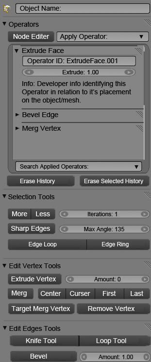
Here is a proposal for a new Edit Panel, renamed the Tools Panel. http://i160.photobucket.com/albums/t171/Dingo_Master/OperatorsWindow_003.jpg
This panel that is only available when a editable mesh type object is selected. This will replace the old edit panel allowing room for many different types of workflows from a variety of users.
In this UI design we have the fallowing Main Menu: Object Name: Displays the name of the object currently selected.
Sub menus: All sub menus contain quick ways to gain accsess to Operators in blender 2.5. The sub menus are content sensitive and will not be shown if the user dose not have the proper view settings active. For example if edges are not the current selection type then the 'Edit Edge Tools' sub menu will not be shown. All Sub menus expect the 'Operators' sub menu are to provide Operators/Tools that are best suited for the 'Normal/Default' user.
Operators Sub Menu: This menu is different from all other sub menus in that it can be used to execute any operator. The Node Editor button is there for future versions of blender, and will not be implemented into Blender 2.5 yet. The 'Apply Operator' drop down window is used to search for all operators that can be applied to the object with out the use of other sub menus. The rest of this menu displays what operators that have already been applied to the object that is selected.
"Selection Tools' sub menu: This sub menu will contain operators that allows the user to select different parts of the object in different ways. The tools that are placed in this menu should be tools that are commonly used or vary helpful for use when selecting parts of the object.
"Edit Vertex Tools' 'Edit Edges tools' and 'Edit Faces' sub menus: These sub menus are used for editing there corresponding parts. (I.E. Vertexs' Edges and Faces) These menus should contain tools that are commonly used when editing or are vary useful.
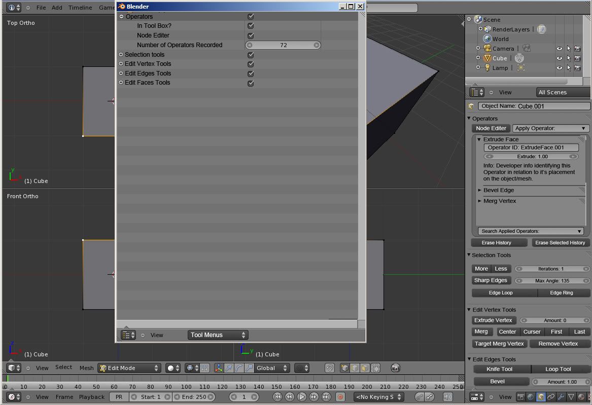
It would be a vary good idea to add a high level of customization to this window, allowing users to make their own sub menus and editing the existing sub menus. A way that this could work is to make use of the Outliner. All users could enable and disable Sub Menus from a section in the Outliner called "Tool Menus": http://i160.photobucket.com/albums/t171/Dingo_Master/ToolMenus.jpg All sub menus installed by default or via plug-in would show up in this menu.
Default Sub menus should be added, edited and created as developers see fit. However it would be best if developers made the default sub menus contain tools that new users would normally have a hard time finding, are commonly used or are vary useful.
~ William Torpey
Artist and Designers vs the Digital Interface
I'll be honest, I'm not a Digital artist or designer but I am an Artist and designer by birth nonetheless.
The tools that allows an artist (and/or designer) to present his/her imagination
(and/or interpretation) is a vehicle to ecstasy for himself (and or others). The question is not the end result but how difficult and intrusive will it be to travel your thoughts to the canvas.
The graphical user interface should be self explanatory. An artist(and/or designer)
should be able to know what to do with the tools, and how to handle it without it being intrusive on his/her thought process. It should be simple, efficient, well organized, scalable and non-restrictive. If there is anything I hate (I'm sure most artist/designers feel this way) is being pulled from my place of thought, by any interruption (by either someone or the a broken tool). And artist(and/or designer) should only need to concern himself with what he is creating not how he is going to manage to create it.
Work flow is very important. I believe windows should be organized into studio categories (for example) base on whether you are creating/editing 2D, 3D, Animating, Video Authoring/Editing or Presenting Still, video or interactive images. Source Management is all important. Another great idea (At least I believe so) is tool authoring studio window. And tools panel should be organized by categories plus custom list.
Why am I here, if I'm not a Digital artist/designer. I want to be able to create in the digital world. And its time I pick up the digital pencil, brush and spatula. I have been reading and exploring a lot about 2d and 3d studios and image authoring/editing software like. Believe GIMP is trying to revise their UI too, and you two should work together and share ideas. Maybe even merge. Test out other UI and features from competitors. Work flow I believe is the key.
The blender team should conduct prototyping. To get feed back from users from blender and users of competitors. The vision should be clear.
An interesting article on art vs design and equally interesting follow up comments.
http://www.aiga.org/content.cfm/art-vs-design?pff=1
I've seen what other artist and designers have done with blender. Great job guys. I hope I at least pored a little fuel into the barn fire of the Blenders UI Brain Storming team.
Jose Castillo future blender artist/designer
Render Output and Encoding Settings
The current render output setting options in Blender seem somewhat counter-intuitive to me in the current set-up. Multiple un-similar settings are grouped together as though they were similar, and the "File Format" options menu is a bit crowded. This would be rather confusing to those unfamiliar with digital rendering.
My proposal:
- An "Image \ Video" toggle switches that would have functionality similiar to how the buttons are currently laid out now in the 2.5 design.
Mock-Up:

Old/New UI switch
My proposal is following:
Many Blender users like the actual (2.4x) interface. Maybe you can make switch for changing from new 2.5 interface to old, because for example I am familiar with old one and completely don't understand new blender's UI. And I don't want to waste my time for practically learning Blender from the beginning, so I think this would be useful for people who don't like new UI appearance like me. Of course if you decide to put old UI too into new Blender it should contains all features that ARE NOT interface-dependent (for example possibility to define own shortcut keys.)
Several Problems with new UI
I hope it's the right section. I have some proposals for the UI. I think its a good idea to handle the window parts with the triangle in the corner. But I noticed some problems with it.
1. The detection is to accurate. It's hard to hit the corner. It should be more loose.
2. When you hold down your mousebutton, after you clicked into the corner and draged it to open a new subwindow, you can't delete the new window by moving the mouse back.
Also I liked the feature to klick on the edge of the subwindow to divide it. But it doesn't exist anymore. Please bring it back.
Last but not least, I demand to reassign the add-function to the space-bar. It made blender very fast to add objects with simple shortcuts, but in version 2.5 I didn't found any fast-adding feature like that. (If there is anyone please tell me where to find.)
--Jansende 19:31, 25 November 2009 (UTC)
- The menu on edge had some adventages over the corner widget. The zone is already used when resizing and the cursor actively shows that fact, so putting all window management functions in the zone separators via menu seems logical, it was fine in 2.49 and before.
- Plus more important, it allows clear info of what is possible (a menu, with text, is pretty informative if correctly worded) vs corner system that requires reading the documentation to learn all the options and read again when you forget and again when a new option is added (vs just remembering edges can be dragged and have a menu... the balance for usability points to the menu). Also it does not clutter the screen, the menu only appears upon request.
- Such menu can do all tasks. Swapping two zones can be done by asking the user to pick which zones to swap, and showing 1 and 2 in two zones the user clicks next just like the collapse operation shows a shaded arrow. Release to create a new window too, click one zone. As always (or should I say <=2.49), Esc to cancel would be fine.
- Search has been already suggested to be put in own keybinding and make space be toolbox again (see mailing list). One the meanwhile you can use shift+a (which is slower than space, two "small" keys in not so comfortable position with one hand or use two hands for more comfort, vs one big key... space wins)
- Maybe you should try the mail list. This seems a bit dead. Gsrb3d 22:57, 25 November 2009 (UTC)