「利用者:Jeske/Active Selected Visual Cleanup Proposal」の版間の差分
細 (moved ActiveSelectedVisualCleanupProposalJeske to User:Jeske/Active Selected Visual Cleanup Proposal: moving in user namespace (+ words separation for word wrap)) |
細 (1版 をインポートしました) |
(相違点なし)
| |
2018年6月29日 (金) 04:43時点における最新版
目次
Active and Selected Visual Cleanup Proposals
The current "active" vs "selected" visuals have a few inconsistencies and confusions. This proposal reviews a set of functional goals we should strive for, reviews the current state of visuals, offers some design proposals, and encourages you to support one of those design proposals or submit your own.
Consistent visuals for unselected, active, and selected will have the following properties:
- the same default color will be used for "selected" in all contexts (orange)
- the same default color will be used for "active" in all contexts (white)
- it will be clear to the user which objects are unselected vs selected vs active in all contexts
- the visuals will be fairly consistent between the different contexts
The contexts where these concepts are visualized are:
- outliner
- wireframe (3dview object-mode)
- shaded (3dview object-mode)
- vertex-select (3dview edit-mode)
- edge-select (3dview edit-mode)
- face-select (3dview edit-mode)
List of proposals
- ASVCP_RemoveUnselectedAndActive
- ASVCP_VisualDashed
- ...add design proposals here..
Some visual changes have already been made as a result of this document. You may find them in ActiveSelectedVisualsCleanupProposalJeskeCompleted.
Review of Current visuals (2.57)
Default Colors
Currently there are several color preferences related to active and selected. As you can see many of them are nearly the same (but not exactly the same) color. Further, in some contexts the active-color is almost the same orange used for selected (object mode) while in other contexts the active-color is white and clearly distinct from selected (vert/edge/face)
 Object Selected
 Vertex Select
 Face Selected
 Face Dot Selected
 Edge Select
 Active Vert/Edge/Face
 Active Object
 Active Spline
face-select (3dview edit-mode)
The face-select edit-mode visuals are very clear. By making the drawing for select and active distinct and overlappable, it can clearly visualize all four states.
vertex-select (3dview edit-mode)
| Unactive | Active | |
|---|---|---|
| UnSelected | 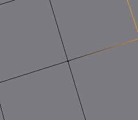
|
(none) |
| Selected | 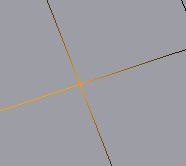 vertex drawn in "selected color" vertex drawn in "selected color"
|
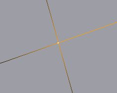 vertext drawn in "white" vertext drawn in "white"
|
vertex-select visuals are consistent with face-select visuals, however, the functionality is slightly different. The selected (orange) gradient is drawn on the lines around selected points, which allows the UI to show clearly whether the vertex is merely selected (orange) or selected active (white). However, unlike some other contexts, the "unselected and active" state is not allowed in vertex-select.
edge-select (3dview edit-mode)
| Unactive | Active | |
|---|---|---|
| UnSelected | 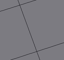 unselected unactive: black unselected unactive: black
|
(none) |
| Selected | 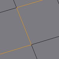 : line drawn in "selected color" : line drawn in "selected color"
|
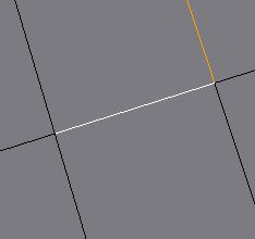 active: line drawn in "white" active: line drawn in "white"
|
Outliner (as of 2.57a)
The outliner visuals have been adjusted as a result of this proposal. The new visuals available in 2.57a are reviewed below.
| Unactive | Active | |
|---|---|---|
| UnSelected | ||
| Selected |
Active objects are shown by changing the text-color to white, while selected objects are shown by highlighting the object-icon in an orange (selected color) circle. These two are orthogonal and clear, as in face select.
wireframe (3dview object-mode)
| Unactive | Active | |
|---|---|---|
| UnSelected | 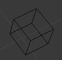
|
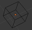
|
| Selected | 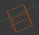 object outline in "selected" color object outline in "selected" color
|
 object outline in "active" color object outline in "active" color
|
The object-mode visuals have the following issues:
- it's difficult or impossible with default colors to see the difference between "selected active" and merely "selected"
- "unselected active" objects are unclear, because the only indicator is the x-ray center-dot which is hard to associate with the proper object
- the use of default-orange active color instead of the default-white active color used in the vert/edge/face select and the outliner (as of 2.57a) is inconsistent
shaded (3dview object-mode)
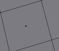
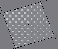
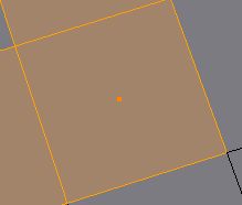
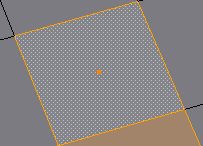
| Unactive | Active | |
|---|---|---|
| UnSelected | 
|

|
| Selected |  object outline in "selected" color object outline in "selected" color
|
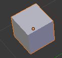 object outline in "active" color object outline in "active" color
|
The object mode visuals have the following undesirable problems:
- the colors and methods used for active are not consistent with either the outliner, or edit-mode active objects.
- the center-dot means neither active, nor selected. Instead it means the object might be active or selected, depending on the state of the border highlight. Like the outliner, this is requiring the user to do some kind of boolean logic with the dot and the border highlight to determine whether an object is the active object. However, the highlighting and colors are not consistent with the current outliner.
- it is hard to percieve which selected object is active (with the default colors)
Review of Shift-click behavior
It's useful to consider how these visuals operate while adding and removing from the selection with shift-click.
One way to explain the behavior is that shift-clicking an object toggles it's selection-state and also makes it active. However, in two contexts (edit-mode vertex and edge select), unselected-active objects are not allowed, therefore, if an element is toggled to unselected in those contexts, it is not made active.
In more detail:
- In the object-mode, shift-clicking an object always makes it active and toggles it's selection state.
- Edit-mode face select behaves just like object-mode.
- In edit-mode vertex or edge select, on the other hand, shift-clicking toggles an object's selection state and IF the toggle was to selected, it also makes the object active. This is a result of the fact that in edit-mode vertex or edge select, objects are not allowed to be unselected-active, wheras in object-mode they are allowed to be unselected-active.
- object-mode (3dview and outliner) and edit-mode face select (3dview)
- if unselected unactive, make selected and active
- if unselected active, make selected
- if selected unactive, make unselected and active
- if selected active, make unselected
- edit-mode vertex or face select (3dview)
- if unselected unactive, make selected and active
- if selected unactive, make unselected
- if selected active, make unseleced and unactive
