「Meta:Sanbox/Doc:2.6/Manual/Sequencer/View/Modes」の版間の差分
細 (1版 をインポートしました) |
|
(相違点なし)
| |
2018年6月29日 (金) 05:55時点における最新版
Page status (reviewing guidelines)
Text Need text and Images for
|
目次
Switching between different view modes
Workspace display modes
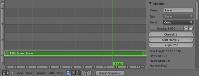
By default, the "Video Editing" screen layout shows four different workspaces.
The upper-left window pane is the Graph Editor, the upper-right window pane is the Preview of the sequencer, the middle is the Sequencer view, and the bottom is the Timeline window.
Our interest here is the two VSE window panes : preview, an sequencer.
Several options in the header bar allow you change the editor to display the sequencer or the preview, and when preview mode is selected, you can choose how to display the sequence in real time, and in various ways.
Sequencer
Right after the menus, three buttons allows you to choose the VSE display mode for the current window. The first button will display only the sequencer in the workspace, the second button will change it to display only the preview, and the third button displays both the sequencer and the preview in the same windows.
Preview
The additional four buttons that appear when you select the preview display mode allows you to choose the mode used to display the current frame. (see below)
There is also a Channel Selector that allows you to choose what channel to show in the preview. Channel 0 is the result of all strips combined together. Channel 1 is what the current frame's image from the strip(s) in channel 1 only looks like, and so on.
Note that these button are also available in both display mode.
Preview display modes
The VSE preview can show you different aspects of the composite result, for the current frame:
- Image
- Colors (what you see)
- Luma
- Brightness/contrast
- Chroma
- Color hue and saturation
- Histogram
- Levels of red, green, and blue
| zoom | |
| You can zoom the view of any of these modes by scrolling your Wheel |
Image Preview
It shows you what the resulting video will look like when saved. This is the main working mode for adding strips and moving them around, cutting, grouping (making meta) and splicing them through special effects.
Luma Waveform
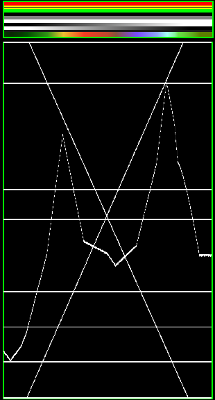
For the selected channel, brightness (or "luminosity"), is mapped with this display.
A luma waveform allows you to judge the quality of the luminance distribution across your video signal. You can view a luma-waveform instead of the usual output display, on every control monitor.
The display plots for every scanline the luminance value. The lines are all drawn on top of each other. The points get brighter if the lines cross (which is very likely with several hundred scanlines). You will understand the picture most easily if you plug an oscilloscope to the Luma-video-output of your television set. It will basically look the same.
In this mode, the vertical axis represents the luminosity: 0 at the bottom, 1 at the top; the horizontal axis of this graph matches with the x-axis of the frame. Just imagine that the view is cut into thin vertical strips, and the brightness values of all points on that strip are measured and plotted on the same x value of the graph. Moreover, the color of a pixel in this mode represents the number of pixels from the matching column of the frame sharing the same luminosity – i.e. the number of curves that cross at this point (black/transparent, for no pixel, white/opaque for at least 3 pixels).
This mode is good for:
- If the waveform does not fill the whole picture, you might want to play with the Bright/Contrast modifier, until it fills the whole picture (contrast auto-stretch).
- With the more advanced Curves or Color Balance modifiers, you can be more precise.
- You can judge if you want to dump the whole thing since it is completely distorted and clips at the top or the bottom.
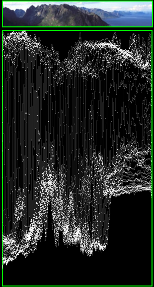
So, from the graph, we observe that:
- Throughout the width of the image, the sky represents its brightest parts. The graph shows a corresponding cloud of points along its width.
- The mountain has darkest areas, which are shown in the graph.
- Note that the mountains are darker at left, and the sea at right is much lighter. This pattern can be seen in the graph as well.
The main use of this graph is to inspect the brightness and contrast levels in the image; and adjust them. In some case only a certain part of the picture needs adjustment, which may call for selective masking (see node editor). When spots in the film that should have even illumination don't, it looks like a flashbulb went off or an extra light was suddenly turned on. This can happen if two strips were rendered or shot under different lighting conditions but are supposed to be contiguous.
Chroma Vectorscope
Use this mode judge the quality of the color-distribution and saturation, you can also view a U/V scatter-plot.
The picture is converted to YUV-format. The U- and V-values represent the angle of the color. For pixel of the picture, one point is plotted in the display at the U and V-value-position. If several pixels happen to have the same U/V-value the pixel in the plot gets brighter.
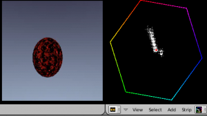
To help you understand what color is meant, a hexagram marking the extreme positions (red, magenta, blue, cyan, green, yellow) is drawn and a red cross to mark the origin.
In other words, for the selected channel, this display shows the color space of the image inside a hexagon. Each point of the hexagon is a primary color: red, magenta, blue, cyan, green, and yellow. Black is at the center, and overall saturation is scaled as dots closer to the outside. The example to the right shows that the image has a lot of red (50% saturation) and small amount of blue, with no green.
Always: remember to activate an additional control monitor of the end result. Color calibration is a matter of taste and depends on what you want.
Use this display to check for too much color saturation. While over-saturated images look great for op-art and computer displays, they stink when shown on the big screen TV. Use the AltA animation key to play the video; this display will update with a new/revised map for each frame. Just like watching the image preview to see what it looks like, watch the Chroma Vectorscope to watch for color use.
This mode is good for:
- If you picture looks very moody or desaturated you might want to take a look at the U/V-plot. You will most likely see all pixels building a crowd at the origin. If you add saturation using the Saturation slider, or any modifiers that change color, you can see in the U/V-plot if you distort the color.
- If you do color-matching on a by hand basis you can match the angle you see of different channels monitors.
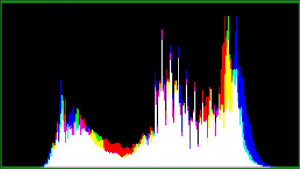
Histogram
This mode displays a graph showing the distribution of color information in the pixels of the currently displayed image. The X-axis represents values of pixel, from 0 to 1 (or 0 to 255), while the Y-axis represents the number of pixels in that tonal range. A predominantly dark image would have most of its information toward the left side of the graph.
Use this mode to balance out the tonal range in an image. A well balanced image should have a nice smooth distribution of color values.
Partial overlay
