Dev:2.5/Source/Development/WinterCamp/UIRules
UI Design Rules
The UI Layout Engine
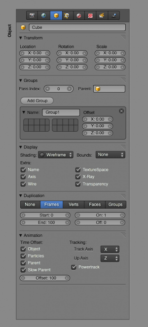
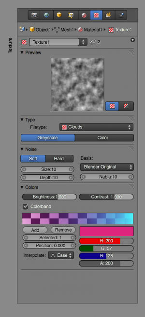
All buttons windows will become generated based on a new "Layout Engine". On top level this is a Python script, defining the "panels", and giving hints for layouts (like "two columns, not flowing") to fill in RNA data, or using templates (like "Constraint buttons" or "Object transform").
By default Panels will automatically flow and align vertically, and don't get internal scroll bars. Panels can only be closed or dragged around to change order. Making horizontal layouts should be possible, but will probably be less optimal for dynamic lists.
How this system will be implemented is open still; target is to make the python side as slim and accessible as possible, leaving all the drawing and evaluation code hidden. The images pasted here are mockups of styles we should allow to be made possible.
Context
All editors, and especially the buttons window, will get a clear indication whether they "Follow context" or "Browse". Visualization of this will be done with either a 'mini outliner' view for "Follow context" or with a text list or icon previews for the "Browse" option.
How to find the editor's context settings should become visually clear and easy to show or hide uniformly. For the buttons window design proposals are being reviewed, for other editors it's WIP still. The old 'data browse' buttons in headers won't be good enough to simply restore.
Screen Bar
Every screen will get a top or bottom 'screen bar', similar to the info header now, but not with the user preferences hidden behind it.
This Screen bar will also communicate 'active context' as explicit as possible.
The Screen bar gets operator/hotkey search box, optionally activated via hot key too
Test: add (customizable) toolbar options here for global tools
Status Bar
Default configured screens will get console in bottom, the header of the console will function as a 'status bar. It can show the stats, reports, errors or 'last issued command'.
Pull down menus
Menus will only show operators, not properties, and will become Python generated.
Each menu item will allow to view and change the hotkey as was assigned to it.
Buttons Window
The old button window can become more compacted by first removing all tools and editmode options (these go to the toolbars/columns for the editors where they work).
All buttons represented here will be defined by a python script, using the Layout Engine. A buttons window header will show the main categories of buttons, and below that a fixed/standard context 'picker' will be added. The rest is free to be filled in by the UI designer.
Headers
Headers will be default used to only show editor related pulldowns and properties. Also these will make use of (a subset of) the Layout Engine and Python.
By design, tools/operators will be only accessible here via the pulldown menus.
Toolbars
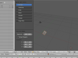
We will first explore vertically listed toolbars, with default space in bottom for the relevant tools settings, allowing to redo operations, or to pick settings when painting is active. Toolbars will only show the operators and their properties, not other settings.
Also the toolbars will use the Layout Engine, but will optionally allow to be extended with custom drag'n'dropped operators as well. This should be saved in .blend files.
Test: make a hotkey to move input focus to tool settings, even when mouse is in other region.
Design topic: if used horizontally, toolbars could only show the icons to make space. Where tool settings for redo then go is an issue... popping this up inside the window is not optimal.
Editor Properties
In 2.48 and older, these properties were only accessible via floating panels. Although one floating panel might work well, two of them is already getting cumbersome, and three or more too messy to use efficiently. For 2.5 we target to start with a clean design, without floating panels to start with (although the UI code allows for it).
Some of those floating panels will go to the tools region (like paint), some to the buttons window (like object properties). Only the real 'editor settings' will be collected in a new 'editor properties' region. This region - like all regions - can simply show or hide on a hotkey, or be slided in/out using mouse dragging.
Design issue: find good layouts to clearly and nicely separate Editor Properties from the Toolbar region.
Pie menus / toolboxes / etc.
Open design topic still.
Usage of pop up menus
By communicating context as well as user actions much better, we can also drop the over-use of confirmation menus in Blender. By default hotkeys won't get such menus assigned, unless the action is clearly destructive and can't be easily undone. This is mostly for operations such as Quit Blender, Save Over, Erase All, Load File. A menu should also warn on losing unsaved data in these cases, allowing to save first. (The latter as user preset though, to keep certain people happy! :)


