利用者:Pepribal/Ref/Interface/Controls
目次
Controls
Blender has a wide variety of controls to help the user interact with it.
When the mouse cursor hovers over a control, a tooltip appears, by default, after a few instants. The tooltip might contain some of these elements:
- A short description of the control.
- A keyboard or mouse shortcut associated to the control.
- A python command associated to the control (usually an operator or property).
With RMB ![]() on a control, a popup menu appears. The actions of that menu are related to the control itself, and might contain some of the following:
on a control, a popup menu appears. The actions of that menu are related to the control itself, and might contain some of the following:
- Insert Keyframe inserts a keyframe for the property associated with the control.
- Replace Keyframe inserts a keyframe for the property associated with the control, replacing the existing one.
- Delete Keyframe deletes the existing keyframe for the property associated with the control.
Add Driver, Delete Driver, Copy Driver
- Add to Keying Set adds the property associated with the control to the active keying set.
- Remove from Keying Set removes the property associated with the control from the active keying set (if it exists in it).
- Add Shortcut lets you define a keyword or mouse shortcut and associates it with the control. To define the shortcut you must first move the mouse cursor over the button that pops up, and when "Press a key" appears you must press and/or click the desired shrotcut.
- Change Shortcut lets you redefine the shortcut associated with the control.
- Remove Shortcut unlinks the existing shortcut from the control.
- Reset to Default Value resets the property associated to the control to its default value.
- Copy Data Path copies to the clipboard the python path, relative to the datablock, of the property associated with the control.
- Copy to Selected copies the value of the property associated with the control to the corresponding properties of the selected objects.
- View Docs pops up an internet browser showing information on the specific python command associated with the control.
- Submit Description lets you enter and submit a short explanation about the control.
- Edit Source creates a text datablock with the source code associated with the control, in case the control is based on a python script. You can check and edit that source code in the Text Editor.
If the control belongs to a group of related number buttons, additional options appear to let you act on the whole group or just on the specific number.
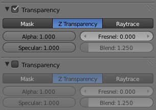
Some controls can be disabled, meaning that no action can be taken on them. That can be due to the current state or context. In that case, they appear in a lighter color. You can see an example in Enabled vs. disabled controls.
When the mouse cursor is over a control, ↵ Enter has the same effect than LMB ![]() in most cases.
in most cases.
Pressing CtrlC or CtrlV when the mouse cursor is over a control that holds a value (text, number or color) copies or pastes that value from or to the control, respectively. Similarly, pressing ← Backspace will reset the value of the control to zero (or to its default value).
Operation button
With LMB ![]() on one of these buttons, the associated python operator is executed.
on one of these buttons, the associated python operator is executed.
Tick box
These controls are used to activate or deactivate certain options. Use LMB ![]() to change its state. When the option is activated, the tick is shown.
to change its state. When the option is activated, the tick is shown.
Option button
| Option button |
These buttons are used to set an on/off status (with LMB ![]() ). When state is on, they appear like pressed. Each option button has its own icon or text.
). When state is on, they appear like pressed. Each option button has its own icon or text.
Number and range buttons
Number buttons hold numeric values, and provide the means to edit them:
- The small triangles on both sides let you increment or decrement the value respectively.
- By clicking on the control and dragging with LMB
 the value keeps changing, following the horizontal mouse movement. Pressing ⇧ Shift at the same time, the change will be smaller; and with Ctrl, the changes are done in round steps.
 - LMB
 on the number lets you edit the value, like in a text box, so you can use the usual editing keys to move the text cursor (←, →, Ctrl←, Ctrl→, ↖ Home or ⇥ End), select part of the text (dragging with LMB
  or using ⇧ Shift while moving the text cursor), or working with the clipboard (CtrlX to cut, CtrlC to copy, or CtrlV to paste). Changes can be accepted with ↵ Enter, or LMB
  outside of the control; to cancel, use Esc or RMB
  .
.
Formulas and predefined variables can be entered. These are valid entries:
- 3*35
- 2*pi
- 5/sqrt(2)
Number controls have a maximum and minimum value defined.
A Range button is a special case of Number button. The main differences are that it has no small triangles at the sides, and that it shows a graphical representation of the value in the range.
Multiple-choice button
Group od mutually exclusive buttons, only one of which can be selected. Use LMB ![]() to select the desired option.
to select the desired option.
List box
This control is useful to manage lists of items. To highlight one of the elements, LMB ![]() on it.
on it.
If the list is too long to fit the box, you can scroll with the scroll bar or with the Wheel ![]() .
.
Buttons for adding (+) or deleting (-) items are usually beside the list boxes.
Menu button
Menu buttons let you select an item from a list. LMB ![]() on the button expands the list. To pick one element, just LMB
on the button expands the list. To pick one element, just LMB ![]() on it. You can also use ↑ and ↓ or Wheel
on it. You can also use ↑ and ↓ or Wheel ![]() or hover with the mouse cursor to highlight the desired item, and confirm with ↵ Enter.
or hover with the mouse cursor to highlight the desired item, and confirm with ↵ Enter.
Once the list is expanded you can refine the search of elements by typing in the search text box provided at the bottom. Only items with matching text will be shown.
If the list is too long to fit in the control, small indicator triangles appear.
You can edit the name of the active item by using the associated text box.
Esc and RMB ![]() close the list and cancel the operation, as well as clicking out of it.
close the list and cancel the operation, as well as clicking out of it.
Buttons to add (+) and delete (X) items can be included in menu buttons.
Select button
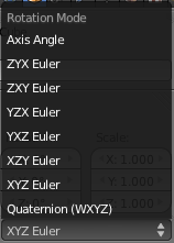
The Select button lets you choose between a set of options. To expand the list, use LMB ![]() on the control. Once the options are shown, use LMB
on the control. Once the options are shown, use LMB ![]() again to select the desired option. The button then shows that option as active.
again to select the desired option. The button then shows that option as active.
You can also choose the option using ↑ and ↓ or Wheel ![]() or hovering with the mouse cursor, and then ↵ Enter to confirm.
or hovering with the mouse cursor, and then ↵ Enter to confirm.
If the list is large and it doesn't fit in the expanded box, move the mouse cursor over the scroll triangles.
Esc and RMB ![]() close the list and cancel the operation. You can also cancel by getting the mouse cursor far from the control, or by clicing anywhere out of it.
close the list and cancel the operation. You can also cancel by getting the mouse cursor far from the control, or by clicing anywhere out of it.
Text box
Text boxes hold text strings, and provide the means to edit it.
With LMB ![]() on the box a text cursor appears, letting you edit the text:
on the box a text cursor appears, letting you edit the text:
- ← and → move the text cursor one position to the left and right, respectively.
- Ctrl← and Ctrl→ move the text cursor one word to the left and right, respectively.
- ↖ Home and ⇥ End take the text cursor to the beggining and end of the text, respectively.
- Dragging with LMB
 or using ⇧ Shift while moving the text cursor lets you select text.
 - CtrlX and CtrlC cut or copy the selected text to the clipboard respectively, while CtrlV pastes it at the text cursor position.
- Accept changes with ↵ Enter or LMB
 outside of the control; cancel with Esc or RMB
  .
. - In some cases you can use ⇆ Tab to autocomplete words.
Datablock selector
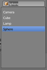
Many tools in Blender need references from one datablock to another. That's what the Datablock selector does: it references a datablock by its name.
This control resembles a text box, but it only accepts existing datablock names. And to be more specific, it only accepts datablocks of the type specified by the small icon on the left.
While editing the text in the selector, a list of the possible options is expanded. If the list is too long to fit, small indicator triangles appear. The text you type in the box works as a search tool: only matching elements will be displayed in the list.
To pick one item, you have several options:
- LMB
 on the item.
 - Type the full item name and press ↵ Enter.
- Use ↑ and ↓ or Wheel
 or hover with the mouse cursor to highlight the desired item and then press ↵ Enter to confirm.
If you type an invalid name, the value will remain unchanged.
Esc and RMB ![]() cancel the operation, as well as clicking out of the control.
cancel the operation, as well as clicking out of the control.
Color holder and color picker
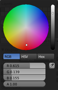
The color holder stores a RGB color. To edit its value, use LMB ![]() on it, and a color picker appears.
on it, and a color picker appears.
The right side of the color holder shows the color with the alpha component over a checkers pattern, so with an alpha value of 1.0, the color will appear the same on both sides, as a single plain color.
The color picker lets us define a RGB color value interactively:
- LMB
 (click or drag) on the color disc defines the color hue and saturation.
 - LMB
 (click or drag) on the gray strip defines the color value (brightness).
 - The dropper button lets you pick a color from any point of the Blender screen. With LMB
 on it, the mouse cursor changes to a dropper. Then LMB
  picks the color, while Esc or RMB
  cancel the operation.
 - With RGB selected, you can edit the color using the RGB range buttons to define its red, green and blue components (values range from 0.0 to 1.0).
- With HSV selected, you can edit the color using the HSV range buttons to define its hue, saturation and value components (values range from 0.0 to 1.0).
- With Hex selected, you can edit the color using the Hex text box, where an hexadecimal dumber of 6 digits must be entered, in a RRGGBB format. Each component ranges from 0 (hexadecimal 00) to 255 (hexadecimal FF).
- The A range button lets you define the alpha component of the color.
The color picker disappears by getting the mouse cursor away from it, by clicking outside of it, or by pressing Esc.
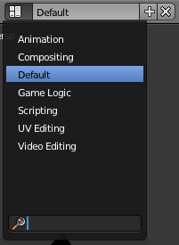
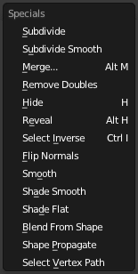
Some buttons and hotkeys bring up a popup menu with several options to choose from. If the list is too long, small scroll triangles appear.
There are several ways to pick one of the options:
- LMB
 on the desired item.
 - Press the key corresponding to the underscored letter of that item.
- Press the indicated shortcut (if any).
- Highlight the desired item using ↑ and ↓ or Wheel
 or hovering with the mouse cursor; then press ↵ Enter to confirm.
 - Press the key corresponding to the order of the item in the menu, that is 0 through 9, and Alt0 through Alt9. Bear in mind that 0 selects the 10th. position, and Alt0 the 20th.
To close the popup menu, just get the mouse cursor away from it, or click outside of the menu, or press Esc.
Node selector
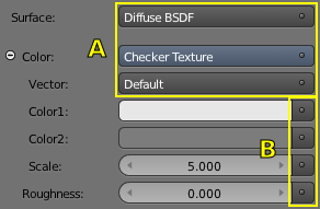
Node selectors let you add a node and connect it to a particular input. They provide a way to manage a node structure without even using the Node Editor.
In Node selectors you can see an example: a particular input called Surface is connected to a Diffuse BSDF node. This node has 2 inputs: Color and Roughness. The first one is connected to a Checker Texture node, while the second one is not connected to any node, as its value is defined inside the Diffuse BSDF node itself.
In the picture, those selectors marked as 'A' define real connections between the particular input and the node they are selecting, with the exception of Vector: in this case default values (Default) are used, and not a specific node. Those marked with 'B' provide the possibility to select a node for the input or edit its value using the respective controls next to them.
Clicking on a node selector control a list expands with all the node types available. In case of a selector with an already defined link, the link options Remove and Disconnect are also available. The first one deletes the selected node, while the second just unlinks it from the input, without deleting it: you can link them again using the Node Editor.
Note that the "active" texture node (the one shown in the 3D View in textured shading mode) will give the selector a different bluish tone.
In Equivalent node structure you can see the node structure equivalent to the former example.
