Dev:2.5/Source/Development/WinterCamp/Properties
Properties
A Hierarchy of controls
This page will seek to explain how the Properties editor type in Blender 2.5 will function, and also communicate how the auto-layout engine can work.
The basic premise of the Properties is to present data to users. Everything you see in the Properties can be animated, driven, and freely changed by the user. This means there are no tools here. These go into their respective editors.
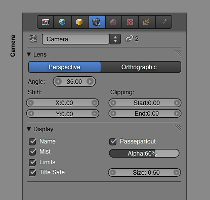
First of all, the most important role of the Properties editor is to present to the user an overview of properties in a clear an accessible way. The users mental model should reflect as much as possible how Blender actually works, as to minimize confusion.
We do this by presenting a hierarchy of properties that correctly communicates the dependencies of properties. This hierarchical relationships flows from top to bottom and left to right. Those items that are at equal levels within the hierarchy should be ordered from with the most important controls first, and lesser ones last.
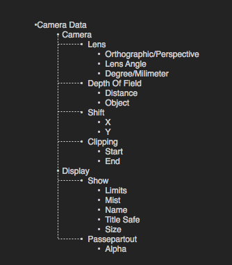
The hierarchy is defined at the first level by arranging controls into a list of panels. Within these panels, header labels and spacing can distinguish groups of controls from each other. Greying out can be handled automatically by checking widgets dependencies to detect whether it should be enabled or disabled, like so:
Starting at the top level, the Properties editor contains a list of tabs, representing different datablocks. Since changing the tabs switches their contents, these tabs are right at the top of the window. The list of tabs themselves are organized so that the most general controls appear of the left (Render Properties), while more fine-grained controls (Object>Mesh>Material>Texture) appear on the right, following reading direction.

The next item in the hierarchy of data is the datablock controls. These let you rename, assign and delete datablocks, and will change or delete the rest of the controls.
The rest of the controls are organized into panels that can be collapsed. These panels are centered around specific tasks, such as adjusting the cameras display settings, interacting with vertex groups, or setting up a colorband.
Templates
Once the hierarchy is defined, different types of data is then organized into a range of templates. These templates have the advantage of always showing the same type of data in a consistent way that makes interacting with the application easier, as well as faster, because the user can immediately identify what he/she is looking for.
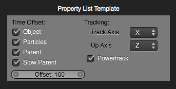
The most basic template is the Property List template, which organizes properties into an ordered list, and presents them in two columns. This template can be used for most render settings, materials and textures, etc.
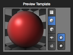
Other templates include the Preview template for showing previews of materials, textures, lights, world, rendering, or even meshes.
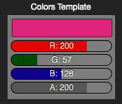
Another is the Color template, which can be visible every time the user has to select a color. This template can even use modified sliders that represent colors through hue, as well as intensity through brightness, so that a high red value makes the slider bright red, and a low value makes it darker.
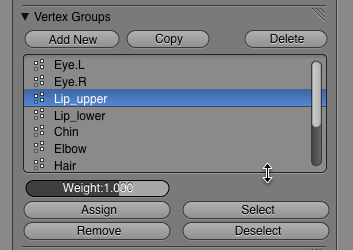
Blender includes a number of ways in which the user can create and modify a list of user-generated groups, such as vertex groups, material groups, UV layers, shape keys etc. These can be presented in a uniform way, that can give the user an overview of the data he/she is working on. Other uses for this is texture layers in Material, Lamp and World properties. These lists can be nicely resizable, and can allow for reorganization.
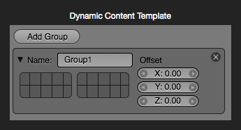
There are also a number of places where Blender lets users add more complex dynamic content, that present the user with additional controls. Examples of these are constraints, modifiers and object groups.
Context Viewer
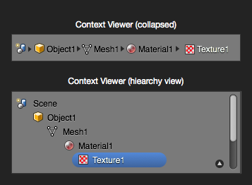
In order to better give users a clear indication of what context they are currently working on, a new Context Viewer is added. It sits below the Property tabs and be either collapsed or expanded to show either a breadcrumb view or a more detailed hierarchy view similar to the Outliner, but focused on the current context.
Animation
Animation in user interfaces can greatly enhance speed of use by making elements gracefully move to new locations rather than jumping directly to a new state. It ensures that users have a full overview of how the new state is different from the old, and provides clear feedback of what action the user has performed. If animations are shorter that 250 ms, which is how fast humans are able to react to a state change, it will never hinder speed of operation.
Here is an example of how collapsing a panel can nicely animate:
Content within panels can have multiple states too. An example is a range of radio buttons that allow different settings, such as this:
Widgets
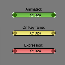
In Blender 2.5, all RNA properties will be animatable. This means there needs to be a way to visualize if a value is being influenced by an F-Curve, meaning it is animated. It is equally important to be able to tell that you are on a keyframe, and if a value is driven by an expression. Although some other apps solve this by adding extra widgets for dealing with keyframes, we can optimize this information by changing the look of the value widget itself, providing a clean view of your data.
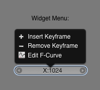
Once we can visualize if values are animated, there has to be a convenient way to add keyframes for values. This can be done through a convenient context-sensitive menu. If users right-click on an item, they'll get this menu:
