「Dev:2.8/UI/Workshop Writeup」の版間の差分
(→Tooltips) |
細 (1版 をインポートしました) |
(相違点なし)
| |
2018年6月29日 (金) 06:21時点における最新版
目次
UI Workshop Write-up
Foreword
The Blender Foundation organized a 2.8 workflow sprint at the Blender Institute in Amsterdam, 25-27 November 2016.
Invited were the active developers, designers and artists who have contributed to Blender’s UI and tools in the past years. This group represented a very wide selection of users with different backgrounds. The mission: refresh or reconfirm existing design decisions and deliver a proposal for the 2.8 Workflow project with enough information to empower people for work on the user interface and usability in general.
This document presents a user-level design document that describes the agreements that have been accomplished during the Blender 2.8 workflow sprint. Having this focused workshop in an isolated environment made it possible to define a couple of big steps forward.
Our role was to come with a design for 2.8 that would get the widest possible support by both the user and developer community. This a big responsibility we are aware of. We gave our best to do this well!
We invite everyone to review or discuss this in public places, and especially to join one of the 2.8 teams to help making it happen (check the projects page).
-- Bastien Montagne, Brecht van Lommel, Dalai Felinto, Daniel Lara, Jonathan Williamson, Julian Eisel, Mike Pan, Pablo Vazquez, Paweł Łyczkowski, Sebastian König, Sergey Sharybin, Ton Roosendaal.
Workflow
Layer System
Plan is to give both render layers and what we currently refer to as (object) layers a major upgrade in functionality. Main requirements for the new system are:
- Render layers shouldn’t be limited to affecting the render output, they should also affect the viewport output to make it match the final render as much as possible.
- Support a system to override the properties of scene content (more on overrides).
- Allow the users to organize the scene content to their liking, ideally within a flexible, hierarchical grouping system that is unlimited in size.
- Help the user organizing and setting up the scene for various workflows and rendering.
Or in short: The new layer system should be an ultimate tool to setup and organize the scene, especially in regards to how it will look in both, the viewport and the final render.
A rather technical, and already slightly outdated proposal is available here. We’re however working on an updated version and a proposal that’s more user-oriented. Please bear with us, this is a challenging design project and we keep going through iterations.
Overrides
An override of a property would mean applying a different value to it without actually changing the property value itself. Especially if the overrides can be applied using some filtering mechanism, they can be incredibly useful.
Typical example use-case: The director wants to see the scene rendered brighter. Instead of changing all lamps individually, the artist simply adds a relative 10% override to the energy of all lights. That means all lights become 10% brighter.
For Blender, an override system would bring another big game changer though: Overrides would make it possible to manipulate properties of linked data-blocks! Users could simply override the property values of the linked data-blocks. What a relief for pipelines!
Blender already has light and material overrides per render layer and there’s also the scene Simplify option. These are only really limited tools and are far less useful than a real override system.
How this will eventually look is still an open question, it's likely that we'll have overrides on different levels: Per render layer overrides, per workspace override, per editor override, etc. This layer proposal adds the concept of collections, which could contain overrides, too.
Workspaces
The screen layouts as we know them from the current Blender versions are a mix-up of workflow and layout configurations. We concluded that these should be separated instead.
To accomplish this, we’ll introduce the new concept of workspaces. Workspaces will allow users to build up their working environment for a specific task. For example there could be workspaces for modeling, sculpting, animation and motion tracking. It should be possible to append workspaces from other .blend files.
The workspaces could store a variety of configurations:
- The active screen layout
- The active object mode
- The active render layer (for this design)
- The UI setup - hidden panels, hidden buttons, customized tool-shelf setup, etc.
- An optional workspace keymap, which can extend and override the User Preference keymap
- Activated addons
It should further be possible to have overrides per workspace, for example to override theme colors of a workspace.
Screen Layouts
Since the major tasks (such as modelling, animating, compositing, etc) can be built out of multiple sub-tasks that may even require switching back and forth, users should still be able to quickly change their screen layout without leaving a workspace. So we want to have screen layout presets per workspace. They should be less tied to workflows though, and be nothing but mere presets for area configurations. Users shouldn’t identify screen layouts using names, but thumbnail previews. Editor tabs (more info) should also help making screen layouts less tied to a specific workflow.
Scenes
Blender already allows having multiple scenes open at the same time. Right now, it is done by having the active scene stored in the screen layouts. That means it’s possible to open two Blender windows with different scenes and to toggle back and forth between scenes by toggling the screen layout. However, it also means that changing the screen layout may change the scene, which is not always wanted. We should keep UI and data separate.
Thus, the scene should be stored within the window, it should not be tied to a screen layout or workspace. If users want to have multiple scenes open, they can do so by opening multiple windows.
Note that following this new layer design, scenes now don’t need to be abused as a way to organize different render engines anymore. This would be done through render layers instead.
The Global Scene option should be removed from the User Preferences then.
Templates
While Blender remains mainly a digital content creation tool, we also want to enable Blender users to support other tasks such as game level editing, 3D Printing or use Blender for education. This can be accomplished by customizing even more than currently possible with the workspace design.
For this, we want to encapsulate all this customization into a ‘Template’. A template defines one or more workspaces, but also includes additional prefabbed art assets, customizations such as input map, startup files, and add-ons.
A template has control over:
- User preferences, including addons
- Input map
- Manipulator widgets (i.e. present a simplified widget with more visual feedback)
- UI configuration
- Hidden UI elements + Disabled Command
- Pre-built 3D assets and presets
- Color theme
Because templates could be potentially big in size (since they contain assets), they will be made available as separate downloads, and loaded into Blender similar to an addon. Possible candidates for templates:
- Blender
- Blender Simplified (“101”)
- Grease Pencil / 2D Editing
- 3D Printing
- VR
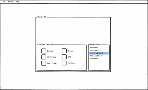
Once installed, the user can then choose a template from the splash screen.
Screens, Editors and Areas
Screens, editors and areas are basically what makes up the flexible windowing system of Blender. It can be a really powerful system, but as it is right now, it does have flaws. Some of them can be fixed with a bit of polishing, but there also need to be some major changes to complement the system. To clarify some terminology: An area is pretty much the pure rectangle, or the sub-window that contains the actual editor. If you change the editor type (e.g. from 3D View to UV/Image Editor), you only change the active editor, the area itself remains unchanged.
Global Bars
Blender is lacking a place to put global settings to. As a result, different levels of data are mixed in the UI. Even worse, sometimes a part of an editor is abused to show global data that also affects other editor types. For example executing an operator in the UV/Image Editor spawns its operator settings in the 3D View tool-shelf. To solve this we need a fixed place to display global information at.
Top Bar
The top bar would be a global area at the top of each window (except of temporary windows like User Preferences). The size is fixed, although it should be possible to hide it. Actually what’s being referred to as the top bar consists out of two (sub-)bars. The following lists what each of them could contain:
- First bar:
- Global menus: File, Window, Help
- Menu to choose scene for the current window.
- Tabs for workspaces
- Add New Workspace button:
Opens a list of default workspaces (this way we can ship Blender with pre-configured workspaces for common workflows, without cluttering the UI with workspaces the user doesn’t need), and the general all-purpose workspace.
- Second bar:
- Settings of the last executed operator
These should be split into basic and advanced settings. - Buttons for operator options during modal operators (more info)
E.g while using the knife tool it would show checkboxes to enable/disable midpoint snap, angle constraints, cut through, etc. - Menu to choose the active render layer of the workspace (for this design).
- Menu to choose the active mode of the workspace.
- Menu to choose the active screen layout of the workspace.
- Search button to search operators and properties (improved version of current spacebar search).
The search results depend a lot on the context (like the editor and the mode the user is in), but since the search bar should give access to all tools, we need to deal with these context issues somehow. There are some ideas for this but we need to shape them further.
- Settings of the last executed operator
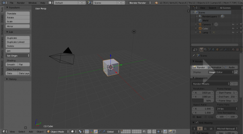
In order to save vertical space, we’ll likely get rid of window decorations. Such as Chrome (screenshot below), Photoshop, or many others.
Status Bar
The status bar would be another global area, this time at the bottom of the screen. It could contain:
- Path of currently opened file (if available) and info if the current file has unsaved changes.
- Notification logs (log of last displayed warnings, errors and hints)
- Important statistics (polygon count, object count, ...)
- Button to show more information. It would open an Info Editor in full-screen (see Info Editor section to see what it will contain). Pressing escape would close the Info Editor again.
- Information about on-going jobs
- Maybe a new version of the Screencast Keys add-on?
Info Editor
Since we plan to introduce the global top bar, we can also repurpose the Info Editor. It would be the expanded, much more detailed version of the status bar. Our place for all kinds of statistics and logs.
The Info Editor could contain:
- Notification logs (log of last displayed warnings, errors and hints)
- Information about currently open .blend file
- Log of executed operators
- Detailed information about on-going jobs
- Diverse statistics (memory, polygon count, object count, ...)
- Hardware/Driver information (maybe system-info.txt can be integrated a bit nicer here?)
Editor Tabs
Blender users tend to switch back and forth between a couple of editor types regularly. Using a menu, this is pretty slow.
There is also a confusing thing with how we handle editor data: we keep the editor data saved in the area when changing to a different editor. This can be useful since users don’t lose their setup when changing the editor type. However, it becomes pretty unpredictable when old data can be reused or when default settings have to be used. For example changing a 3D View into a Node Editor and back to a 3D View means the old 3D View data can be used, but opening a 3D View in an area where there hasn’t been one before, means it is initialized with some default setup.
The proposed solution for these issues would be the introduction of editor tabs. There wouldn’t be a tab for every available editor type, but for all editor data stored within an area. A ‘+’ icon would allow adding new editors.
Tabs will allow the user to quickly toggle editor types and give feedback on where there is old editor data that can be reopened. Some other things could be supported with this:
- Removing of editor data (‘x’ in tabs to remove the editor and its data from the area)
- Moving editors to different areas by dragging its tab
- Having multiple editors of the same type in one area
Areas
We came to the conclusion that general area interaction and appearance need some polish:
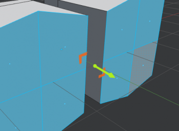
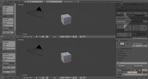
- Right now, areas need to share a single edge so they can be merged into each other. It should be possible to merge a single area into multiple smaller ones whose edges add up to a shared edge:
- It should be possible to split an area by ‘merging’ a smaller one into it:
- The hotspot of area dividers should be increased, maybe there should even be some mouse-hover feedback.
- The difference between areas and regions should also be communicated better in a visual way, for example using thicker area borders and/or rounded area corners.
One problem when switching screen layouts or workspaces is that users easily become disoriented. The reason is that the editors of the new layout/workspace use completely independent data, and thus look different. There should be a way to share the viewing angle from which you’re looking at the editor content and everything that influences it (perspective/orthographic mode, viewport lens angle, clipping distances, …). A shared viewpoint would be especially useful for 3D Views but also for other editors.
There are a couple of ideas to realize this:
- ‘Pinning’ of an editor:
- A pinned editor would share the view data with other pinned editors of the same type within the workspace.
- Operator to copy viewpoint to pinned editors.
- Naming of editors:
- Allow naming an editor.
- Allow editor to use view data of of a different editor by choosing its name from a list.
We decided to try the ‘pinning’ idea first to see if it’s sufficient.
Editor customization
The user should be able to easily adjust all editors to their needs. We mainly want to introduce support for the following:
- Customize visibility of panels and buttons
- Tell Blender exactly which buttons and panels are displayed in the UI.
- Per workspace.
- For example the "Grease Pencil" workspace would only show panels and buttons related to the Grease Pencil.
- Customizable tool-shelf
- Support adding, removing and renaming of tabs
- Add operators and properties to tabs using drag ‘n drop or a search box.
- Per workspace.
- For example in the "Modelling" workspace, the user would set up a tool-shelf tab to show the Extrude tool, the Bridge tool, the Knife Tool, ...
How exactly this customization will happen UI-wise is still open. Some ideas are:
- Panel and button tags that will be compared to a list of tags of the workspace.
- Configure UI mode in which icons are displayed for adding/removing of panels and buttons:
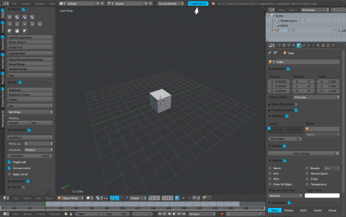
More drafted proposals welcome!
Tools
Tool Workflow
Many users love the fast general workflow of Blender. This mainly comes from the combination of shortcut heavy interaction and the paradigms of Non-Modal and Select->Operate tool usage. This isn’t a really beginner friendly way of doing things though. Beginners are more used to toolbars that allow activating a tool mode. There are also tools in Blender that depend on the mouse location, like the transform tools. They were simply not designed for being invoked from a tool-shelf and it’s mostly useless to have them there. The question is, how can we combine both, the toolbar heavy workflow with modal tools and the shortcut heavy one with mostly non-modal tools?
We want to try solving this issue with extensive use of manipulators. Activating a tool from the tool-shelf wouldn’t enter a tool mode that doesn’t allow executing a different tool, but it would activate manipulators for the chosen tool. It should still be possible to execute a different tool than the one displayed by the active manipulator. Think of the manipulator as a 3D button to actually invoke the operation.
There’s only going to be one visible tool at a time, that means if you activate the Extrude tool, the transform manipulators will be gone.
This idea is a nice combination of the different workflows, without conflicting with each other. Obviously, not all operators can be represented by manipulators, but many of them.
Note that this manipulator based workflow wouldn’t be exclusive for the tool-shelf, there should still be ways to activate the manipulators of a tool using shortcuts. It could work by...
- … using sticky keys
E.g. tap E for extrude, hold it to show extrude manipulators. - … using modifier keys
E.g. E for extrude, CtrlE to show extrude manipulators.
Should be especially consistent to ensure discoverability (meaning the same modifier keys should be used everywhere)
Modal Tool Feedback
Even though Blender uses the Non-Modal paradigm for tool execution, we still have a couple of modal tools. Examples of this are the Knife, Inset or the Loopcut tool. The modal nature makes them faster and more flexible to use. However, many modal operators have options, and it’s pretty hard to discover them. While they are active, the header of the editor they are executed in shows the options that can be toggled using shortcuts. Decision was made that the new global top bar should be used for displaying buttons for the operator options.
E.g. instead of having to press C to enable the Angle Constraint option of the Knife tool, there would also be a checkbox for it in the top bar.
Multi-Object Editing
Users often want changes to properties to not only be applied to the active object, but to all selected ones. Initial support for this was added in 2.75 (release notes entry), but it was hidden behind the Alt key for the time being. Some things with it should be changed, it should behave like this:
- Don’t require holding Alt, action should always be applied to all selected objects if possible
- Give info if an action is applied to multiple objects (“Applying value to 42 objects”)
- Number buttons:
- Dragging or clicking the little triangles should apply the delta value to all selected objects
- Entering a number would override the value of all selected objects, but expressions could allow relative change too (e.g. “self + 1.2” would increase the property of all selected objects by 1.2)
Additionally, we need to figure out how multi-editing should behave in corner-cases, such as editing materials, modifiers, drivers, etc.
This actually doesn’t only apply to object editing, but also to bones, sequencer strips, masks, tracking markers, ...
Grease Pencil
Grease Pencil should get an own object type to integrate it better into the Blender UI and workflow. This isn’t a new decision, we just reconfirmed it. This means that drawings can use the regular collection and render layer system as well as using the Properties Editor to display its settings.
The Grease Pencil was initially developed as an annotation tool, so artists could leave some quick annotations in the UI. While Grease Pencil is getting a more and more profound tool, we need to ensure we keep these capabilities as quick annotation tool. The idea is to split Grease Pencil up into two tools, an annotation tool that will be available in multiple editors and a proper drawing tool for the 3D View.
It should be possible to convert strokes made with the annotation tool into strokes of the draw tool.
Device Input
Input Map
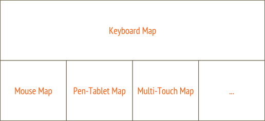
With input map we refer to the combination of mappings for all available input devices. This is more than just keyboard and mouse. Technology keeps evolving and artists want to use the devices they like for their workflow. Thus, Blender should at least have some basic support for input devices like pen-tablets, multi-touch, 3D-mice, virtual on-screen keyboards, etc. The entire input map system needs to be designed with all this in mind.
Some major requirements for the input map system are:
- At least some basic support for common input devices.
- Allow combining different input devices without conflicts (as far as possible).
- Work nicely with both, left and right mouse selection (e.g. allow disabling separated selection and action).
The input map should be built out of building blocks for the individual devices that can work alongside each other. This way it’s easy to drop or swap the input map of a single device without breaking the entire map.
Input Editor
The current keymap/input editor (User Preferences -> Input) is simply a pain to use. Configuring the entire keymap is a major undergoing and even changing single shortcuts is a hassle.
One reason for this is rooted in the way Blender’s operators work: An operator can have options to alter its behavior. In many cases this makes the operator name that’s exposed to the user misleading. For instance Clear Seam actually uses the Mark Seam operator, but with the option Clear enabled. That means if the users search for the Clear Seam operator in the input map, they won’t find anything. Even worse, for simple things like toggling a boolean property (like toggling a checkbox) using a shortcut, Blender uses generic operators. These are then shown to the user with useless names such as Context Toggle or Context Set Enum.
Another thing is the input editor only shows operators that have a shortcut assigned to them. If an operator doesn’t have one, it is not listed.
To solve these issues, the input editor should be changed in the following ways:
- Conflict detection: Show a hint when there is a possible conflict between shortcuts.
- Instead of showing an entry for each shortcut and the operator info in them, we should show all operators and a list of available keymap items attached to them.
- Display different names for operator variations. Especially for generic operators.
- Input options (E.g Use Pies, Use Sticky Keys, Use Multi-touch, etc.)
The Keyboard Map
Blender’s current keymap suffers from one major issue: It is totally overloaded. The artists that were part of the workshop agreed to design a stripped down keyboard map, that frees a lot of shortcuts. Complex hotkey combos and specialized tools, such as CtrlAlt⇧ ShiftM for Select Non-Manifold should never be part of the default keyboard map, instead they can be assigned per a user’s preference.
The goal in 2.8 is to provide a more minimal keymap that provides the essential tools per editor, with the primary focus being on Selection and Transform consistency across all editors. Having this kind of consistency is very important.
Additionally, the keymap should leave plenty of room on the keyboard for artists to customize their own keymap without the constant struggle for open keys that we have now.
The existing 2.7x keymap will remain as a legacy option.
General UI
Splash Screen
The splash screen, as the entry point to Blender, should allow users to easily configure Blender for their needs. The splash screen should allow the following:
- Choosing between different startup files and templates.
- Doing basic system setup (render device, language, …)
- Doing basic UI setup (theme, input maps, …)
We may need to make the splash screen a multi-page quick configuration wizard.
Tooltips
Decision was made to follow these tooltip guidelines starting with Blender 2.8: Link. That means that for the future, we ask developers to add more detailed information to tooltips, so that these eventually become useful. If a button is disabled, we also want developers to add information about why it is disabled. We’ll be very strict about this to ensure high quality and consistent tooltips!
Further, we want to have an easy way to change tooltips without having to touch the code base. This could for example be done using Python files.
Grid Based Layout
Currently, some UI widgets have different height and different margins, which leads to small misalignments all-across Blender and contribute to overall visual noise: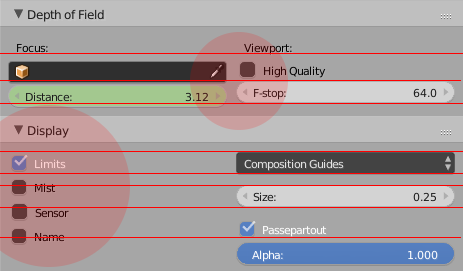
To avoid this we should extend the layout engine to support aligning buttons to a virtual grid and make extensive use of it.
Theme
Team agreed on simplifying the current Theme options. E.g. At the moment we have individual settings for each header, region, etc, for each editor. These could be set globally for ease theming (one color for all headers), and then, override individual properties in case it’s needed for that workspace.
Cases where theme overrides would make sense:
- Grease Pencil workspace should have a brighter background, or even textured.
- The Properties editor & User Preferences should use the same Window background, but for other editors such as the Timeline, VSE or Nodes Editor, the background is completely different.
Pies
Many of the pie menus that are currently available are mostly a mess. While it should be totally allowed that users configure their own crazy pie menus, at least the ones that ship with Blender should be laid out well and be an actual improvement for fast workflows.
We’re working on a pie menu design guideline page that should be followed to ensure these qualities.
Widgets
We concluded there’s a need for some new interface widgets and for updating existing ones. Namely:
- Add text area widget
A widget that allows editing multiline text. It would be useful for editing text objects, custom metadata, frame node text, etc. - Extend list widget
- Support nesting
- Drag ‘n Drop reordering
- Redesign scrollbars
- Scrollbars shouldn’t be as chunky as they are now.
- Scrollbars of animation editors do contain frame info and should stay mostly untouched.
- Improve Normal value widget
- The black and white nature of the widget makes it difficult to see at a glance its direction. This could be solved by coloring the ball as RGB for XYZ, and/or an indicator drawn over it.
- Below (or on click, like the Color widget) the widget there should be sliders to view/set the XYZ values directly.
Project structure and decisions
Blender is an inclusive project. Everyone is welcome to join and to start working on topics as we’ve outlined in this document and elsewhere in wiki.
Work on Blender typically happens in so-called module teams, consisting of coders and artists. Here work gets decided on in consensus by all team members - or when that’s not possible in consensus by the module owners (see the full module owner document)
Blender is also organized as a meritocracy, or more specific - the people who contribute to Blender are also the ones that should be empowered to make it happen. This empowerment gets confirmed and protected by Blender Foundation, which is the main role of chairman Ton Roosendaal (the “BDFL”).
